I wanted to remind you SlopeCharts users of an important feature that I think is easily overlooked. First, I wanted to share a clever tweet from that Knight boy, which I thought was worth highlighting.

Slope initially began as a blog, so this is where most of the website’s content resides. Here we have tens of thousands of posts dating back over a decade. These are listed in reverse chronological order. Click on any category icon below to see posts tagged with that particular subject, or click on a word in the category cloud on the right side of the screen for more specific choices.
I wanted to remind you SlopeCharts users of an important feature that I think is easily overlooked. First, I wanted to share a clever tweet from that Knight boy, which I thought was worth highlighting.
Hey, hey! Ho, ho! Non-SlopeCharts have got to go!
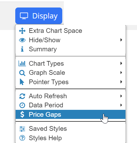
Yes, indeed. Yet another improvement, folks. And this is one you’re all going to love: it’s an automatic gap detector. I haven’t thought of a spiffy name for it, so there ya go.
The Price Gaps feature can be located in the Display menu of SlopeCharts. This is an automatic way of highlighting price gaps that occur on any kind of price chart.
I’ve been involved in financial data for my entire adult life, and I’m well acquainted with its many peculiarities. One of the key ones is symbology, which varies from market to market, and is especially insane in the world of commodities (and don’t even get me started on futures options).
SlopeCharts is not immune to these vagaries, and until now, it was impossible to create a custom symbol with any commodity data, because the futures charts begin with the slash (“/”) which also is obviously the symbol we all use as the division sign. If you wanted to chart the S&P 500 futures versus the long-term continuous gold contract, you might have tried to enter /ES//GC (that is, /ES divided by /GC), and it would have just barfed all over the place.
But those days are over! Now you can make use of futures symbols (well, Diamond members can, since they have access) to your heart’s content. I thought I’d share a few example charts to illustrate this in action. For you Gold/Diamond premium members, please note I’ve added these charts to the Pairs shared watch list.
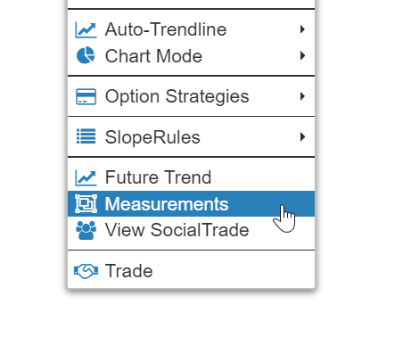
(more…)The pace of SlopeCharts improvements is really picking up! The latest one is: Measurements! To take a price and time measurement in SlopeCharts, just right-click anywhere in the chart and choose Measurements from the menu which appears:
I have another cool new feature in SlopeCharts to announce: Attached Studies. What on Earth is that? Well, let me tell you! What we’ve done here – – and I don’t know if I’ve seen this elsewhere, so let me know if I’m wrong – – is created a way for you to associate any study set with a specific symbol.
As you probably know, normally when you have technical studies “active”, they apply to every single symbol you examine. That’s the way it is on any website or any charting program. You choose the studies, and then you start going through your symbols, all of which will be enhanced by the studies.
There are some instances, though, when you don’t want that. perhaps there is one particular set of studies which you always want to see just for the Dow Jones Industrial Average, and nothing else. Using this new feature, you can “attach” that specific study set specifically to the $INDU (or whatever the symbol might be) so that it reliably appears for that symbol and no other. In other words, you won’t have the nuisance (or have to remember) to apply that specific study when you look at that particular symbol.
(more…)