I am delighted to let you know of another improvement to our wonderful SlopeCharts product: the Andrews Pitchfork drawn object. (Press Ctrl-F5 to refresh your SlopeCharts page if it’s already up and running).
Slope of Hope Blog Posts
Slope initially began as a blog, so this is where most of the website’s content resides. Here we have tens of thousands of posts dating back over a decade. These are listed in reverse chronological order. Click on any category icon below to see posts tagged with that particular subject, or click on a word in the category cloud on the right side of the screen for more specific choices.
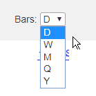
Granularity
Yep, even on a national holiday, there’s progress – – I’m happy to let you know that SlopeCharts now has five styles of bar granularity – Daily (the default), weekly, monthly, quarterly, and yearly, all accessed from this new dropdown:
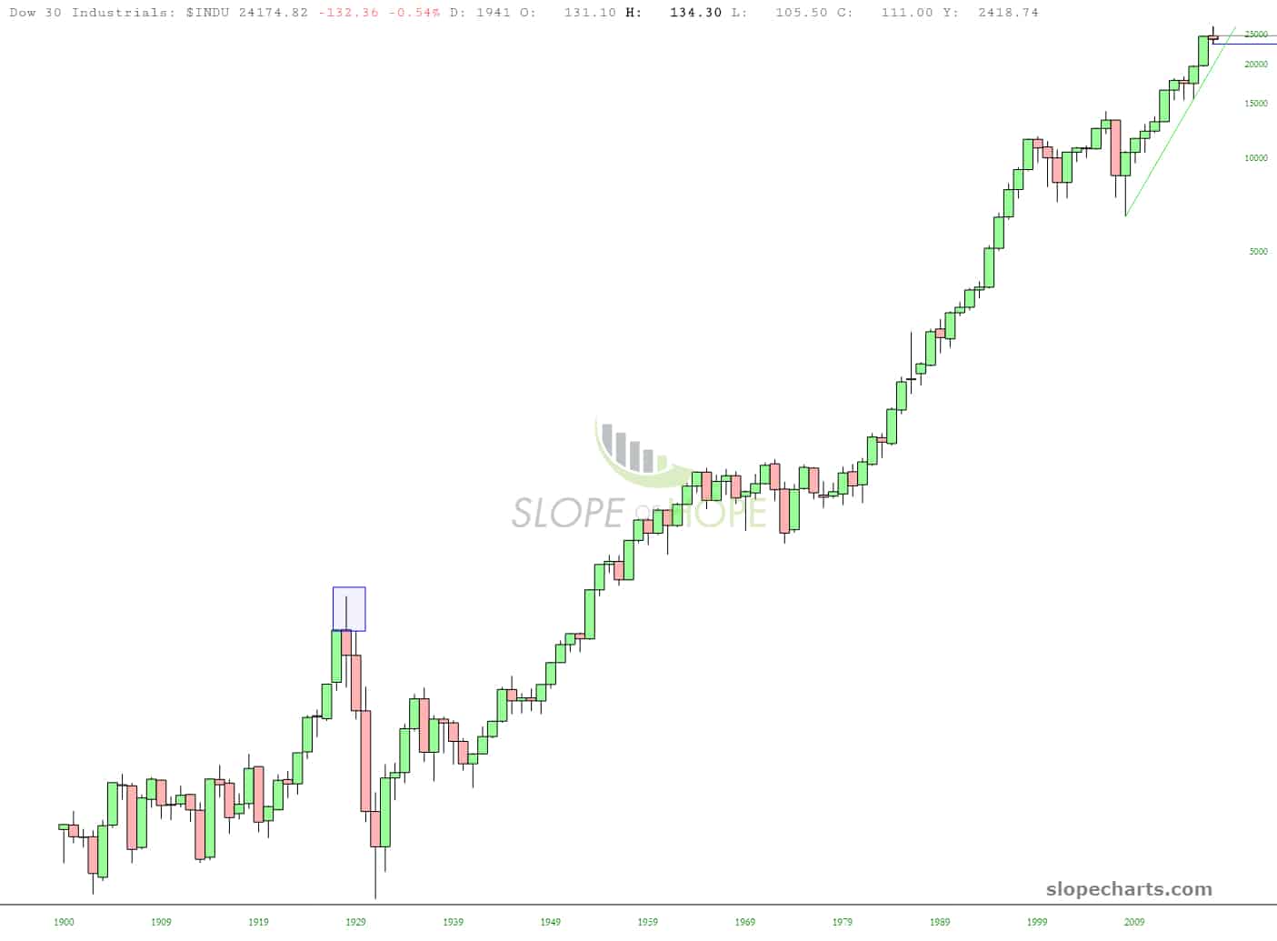
This obviously gives you new insights in seeing a large amount of data; here, for instance, is the entire history of the Dow Industrials from 1900 forward:
Future Trend Now More Amazing
There are two things that astonish me lately: (1) how tiny little SlopeCharts, with virtually no resources at all, is completely outstripping multi-million dollar companies who have armies of engineers (2) why anyone would choose to use anything except SlopeCharts.
Dislodging people from whatever tired old chart product they are using is very challenging, but we’re getting there.
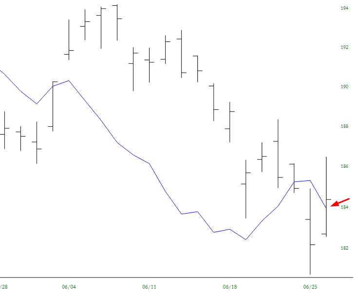
SlopeCharts excellence has been notched up even higher with something no one on the planet has, or has even imagined. You already know about Future Trend, which we only launched a week ago. We’ve outdone ourselves by amping up this feature with something I call, somewhat paradoxically, Prior Future Trend.
So I’ll just suggest this: read what I’ve already written about it here. Try it out. Experiment.
The bottom line is that we’ve introduced a way for you to go back in time and see what Future Trend WOULD HAVE PREDICTED and see how it stacks up against reality. AAPL, for example, predicted today’s closing price almost to the penny, which just about made a body part fall off when I saw it. This is, I suspect, a notable exception, but in any case, this is a brilliant new feature you won’t see anywhere else – – until the competition steals it, as they have with just about every other charting innovation I’ve dreamed up! But………it’s here before anyone else:
Future Trend is LIVE!
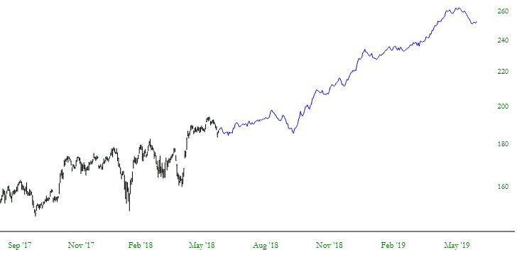
I am delighted to announce another enhancement to SlopeCharts, which is the only charting platform I use. We have created something I call Future Trend, which does something I doubt any of you have seen anywhere else: it shows the next two YEARS of price data.
Now, let me stop right here and make super-dee-dooper crystal clear something that only an idiot or a lawyer would not understand: these projections are virtually guaranteed to be WRONG. Do you honestly think I have access to the next two years of stock data? If I did, I wouldn’t be running these stupid ads on the site and collecting pizza money? (This is another subtle tip that PLUS people are the ONLY people that keep Slope going – – hint, hint).
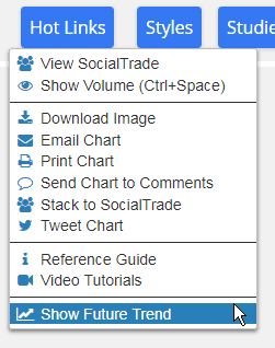
However, what we have done is created our own proprietary system which uses historical price data and seasonal trends to project an idealized and hypothetical path forward for a given security. Accessing this super-cool new feature is a cinch; just use the Hot Links menu:
Charts of the Future!
We are putting the finishing touches on it right now, but very soon (perhaps even today) we will be unveiling the latest feature in SlopeCharts which I called Future Trend. By using a proprietary calculation of historical and seasonal trends created specifically for each chart, it actually projects price performance INTO THE FUTURE. I’m not sure if I’ll eventually make it a PLUS-only feature, but at first, I’m definitely going to make it available to everyone.