I am delighted to announce another enhancement to SlopeCharts, which is the only charting platform I use. We have created something I call Future Trend, which does something I doubt any of you have seen anywhere else: it shows the next two YEARS of price data.
Now, let me stop right here and make super-dee-dooper crystal clear something that only an idiot or a lawyer would not understand: these projections are virtually guaranteed to be WRONG. Do you honestly think I have access to the next two years of stock data? If I did, I wouldn’t be running these stupid ads on the site and collecting pizza money? (This is another subtle tip that PLUS people are the ONLY people that keep Slope going – – hint, hint).
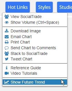
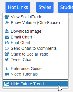
However, what we have done is created our own proprietary system which uses historical price data and seasonal trends to project an idealized and hypothetical path forward for a given security. Accessing this super-cool new feature is a cinch; just use the Hot Links menu:
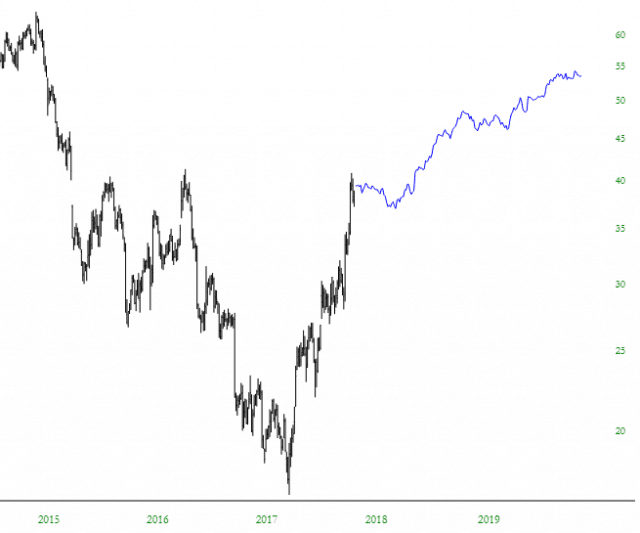
When do you this, a warning will come up (again, for the idiots and lawyers) to make clear that it doesn’t predict the future. From that point forward, any chart you see with a sufficient amount of prior price data will display a blue line chart two years into the future. (Which, right now, gives us 2020 vision – – amiright? Hello?)
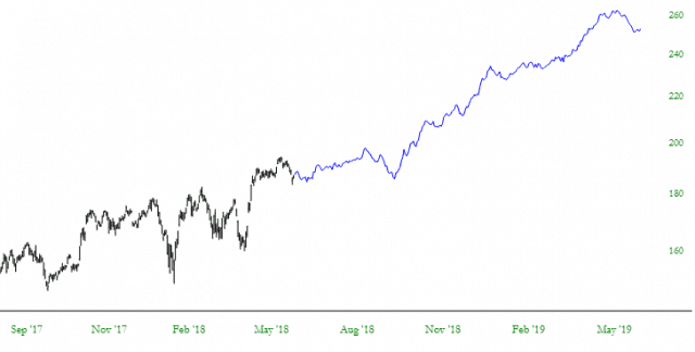
Here’s another example.
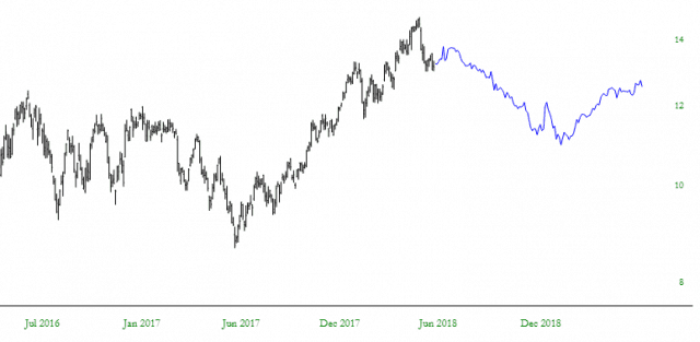
And USO, just to show that not every chart goes up:
You can zoom in on the future, and the data line shows the information, and it’s generally-speaking the same spiffy SlopeCharts experience that you’ve come to expect from the finest browser-based stock chart platform that exists.
When you decide you’d rather just see what’s happened so far instead of the future, just turn it off:
I consider this a “beta” release, so email me anything that blows up or seems wrong. Enjoy!


