In college, I always looked forward to watching Letterman with my roommates with the hope that Flunky the Clown would show up (this was eons before YouTube, so it was catch-as-catch-can to get your Flunky fix). Here's a sample:
Slope initially began as a blog, so this is where most of the website’s content resides. Here we have tens of thousands of posts dating back over a decade. These are listed in reverse chronological order. Click on any category icon below to see posts tagged with that particular subject, or click on a word in the category cloud on the right side of the screen for more specific choices.
In college, I always looked forward to watching Letterman with my roommates with the hope that Flunky the Clown would show up (this was eons before YouTube, so it was catch-as-catch-can to get your Flunky fix). Here's a sample:
At the end of the day yesterday, my biggest long was FXE (the Euro/USD) and my biggest short was GLD (errr – if I have to tell you – gold). This may seem like a pair of trades guaranteed to cancel each other out, but so far this isn't the case.
The Euro zoomed higher this morning, thanks, I suppose, to the more-or-less successful sale of Portugal bonds. Precious metals and the Euro are typically joined at the hip, but instead of zooming higher alongside FXE, my GLD short slipped lower. As I am typing this, the EUR/USD is up 0.4% and GLD is down 0.24%. Quite a contrast!
My stop-loss on GLD is 135.17, and a break below 132.86 would, I think, really start pushing things downward. This is an intraday chart:
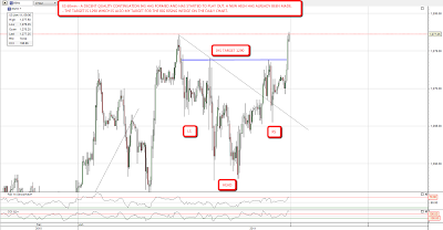
I'm seeing bullish breaks everywhere this morning, and I'm going to break my usual limit of five charts and post a sixth today. I was expressing serious doubts about the very short term bear case yesterday morning and my doubts were well founded. On ES an IHS has formed and has started to play out. The target is 1290, which is also my target for upper trendline of the big rising wedge on the daily chart:
The falling wedge on copper that I posted yesterday morning has broken up, and has already progressed too far for it to become a declining channel. The target is the previous high just below 450:

I mentioned yesterday that the falling wedge on oil had already broken up, and it is now most of the way to the target which is also the previous high just over 92.50:

What's really alarming me this morning though is what I'm seeing on forex. I've posted the falling wedge on GBPUSD in recent days, and that too has broken up. The target is the previous high at 1.63, though if it is evolving into a declining channel the target would be 1.59:

Many thanks to toad37 for pointing out the possible IHS forming on EURUSD yesterday morning. Since then a second alternative IHS has formed and both have broken up. The targets are 1.312 and 1.317 respectively and I've marked them both on the chart:

This is a bad place for a significant EURUSD low. I mentioned my analyst friend predicting an imminent major low for EURUSD in the 1.29 area the other day, and he could be right. Looking at the EURUSD daily chart I have a possible rising channel from the summer low, and very clear positive divergence on the daily RSI. If EURUSD has bottomed any looming equities correction is going to be fighting against a declining USD, which will be heavy going:
It's been a while since I've stepped back and taken a look at the big picture of the markets, so I'll take this opportunity to do so. This will be my last post of the day, so I imagine there will be a gazillion comments by the time Springheel's post is up in the morning.
The market has been climbing mercilessly for twenty-two months now, and the surviving bears are, naturally, pretty despondent over the Fed's seemingly unlimited ability to levitate these markets. If you look at the very long-term charts, however, the rise makes sense in context, and there is hope for the bears after all.
The NASDAQ Composite is right near its 38.2% retracement level, which proved to be an important reversal point back during the 2007 top (in spite of a bit of an overshoot). In each of these examples, I've circled the interesting price points of the charts in red.
Looking at the Dow Industrials (which, believe it or don't, I'm still looking to hit under 6,000 before this is all over – – see the pink tinted circle) the retracements also seem to have plenty of power. We have well exceeded the level found last April, but as March 2009 proved, you can have some "overshoots" while, by and large, respecting these support and resistance levels. Take note of the many instances of this happening.
Here's an even longer-term view of the same index.
It's not often that Fibonacci Arcs are useful to me, but there are a few indexes in which they are. The S&P MidCap 400 is one of them. On the left side, you can see the fascinating behavior of the prices are they hug the curve. After the cruel rise of the past two years, this index is at last approaching the same arc.
Probably the most fascinating chart to me of all is the S&P 500, on which I have placed fan lines going back about eighty years. The power of these lines is breathtaking. I've highlighted the 61.8% line in particular (start point: 6/30/1932; end point: 3/24/2000).
Zoom in closer to get an appreciation for where we currently are.
There is no shortage of people, pundits, and publications that have made fools of themselves calling "the" top. I don't want to join that chorus, since an overpriced market can always become even more overpriced. But, for the seven bearish individuals still alive here on Earth, I can say the charts may be a source of solace.
Oil prices pivoted off of key support at 87.25-86.80 last Friday in the aftermath of a decline from 92.58. Strength yesterday and today has the look and feel of a new upleg, which if accurate projects next to 94.60-95.20 — and, if that target zone is breached, onwards to 103-105. At this juncture, only a sudden downside reversal that breaks 87.25 will disrupt higher projections.
The move has benefited the US Oil Fund ETF (USO), as well as Petroleo Brasileiro (PBR), which we've been following. The daily chart on PBR shows the recent pullback from the Jan 3 high at 38.25 to the Jan 10 low at 35.89, which has the right look of a completed correction. Given today's strength, the chart has the look of a new upleg that should take out the prior high at 38.25 en route to still higher near-term target zones.
Originally published on MPTrader.com.
