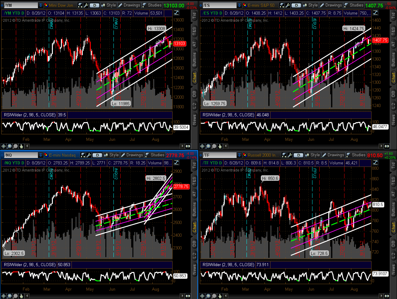
The first two Daily charts below show the profit-taking that is
occurring in the Nasdaq 100 Index. It's currently sitting at the lower end of
its smaller, steeper upward-sloping channel as I write this during intraday
action on Tuesday.

Slope initially began as a blog, so this is where most of the website’s content resides. Here we have tens of thousands of posts dating back over a decade. These are listed in reverse chronological order. Click on any category icon below to see posts tagged with that particular subject, or click on a word in the category cloud on the right side of the screen for more specific choices.
The first two Daily charts below show the profit-taking that is
occurring in the Nasdaq 100 Index. It's currently sitting at the lower end of
its smaller, steeper upward-sloping channel as I write this during intraday
action on Tuesday.
The title speaks for itself.
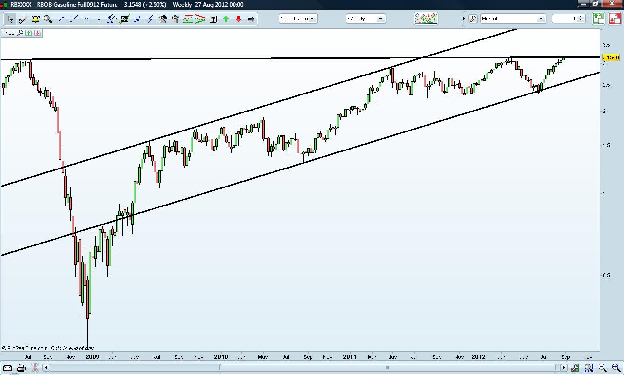
Let's cross our fingers that the Gasoline futures do not break resistance…..
Gasoline Futures
I was asked yesterday why I'm thinking the 1440 SPX area might well be a major high rather than a retracement on the road to test the 2007 highs. From a TA perspective both are definitely valid options, and I would go so far as to say that in all likelihood we will do one or the other. I covered both options in my weekend post before last and you can see that post here.
There are a few technical reasons why I'm leaning towards thinking this is a major double-top being formed and they are as follows:
1. There are major topping patterns formed and very much still in play on copper, EEM and many other indices. These need to be borne in mind and make downside risk here unusually high.
2. SPX highs tend to be at tests of important previous support or resistance levels, and the April 2012 high wasn't. This has me thinking that the April high was part of a topping pattern rather than a significant interim high in its own right.
3. The huge Dow Theory divergence between Dow and TRAN here is characteristic of major tops.
4. There is a very nice setup of negative RSI divergence on the weekly chart, and there is also a decent resistance trendline that is a few points above the 1440 area SPX pivot
We live in insane times. I mean this sincerely.
The reason they don't seem insane is because we have been led here, bit by bit. We are like the proverbial frogs in the pot full of water; the temperature has been turned up very gradually, and we don't notice what a dire situation we're in.
Let's just step back and look at the facts: the entire financial world is breathlessly awaiting the words of a lifelong academic who couldn't successfully manage a Burger King. The most powerful position in the financial universe has been given to The Bearded One, and while all the chatter this week is going to focus on whose Jackson Hole is going to get reamed, the real fireworks will be on September 13th.
The three Daily charts below show the Percentage of
Stocks Above their 20-50-200 Day Moving Averages. At the moment, they
are all above 50%.
In the event that the 6 Major Indices and 9 Major Sectors drop and
hold below their middle Bollinger Band on their Daily timeframe, I'd check to
see if the percentage on the above referenced three charts also drops and holds
below the 50% level. If all three fall and hold below, it's a likely
confirmation of further weakness to come in the equity markets in the short,
medium, and longer terms…possibly signalling a correction.


