Slope of Hope Blog Posts
Slope initially began as a blog, so this is where most of the website’s content resides. Here we have tens of thousands of posts dating back over a decade. These are listed in reverse chronological order. Click on any category icon below to see posts tagged with that particular subject, or click on a word in the category cloud on the right side of the screen for more specific choices.
Comparing Recent Price Action on the Four Major Indices (by SB)
Below are several charts comparing price action among the Dow 30, S&P 500,
Nasdaq 100, and Russell 2000 Indices.
The first chart shows the price
action over the past three days, beginning with Friday's big decline. With
yesterday's and today's (Tuesday's) combined bounce, the INDU and SPX
have closed higher than Friday's open, while the NDX and RUT are still
below.
The next
chart shows yesterday's and today's bounce. The RUT is leading in terms of
percentage gained over the past two days and is the one to watch to see if this
leadership holds on any further rally, or if meaningful weakness enters that
could, ultimately, drag the others down.
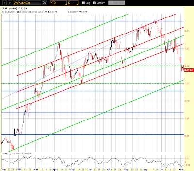
The NDX was the
weakest on the two-day bounce, perhaps because of AAPL's relative weakness,
which is reflected in this year-to-date Daily ratio chart comparing AAPL to the
NDX (the Momentum Indicator is still below zero as price struggles below
resistance)…also, two important ones to watch for either a strengthening or
for further relative weakness, which could lead to the resumption of a decline
in both.
Election Night: Silly versus Sensible
A long-standing favorite sketch of mine:
What’s TastyTrade?
For a break in the Election Obsession………..the financial network for which I do a daily show, TastyTrade, just came out with a video snapshot as to what they're all about. It's just over three minutes, so check it out. They've also given me a special promotional link for my readers to get free access to TastyTrade (and a bunch of other goodies) for opening up an Ameritrade account.


