I know that the Cupertino-based tech giant has been talked to death, but my relationship with Apple is, I think, a fairly special one, so I wanted to share my own view as to the principal phases the company has been through over the years of its public ownership. I’ve laid out the entire price chart of Apple from its IPO to the present day and have tinted what I consider the main eras: (more…)
Slope of Hope Blog Posts
Slope initially began as a blog, so this is where most of the website’s content resides. Here we have tens of thousands of posts dating back over a decade. These are listed in reverse chronological order. Click on any category icon below to see posts tagged with that particular subject, or click on a word in the category cloud on the right side of the screen for more specific choices.
Wednesday Musings
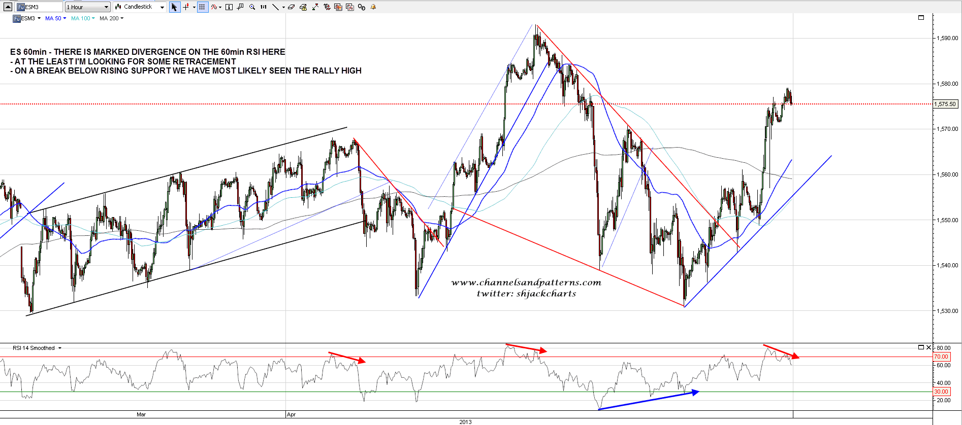
ES made good progress yesterday and made and exceeded my first upside target.We have now reached a level where we may see a big reversal to complete the possible H&S forming on the SPX chart. Will we see that reversal? I don’t know yet, but we are starting to see a significant reversal signaled by strong negative divergence on the 60min RSI. If rising support from the last low breaks, and that’s now in the 1555 ES area, then I’ll be looking for a retest of last week’s low to complete that H&S:
Goofy Day Comment Cleaner
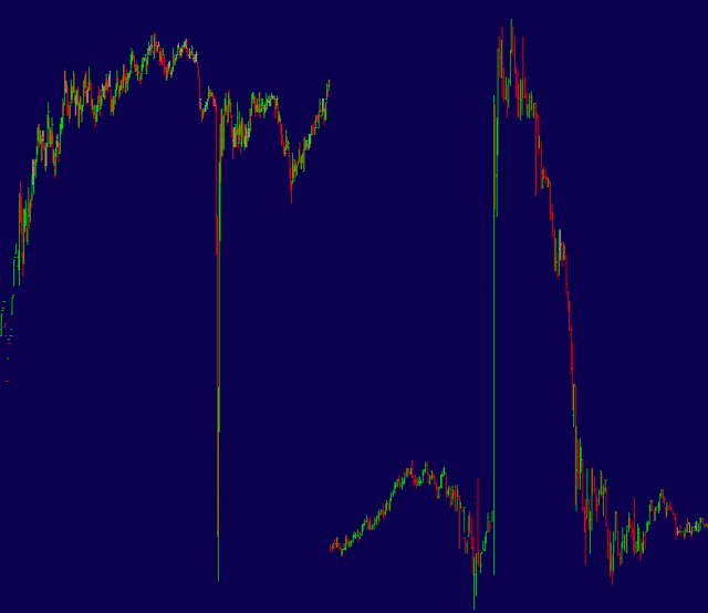
Before I head upstairs to read my little girl her bedtime story, I’ll share a chart with you that captures the nuttiness of Tuesday’s trading. On the left is the DIA minute bar chart; and on the right is the AAPL minute bar chart after hours. Opposites yet equal in their insanity. Good night.
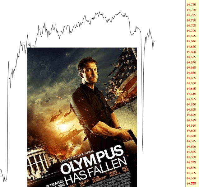
Olympus Has Not Fallen
Dumbest Thing EVER
Hacked AP twitter account. Claim of White House bombing and injured President. Entire day’s market gain reversed in moments, then springs right back. We are officially on the other side of the looking glass now. This market has become a bad joke.