As I’ve mentioned, we’re going to accelerate development of new features and products here on Slope. Here’s the first one for 2019: Comparison Charts for SlopeCharts.
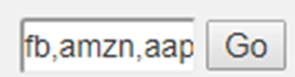
You can easily compare two, three, four, or five different symbols to one another simply by entering whatever you wanted to compare, separated by commas. For instance, perhaps you would like to examine the relative price performance between the “FAANG” stocks, so you would enter FB,AMZN,AAPL,NFLX,GOOGL in the symbol entry and click Go.
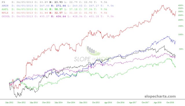
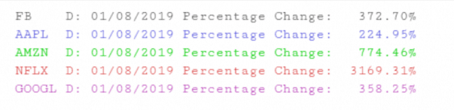
After you have done so, SlopeCharts would present to you, on a percentage change basis, each of the symbols, each one differently-colored. A key showing which symbol matched which color would be displayed, and as you move the cursor, you would be shown the percentage change on each particular date for every symbol displayed.
Here is a closer look at the percentage key:
Just as you can save individual symbols to watchlists, you can also save groups of symbols. You save the bundle of compared symbols the same way as a regular symbol, just by clicking the Add button and choosing which watchlist you’d like to store the symbols.
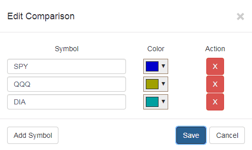
You may decide that you would like to alter the properties of this saved symbol set, perhaps with respect to its contents or presentation. To do this, right-click on the symbols within the watchlist and choose Edit Comparison.
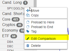
A dialog box will appear allowing you to do four different things: alter the symbols used, change the color for each symbol, delete any symbol, or add new symbols. Once you are finished with any changes, click Save (or just click Cancel to change nothing).