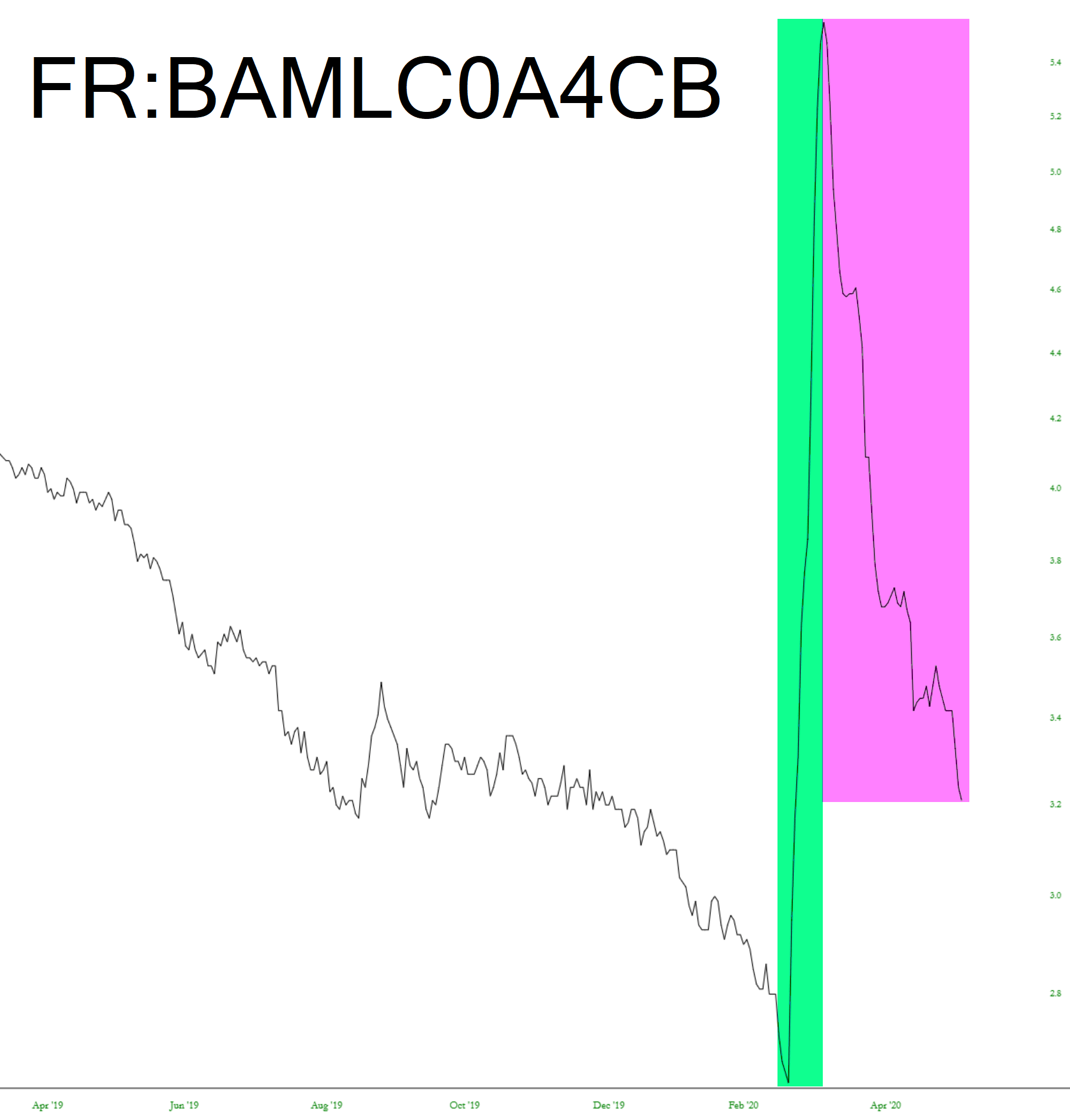
As I was trying to hang onto the thrilling market mayhem with the ES +0.00 and the NQ down 0.01%, I was so bored I started looking at interest rate charts. I found this one kind of interesting:
Slope initially began as a blog, so this is where most of the website’s content resides. Here we have tens of thousands of posts dating back over a decade. These are listed in reverse chronological order. Click on any category icon below to see posts tagged with that particular subject, or click on a word in the category cloud on the right side of the screen for more specific choices.
As I was trying to hang onto the thrilling market mayhem with the ES +0.00 and the NQ down 0.01%, I was so bored I started looking at interest rate charts. I found this one kind of interesting:
If one were to glance at the headlines this morning, they would assume the market was in a free-fall.

That would be an understandable reaction. When I hit the sack last night, the ES was down something like 35 points. Everything was red. All eyes were on China, as it prepared to unleash the Kraken on Hong Kong. And yet, in our perpetually-captured market………..
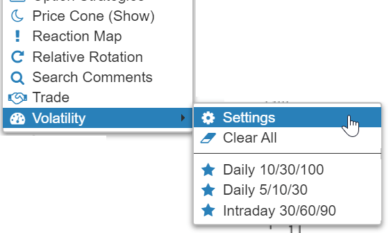
(more…)Tonight I wanted to let you know about two improvements in SlopeCharts.
The first has to do with our Volatility feature, which is now presented as a sub-menu: