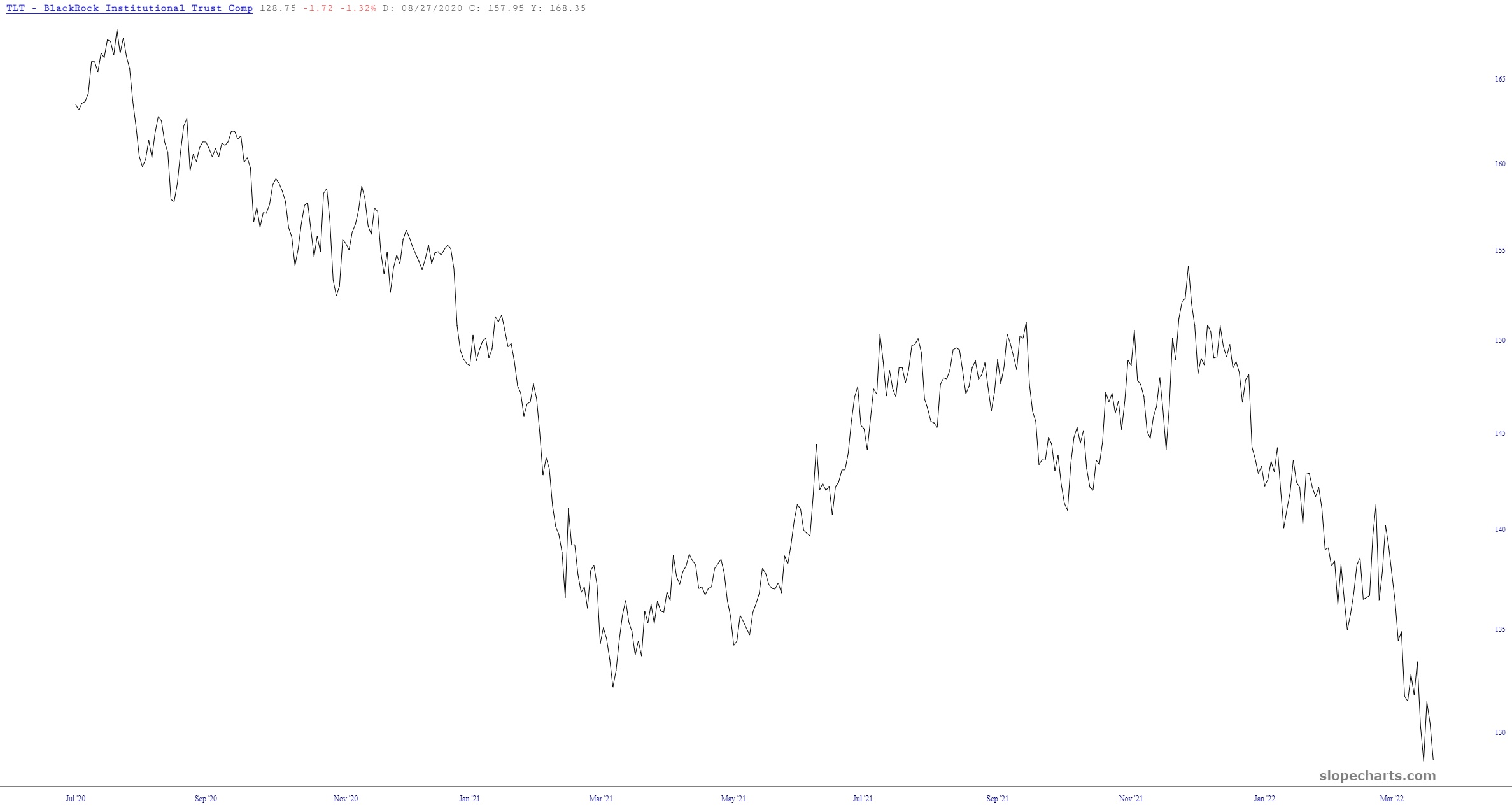
No one can deny that bonds have absolutely stunk up the room for two solid years. Would that equities looked anything like this! Slope would rival Google in terms of traffic! In any case, this is TLT for 24 months solid:
Slope initially began as a blog, so this is where most of the website’s content resides. Here we have tens of thousands of posts dating back over a decade. These are listed in reverse chronological order. Click on any category icon below to see posts tagged with that particular subject, or click on a word in the category cloud on the right side of the screen for more specific choices.
No one can deny that bonds have absolutely stunk up the room for two solid years. Would that equities looked anything like this! Slope would rival Google in terms of traffic! In any case, this is TLT for 24 months solid:

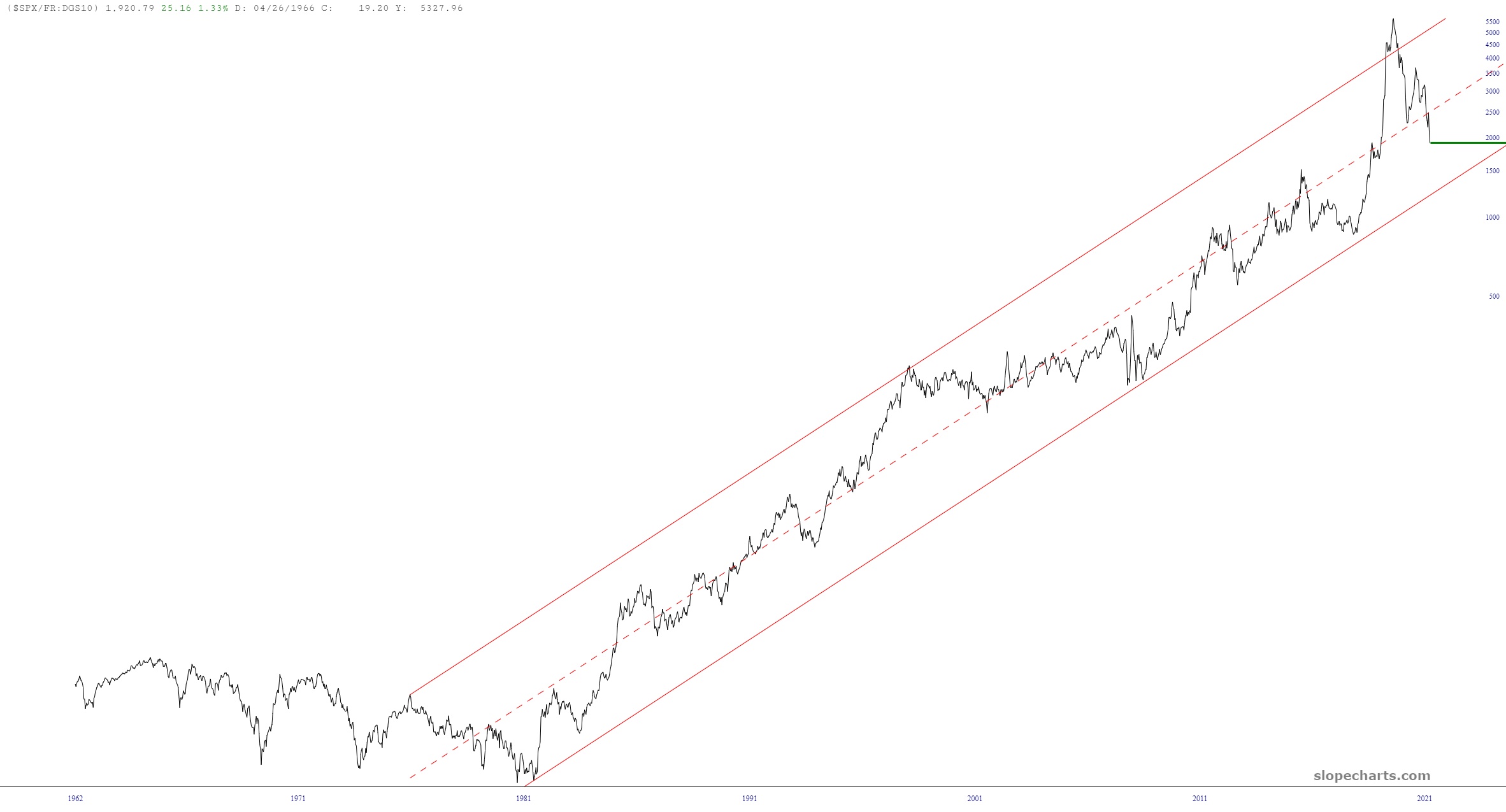
Remember my MICE chart? (The Most Important Chart Ever)? It is equities divided by interest rates, and when it was so high in the summer of 2020 that it actually cracked above the channel, it clearly anticipated either lower equities, higher interest rates, or both. Look how far it has moved since then, traversing the majority of the channel.
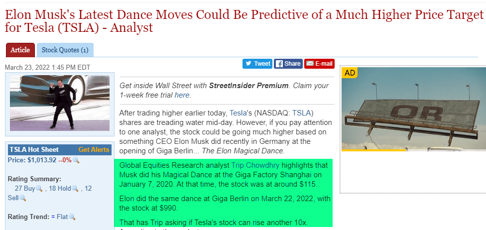
And some people think charting is a dumb way to analyze stocks! Click on this to see it better: