Slope initially began as a blog, so this is where most of the website’s content resides. Here we have tens of thousands of posts dating back over a decade. These are listed in reverse chronological order. Click on any category icon below to see posts tagged with that particular subject, or click on a word in the category cloud on the right side of the screen for more specific choices.
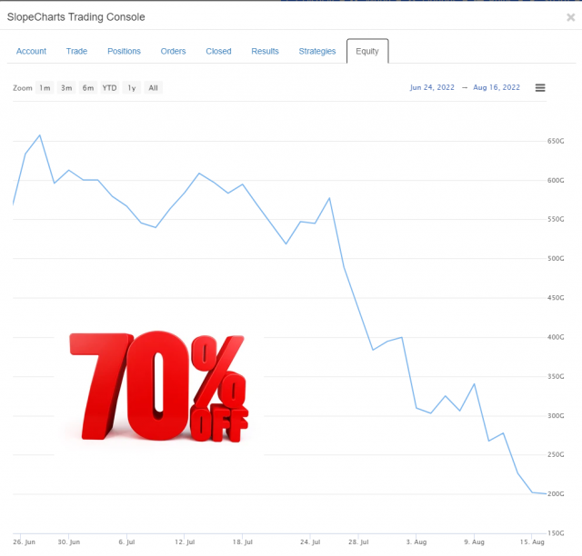
When times are good, I lament that my virtual portfolio isn’t real. When times are bad – – or, like now, absolutely horrendous – – I am relieved it is just a bit of fiction. Here we see my “Balls to the Wall” loss of nearly half a trillion dollars. That is Bezos-level of cash!
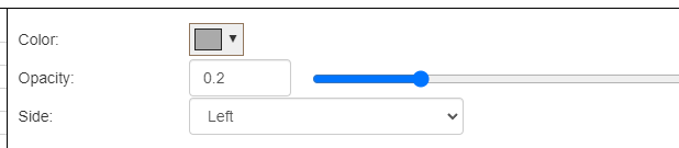
From time to time, I’ll ask Slopers what features they’d like to see on the site. For years now, always near the top of the list, was the same thing: Volume Profile.
I resisted adding this, principally because of the challenges of finding a data source. Even the most ardent volume profile fans couldn’t articulate how to get the data. But I cracked that nut, and I’m delighted to say we’ve now integrated this into SlopeCharts. In a few days, this will be limited strictly to my beloved Gold and Platinum users, but for this initial rollout, I’m letting everyone try it so I can get feedback.
Volume Profile is accessed via the same Technical Indicators dialog box where all the other studies live. You have several controls: the ability to change the color of the volume profile, the opacity, and whether or not the profile is anchored to the left or right side of the screen.
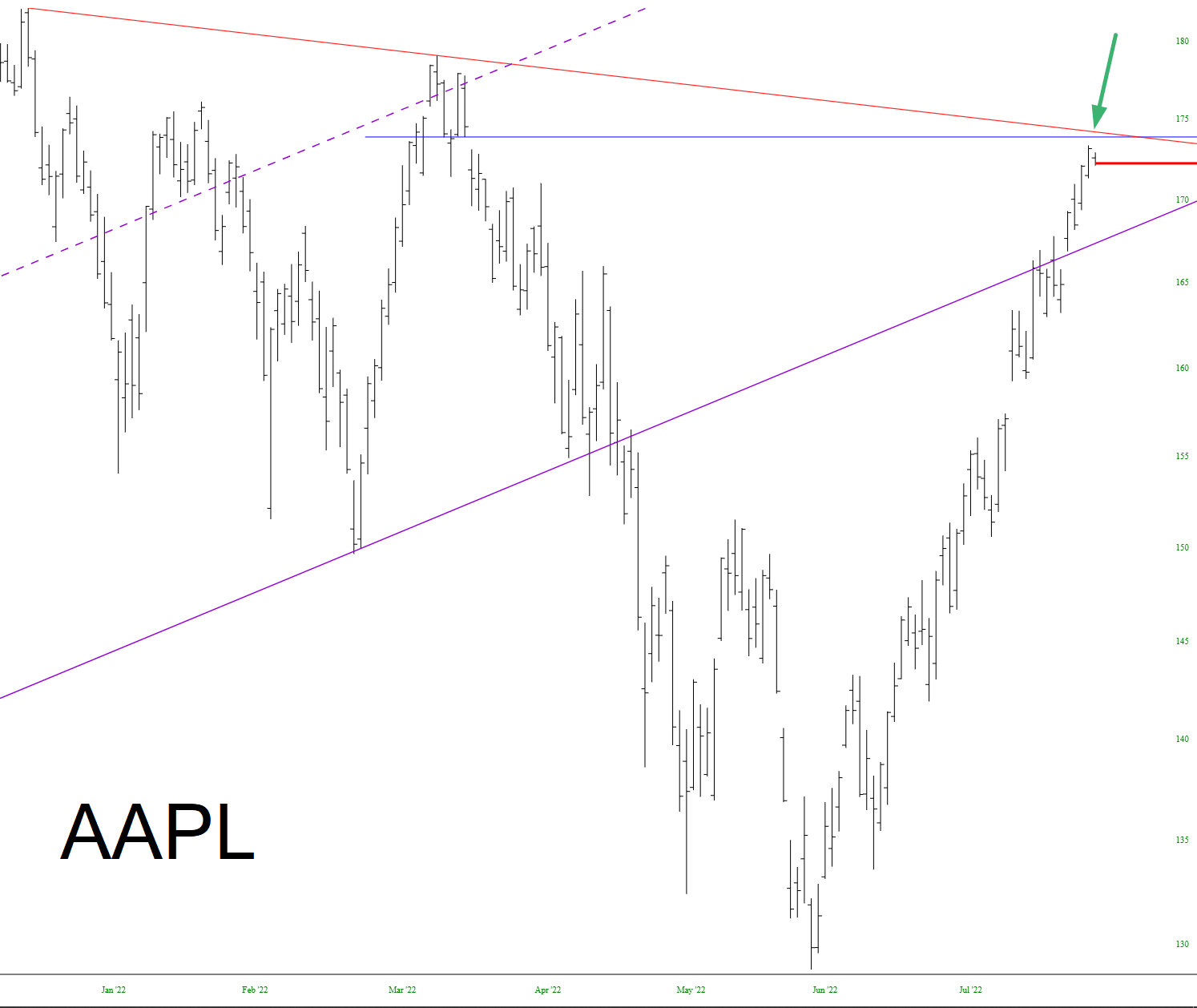
There are two important resistance points for Apple Inc (AAPL): its price gap and its descending trendline, which just so happen to converge at almost exactly the same spot. As of now, it’s holding fast.