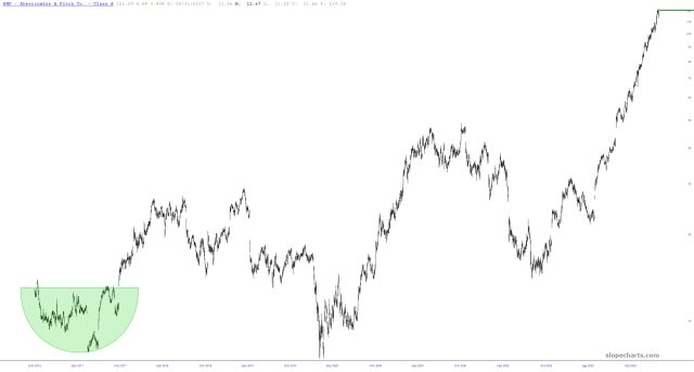
I like looking at charts. I think that’s clear, because if I didn’t, I would have quit this job decades ago. Thus, when I was thumbing through them the other day, I was struck by a strange parallel. First, we have the chart of Abercrombie & Fitch, the maker of pricey clothing for young people with the famously sexy advertisements.

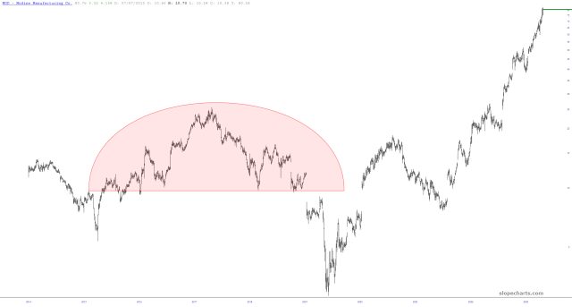
Then we have Modine, which is in the very unsexy business of creating thermal management systems for automobiles and trucks. The organizations could hardly be any more different. And yet – – – don’t the charts look AWFULLY similar to you?

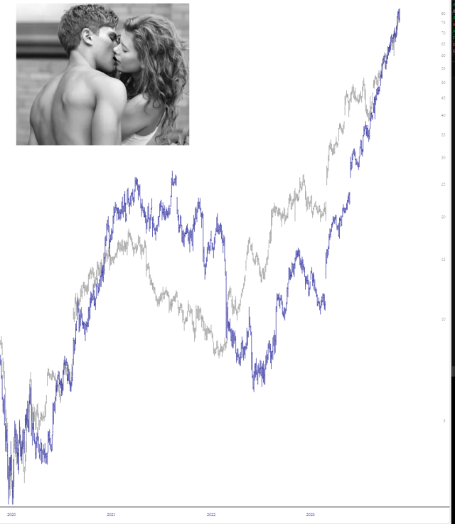
Using our trusty layered charts feature, I shown below how the charts are absurdly correlated. It’s almost like showing two different classes of stock from the same organization.

A healthy, organic market is comprised of many different components with many different performance levels. An unhealthy market tends to have dissimilar charts that are very closely correlated. I’d say that these two wildly different companies help prove that point with this poignant example.

