
Big news, everybody! The options charts are ready!!!
The Slope of Hope is delighted to make available something extraordinarily rare: high quality, easy-to-use charts of options. This is an exclusive feature provided to Platinum premium members of the service. To access this page, choose Options Charts from the Options menu:

You will be presented with a page that has these elements:
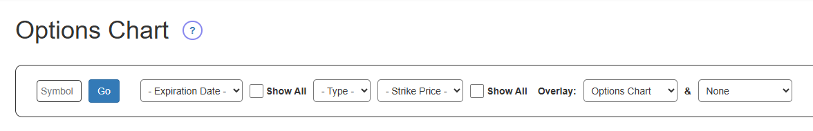
From left to right:
- Symbol is where you enter the underlying root symbol (the site supports U.S. equities);
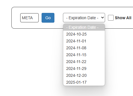
- Expiration Date provides the eight nearest-term expiration dates, unless you click Show All, in which case all the expiration dates will be available;
- Type lets you choose between Call and Put;
- Strike Price provides the strike prices that are closest to the present price of the stock; if you want to see every possible strike price, which can sometimes be an exceptionally long list, you can click Show All;
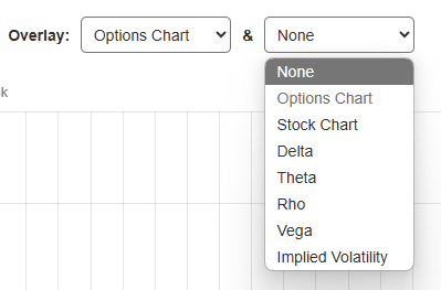
- Overlay provides two dropdowns, allowing you to mix and match various kinds of stock and options data onto the same chart or, most simply, see the historical bid/ask data for the entire history of the financial instrument in question.
There are a few important things to know:
- Presently, the chart does not include the current day’s information. Shortly after the closing bell, the database is appended with the latest options data.
- The options chart shows the closing bid and ask for the specific instrument being displayed, which is almost always more useful than the open/high/low/close data, since the vast majority of options are exceptionally-thinly traded.
- You need to fill in the form from left to right, as shown below, since you need to clearly define precisely what it is you want to chart.
Using the options chart form is very simple. The first thing you do is enter an equity symbol and click the Go button. That will let the form figure out what the nearby expiration dates are.
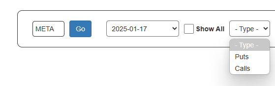
After you choose an expiration date, you choose whether you want to see a Put or a Call.
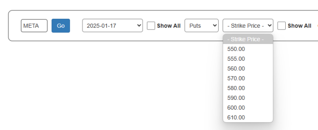
Based on that, the page figures out what the nearby strike prices are. For both the expiration date dropdown and the strike price dropdown, you can choose the Show All checkbox to see many more choices, but most people are interested in the default values.
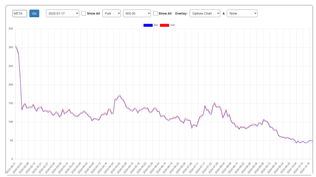
You will then be presenting with a chart showing the bid (in blue) and ask (in red). You can zoom in to any portion of the chart and double-click anywhere inside the chart to unzoom.
You are not limited to this chart, however. There are seven different kinds of information you can display, and you have two dropdowns (each of which have the same choice) from which you can choose.
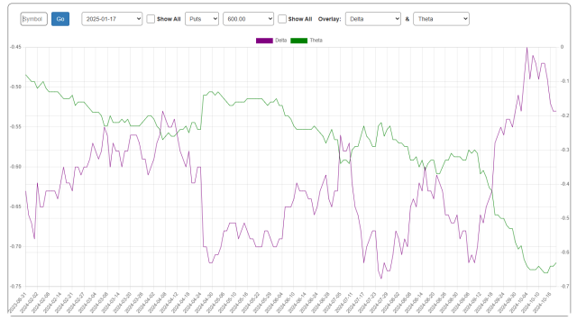
Here, for instance, is the Delta and the Theta chart:
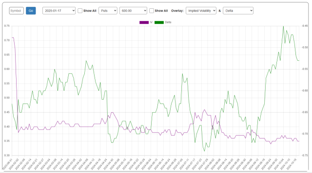
And here is Implied Volatility and Delta. Any combination is acceptable.
We hope you enjoy this powerful feature on the site! Oh, and one last thing for you Platinum folks who want to try it – – we are still putting a few bells and whistles on the page, but the biggest heads-up for you is that we are still loading the (gigantic) database. For now, try it out with the “Mag 7″ stocks, but in a few days this sucker should have just about everything under the sun.
