
My own website, Slope of Hope, provides me all the market information I’d ever want, so I’ve never bothered subscribing to anything else. That is, until about a month ago when discovered Current Market Valuation. What’s cool about CMV is that, unlike my chart-focused Slope, it is completely focused on long-term fundamental and economic data to draw its conclusions, which are by their nature devoid of emotion, interpretation, or agenda.
Having said that, here is where its aggregate analysis stands right now. Perhaps you have heard the term “pegging the meter“. It certainly applies here. It has NEVER been this hot.

It uses a host of models to reach this conclusion, each of which shows where things stand on their individual continuum. These range from very bullish (extreme left side) to very bearish (extreme right). It’s a mixed bag, but the most important elements are rammed far to the right.
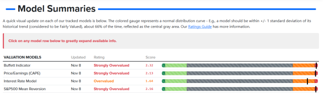
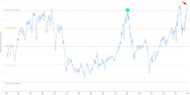
Here, for example, is the famous Buffett Indicator. It has never been higher, not even at the highest point of the Internet Bubble.
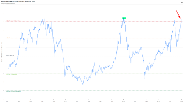
Likewise, here is the Mean Reversion Index. In March 2000, it was momentarily just a tiny bit higher than it is now, but let’s all agree that, based on the DECADES of information presented (all the way back to when Harry Truman was President), we are at unprecedented nosebleed levels.
In spite of its quality, CMV is crazy-cheap considering the information you get. I’d encourage you to try out a subscription since, like I said, it is literally the only financial website other than my own that I actually consider worth paying for.
