
Although the annual charts didn’t yield much insight (or encouragement!) I find the monthly charts do. Below are the 15 most intriguing ETF charts.
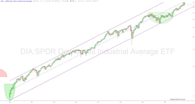
We begin with the Dow Industrials, in which December basically undid November. We have persistently been in the lower half of its very long-term ascending channel, and I expect a “tag” of the lower boundary of that channel in the first quarter of the year.
For the other fourteen charts, I’m going to show them just to Slope’s beloved premium members. You can, of course, join their hallowed ranks by clicking here, at which time you’ll get instant access.

