Most of you know I watch sports basically not-at-all. What’s weird is that the EXTREMELY rare occasions I do watch them, something incredible happens. It’s quite strange. The latest was today, when my wife and I went to a sports bar (which feels weird even just to type) and watched the Duke/UConn game. The last ten seconds were………surprising.
Slope of Hope Blog Posts
Slope initially began as a blog, so this is where most of the website’s content resides. Here we have tens of thousands of posts dating back over a decade. These are listed in reverse chronological order. Click on any category icon below to see posts tagged with that particular subject, or click on a word in the category cloud on the right side of the screen for more specific choices.
Birthday Allowed
Since today is Slope’s 21st birthday, I was wondering what I would do for the 22nd. I already have my answer: NOTHING! The routine below makes it clear as to why.
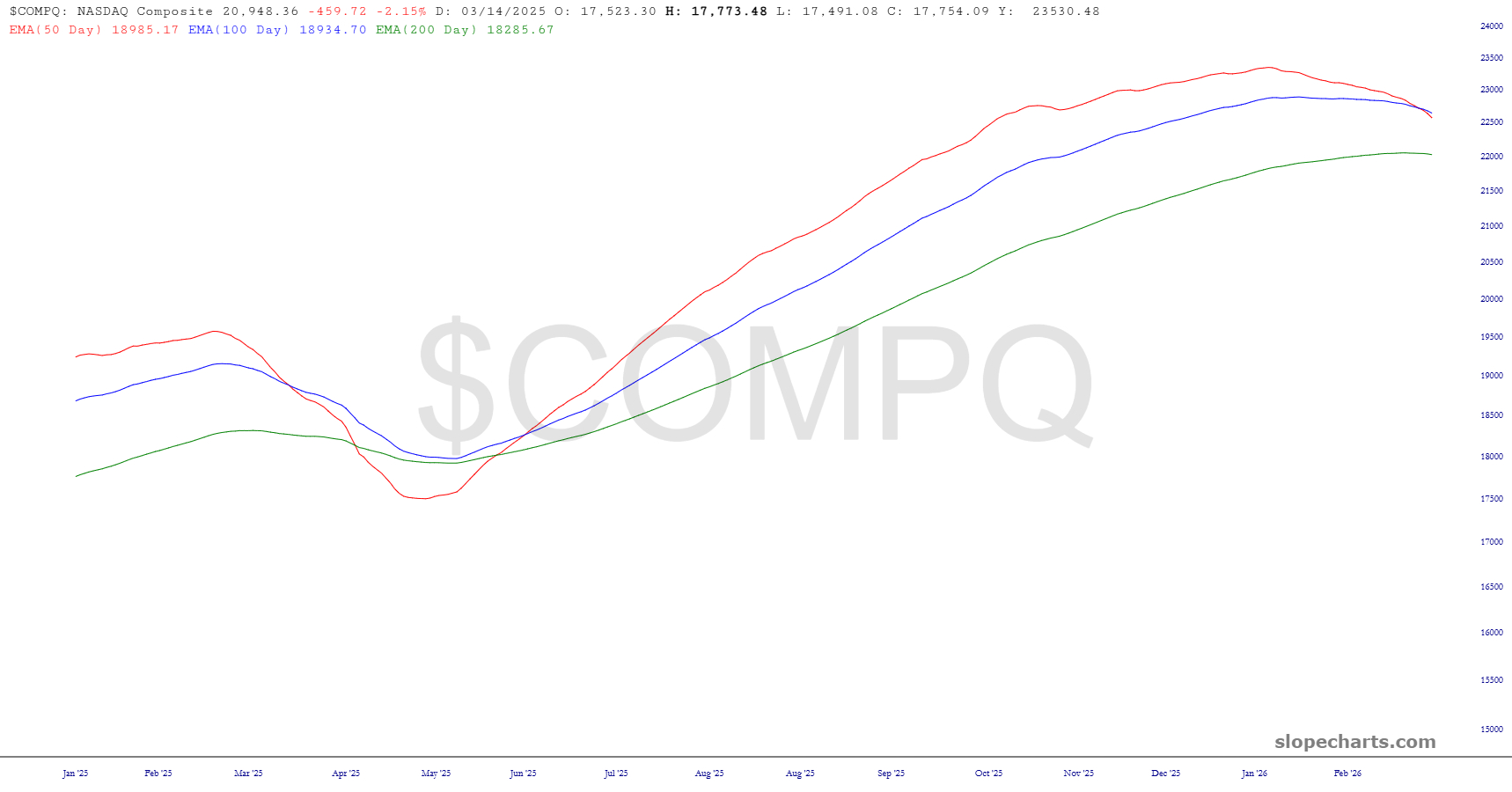
Last Look at Indexes
This is an extraordinarily important juncture for the market: we are either so oversold that we’re going to bounce strongly, or else we’re heading into such a big sell-off that the “oversold” state of the market doesn’t even matter. What I can say for sure is that, for the first time in an entire year, the 50-day EMA has crossed beneath the 100-day.
The Rolo Bottom
Fear and greed. It’s all that makes any market. As a bear, I’m feeling greedy as the market collapses, as it has over the past five weeks. Greed served me particularly well last week. Also, as a bear, I feel fear, since to be blunt, virtually the entire world is aligned against me and my interests.
This fear has been born from hard experience, such as what I went through in October of 2022. For most of the year, the market has been going splendidly my way. I make doing amazingly well.
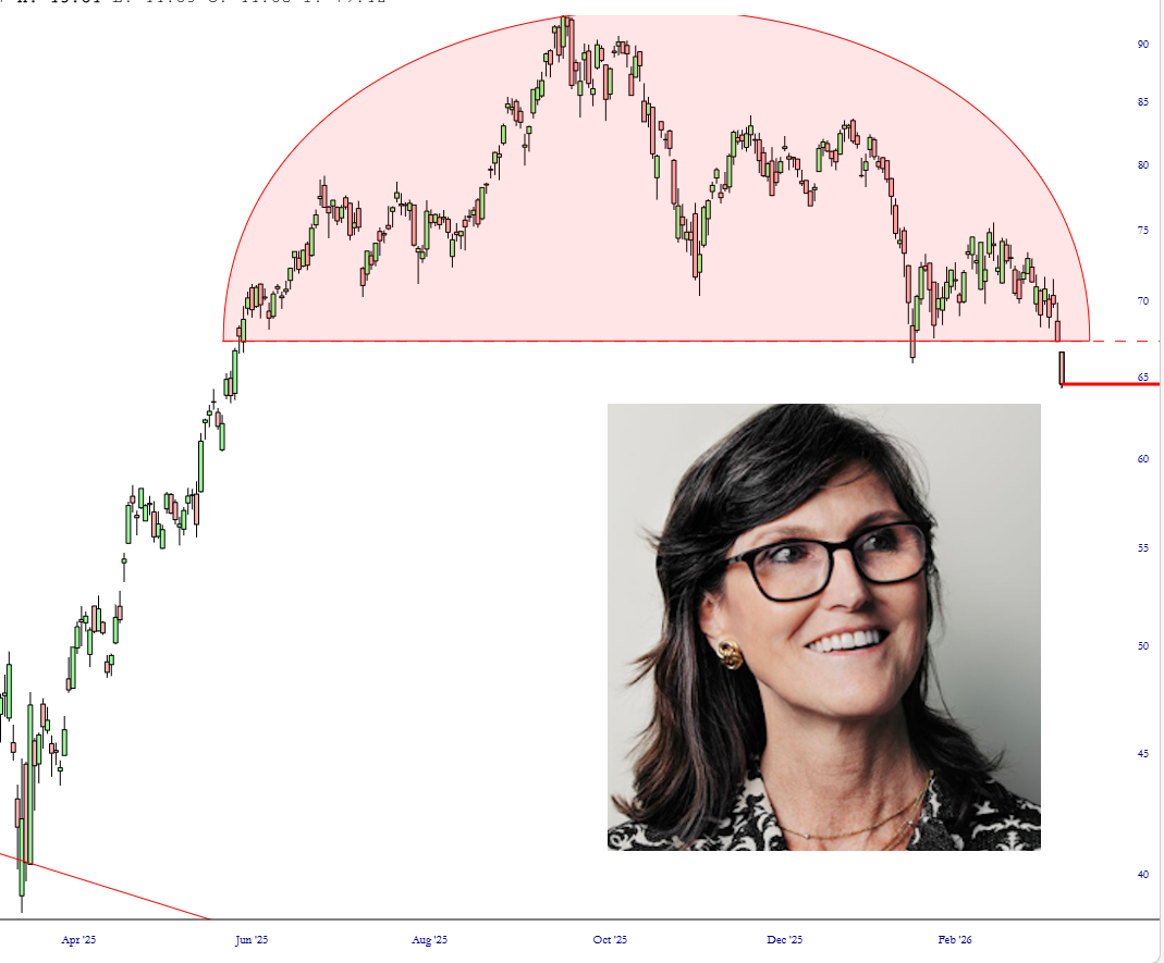
Cathie Doomed Wood
I’d say that the shape of this ARKK shows that it’s going to sink beneath the waves.