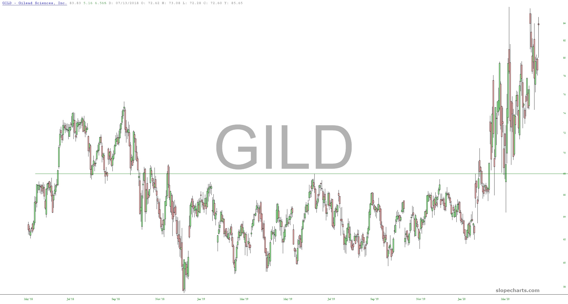
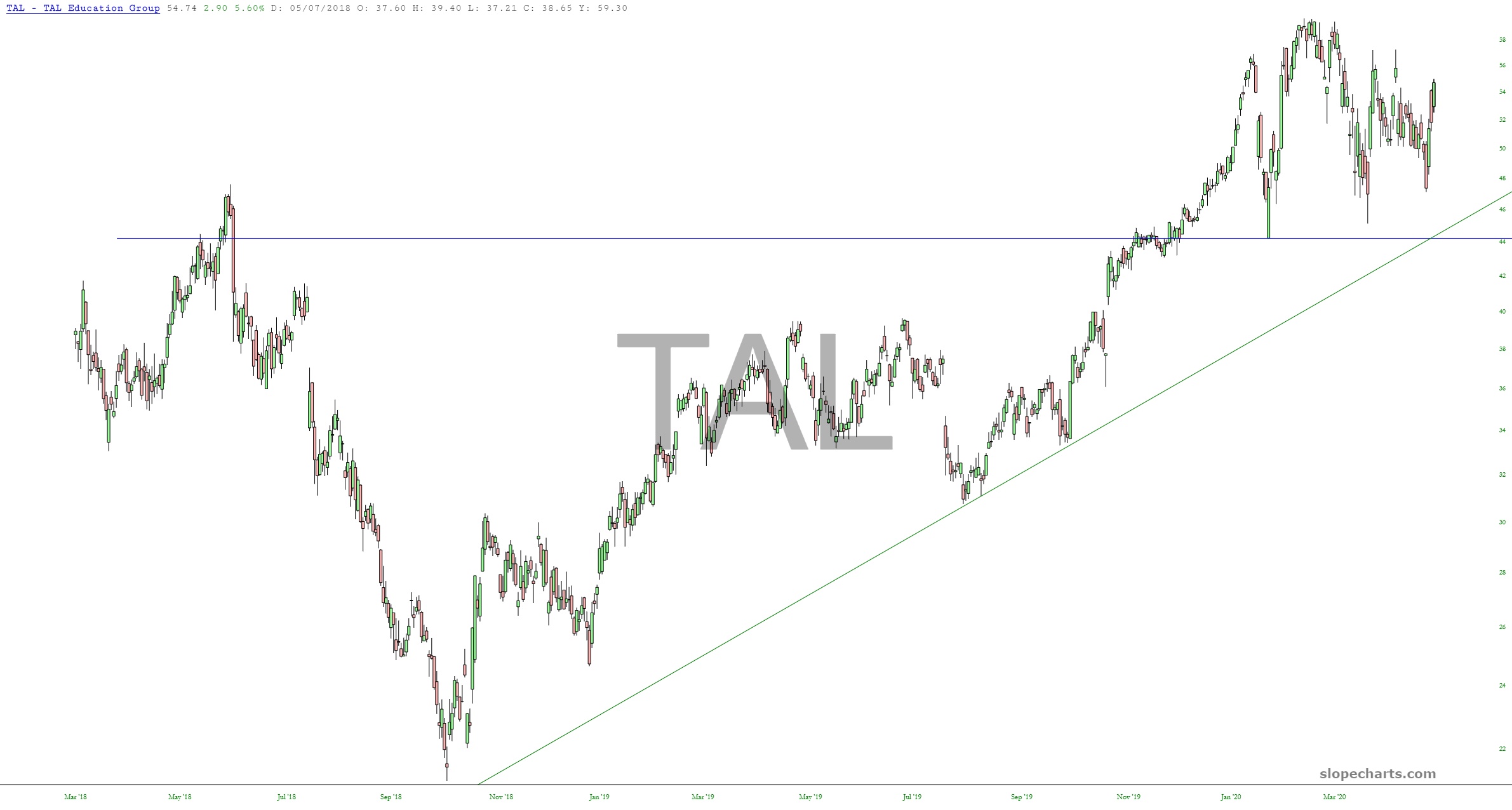
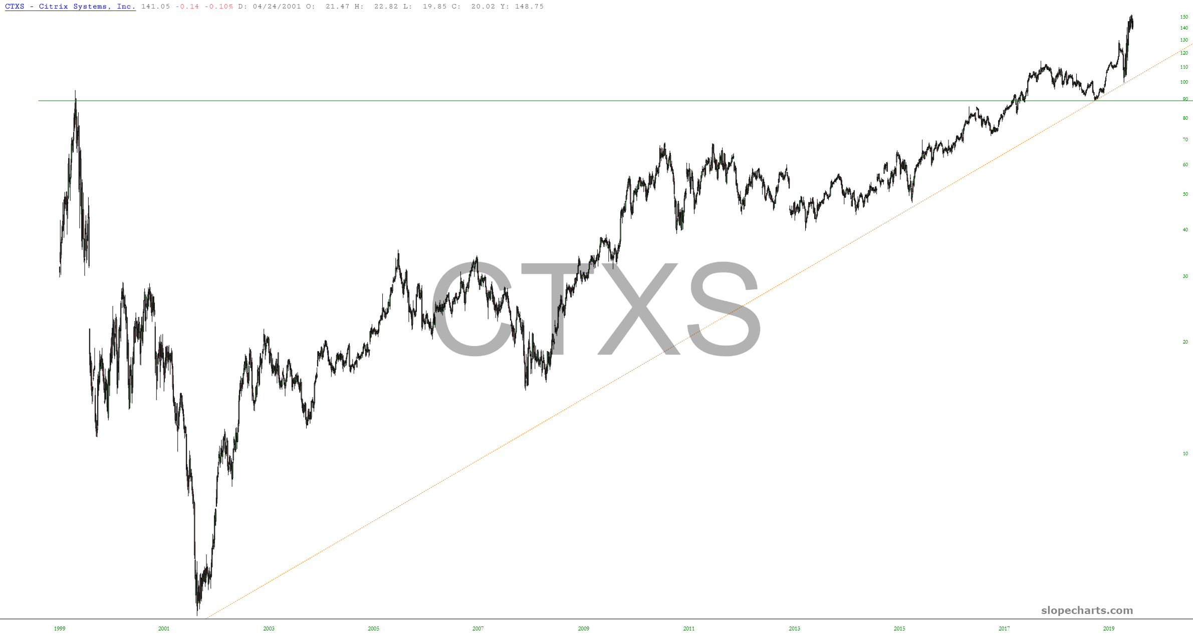
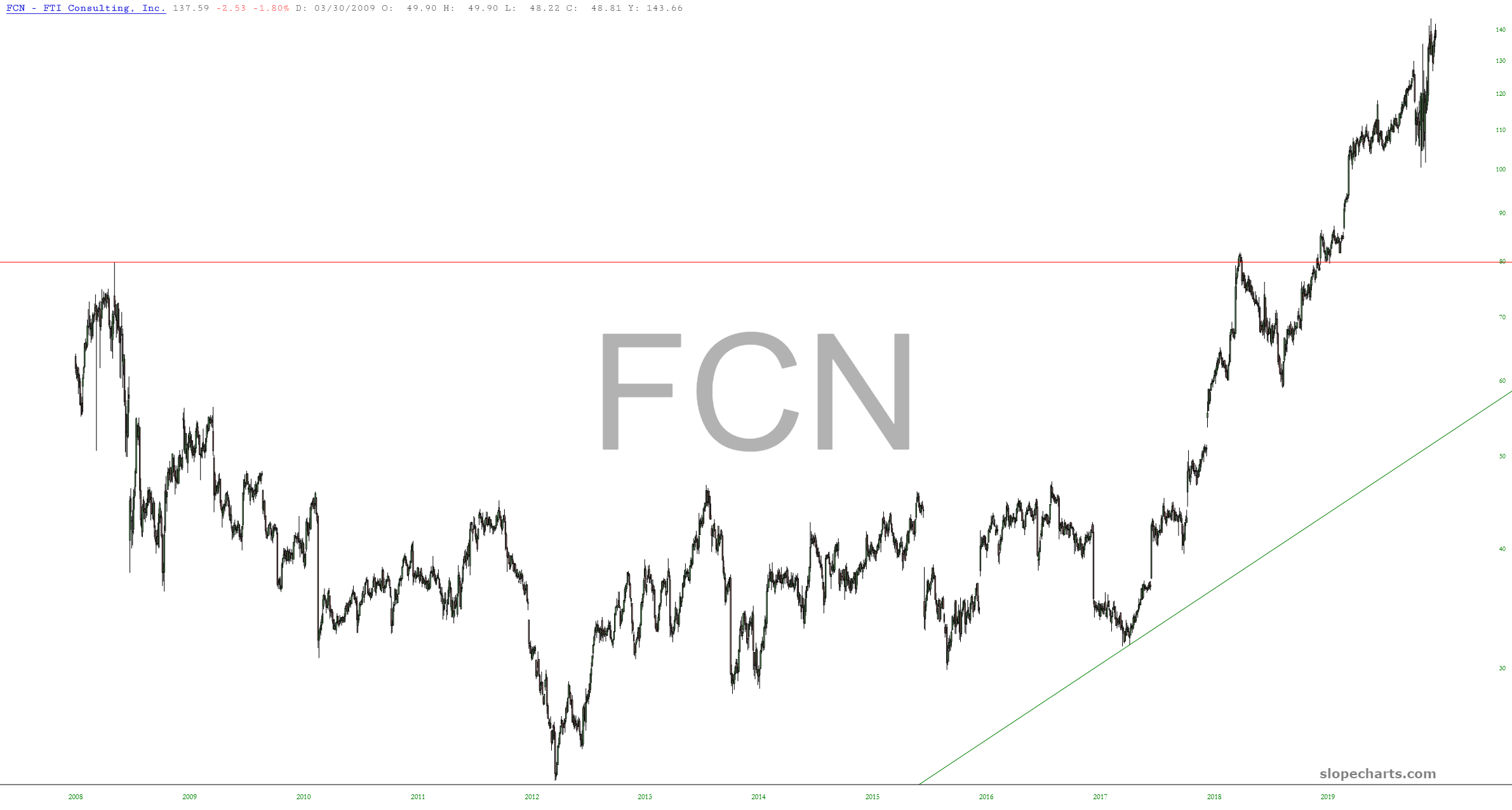
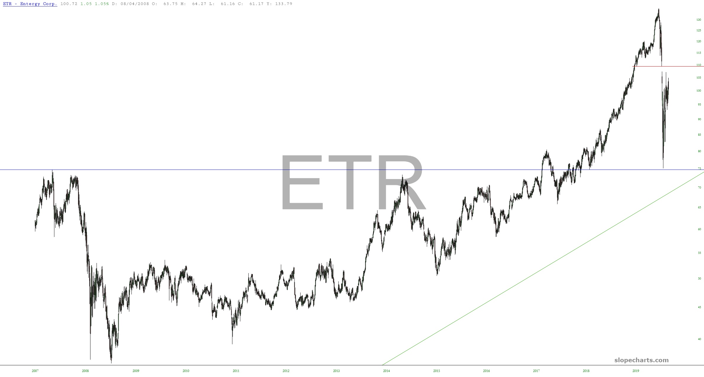
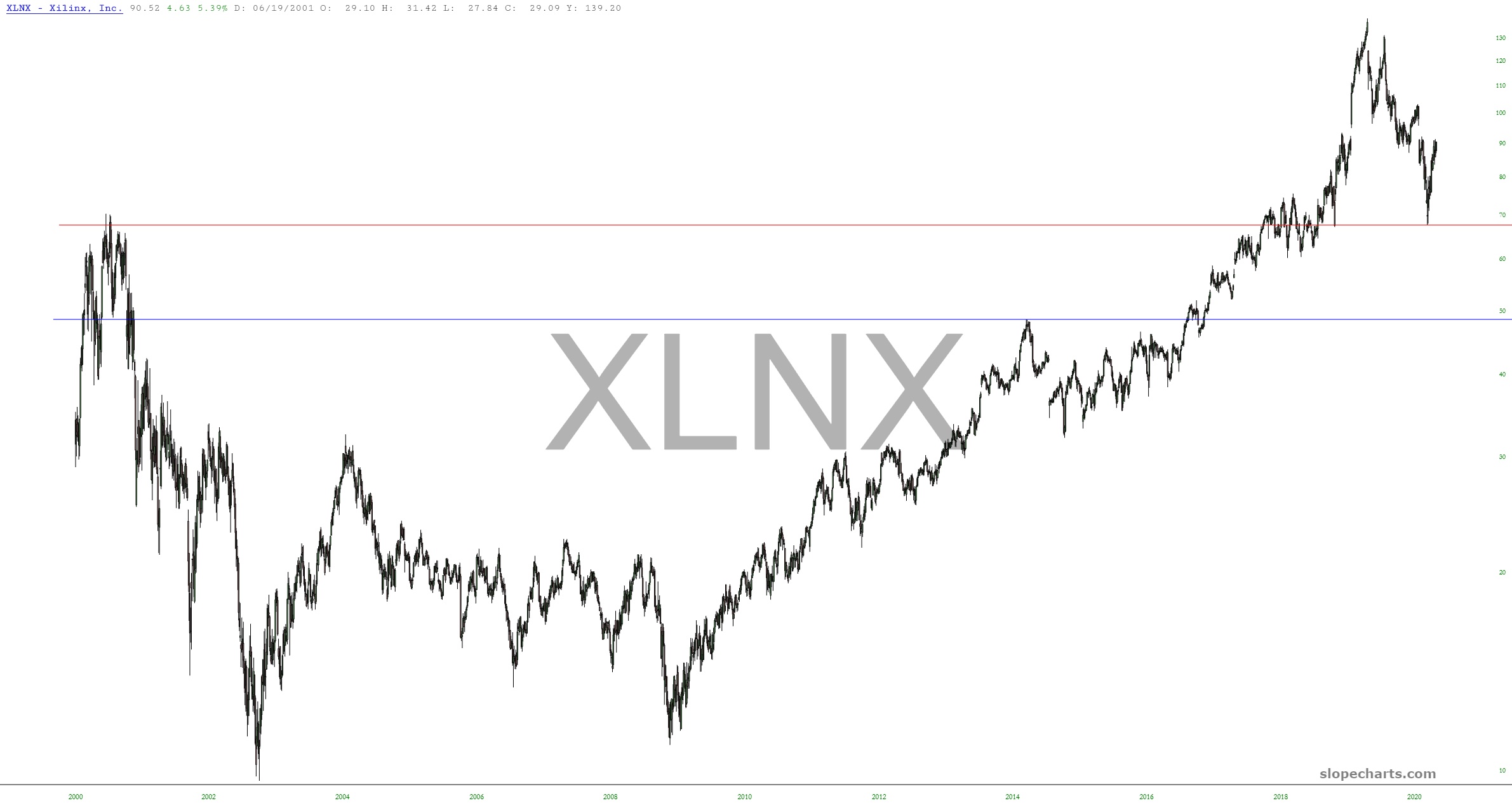
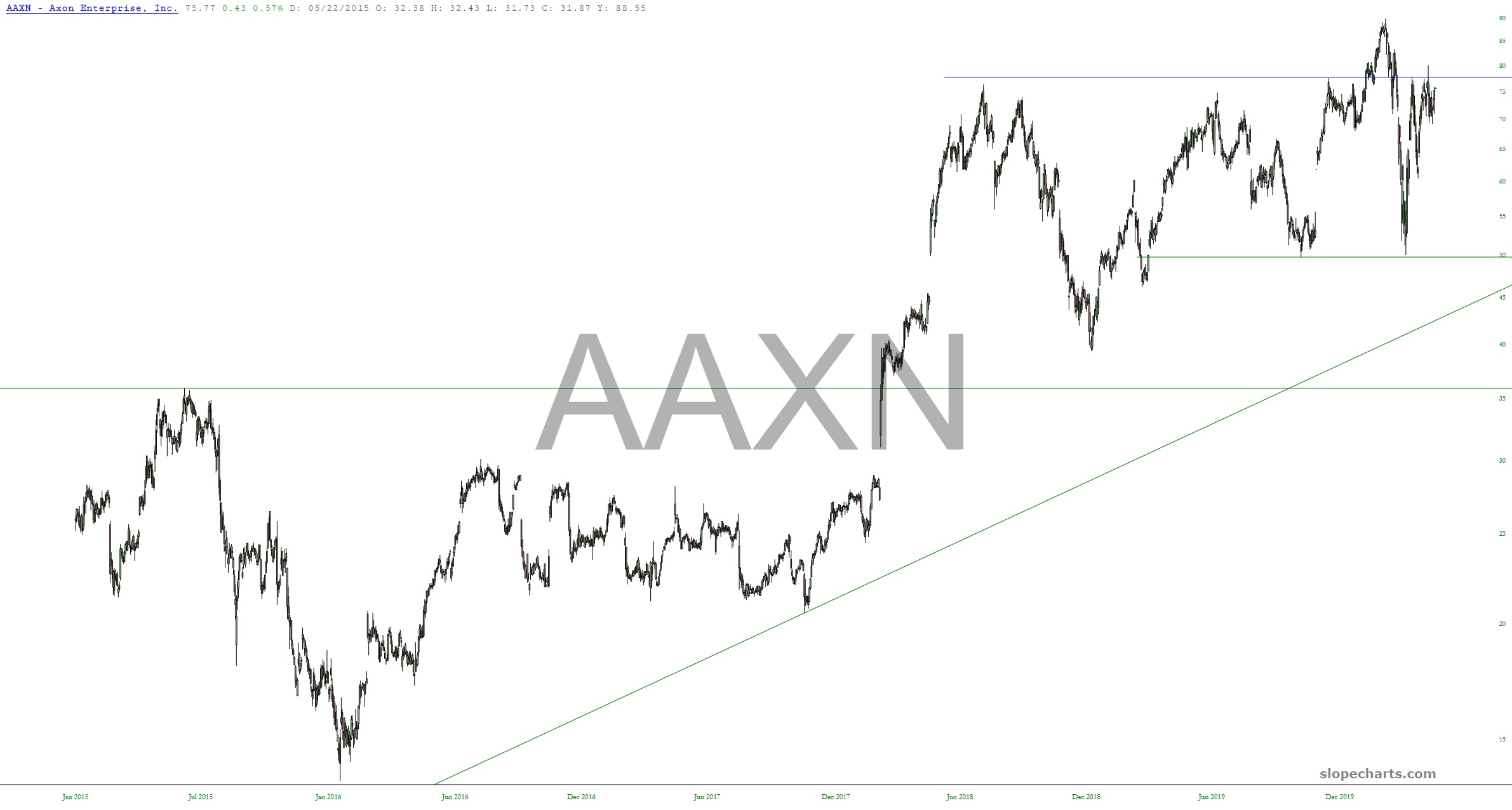
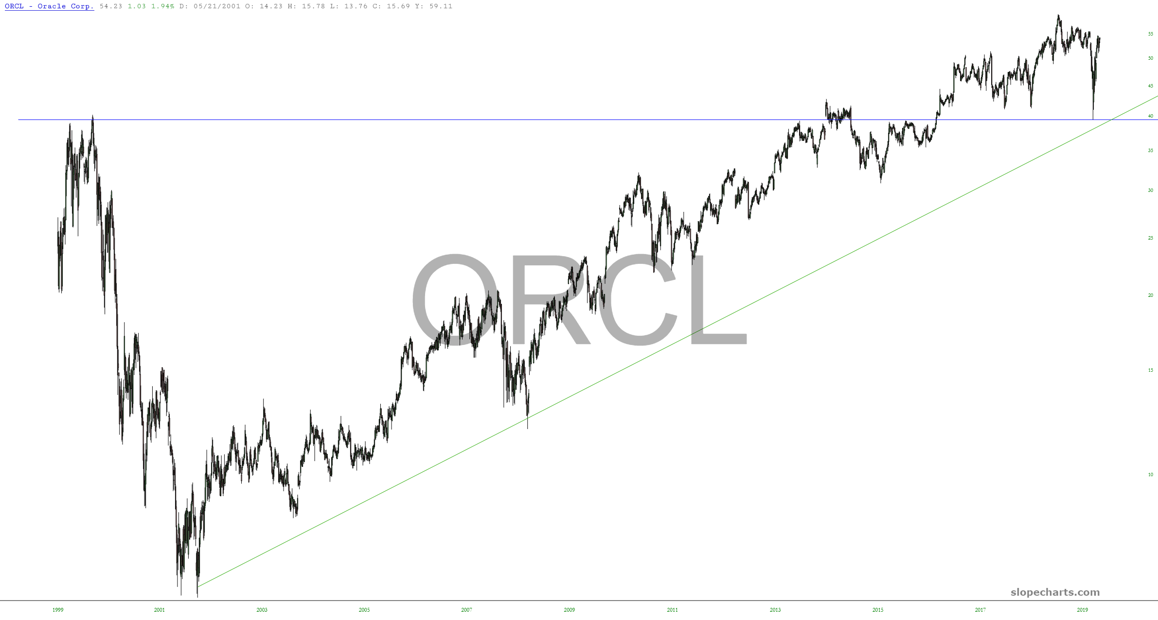
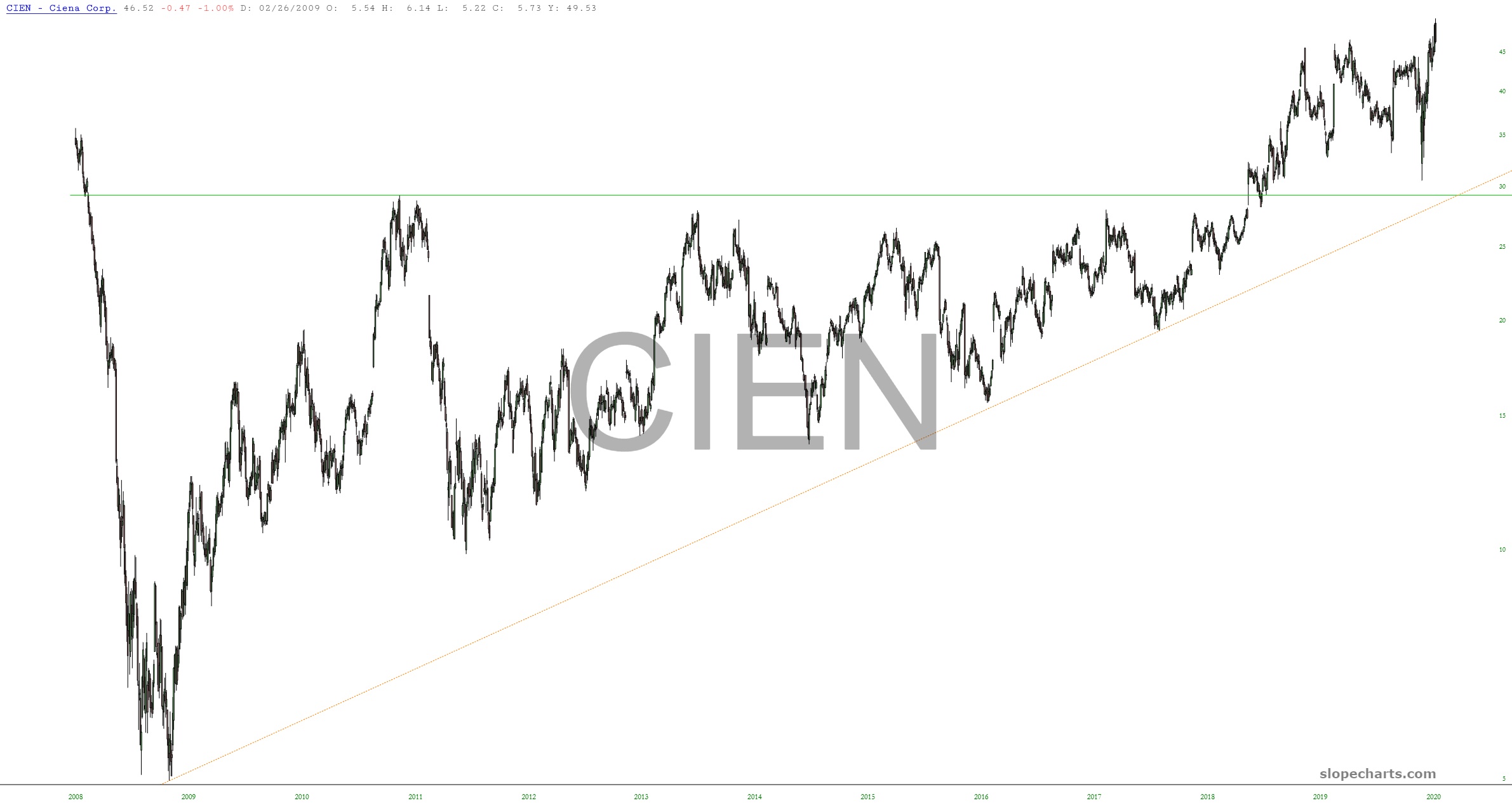
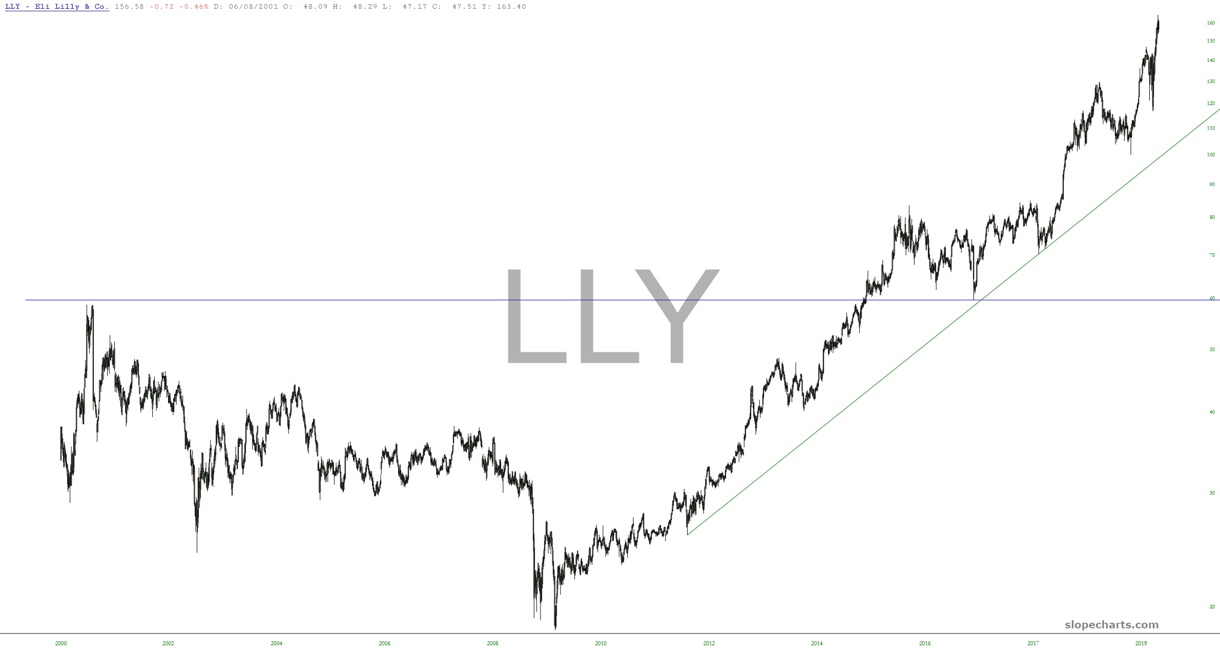
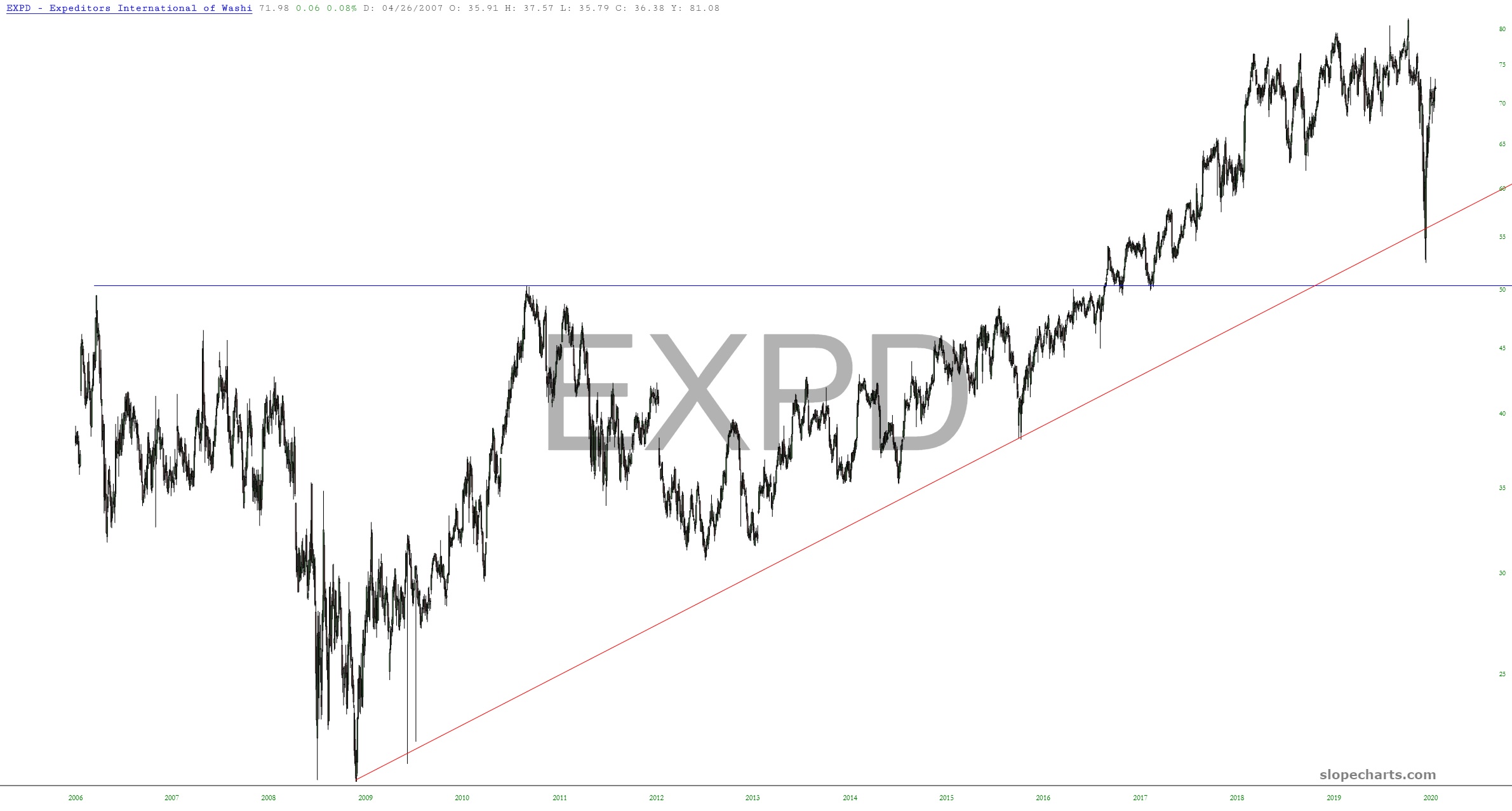
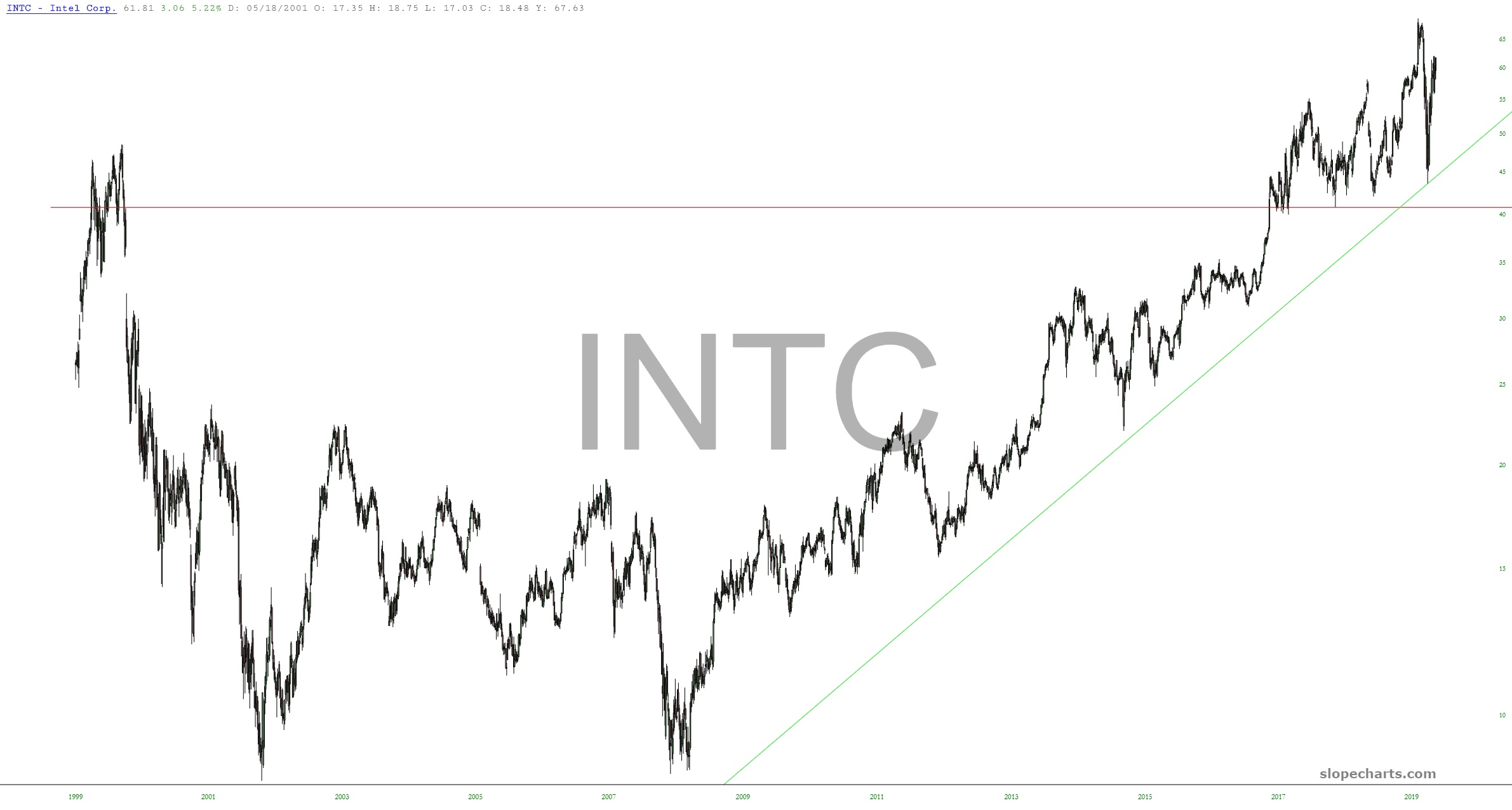
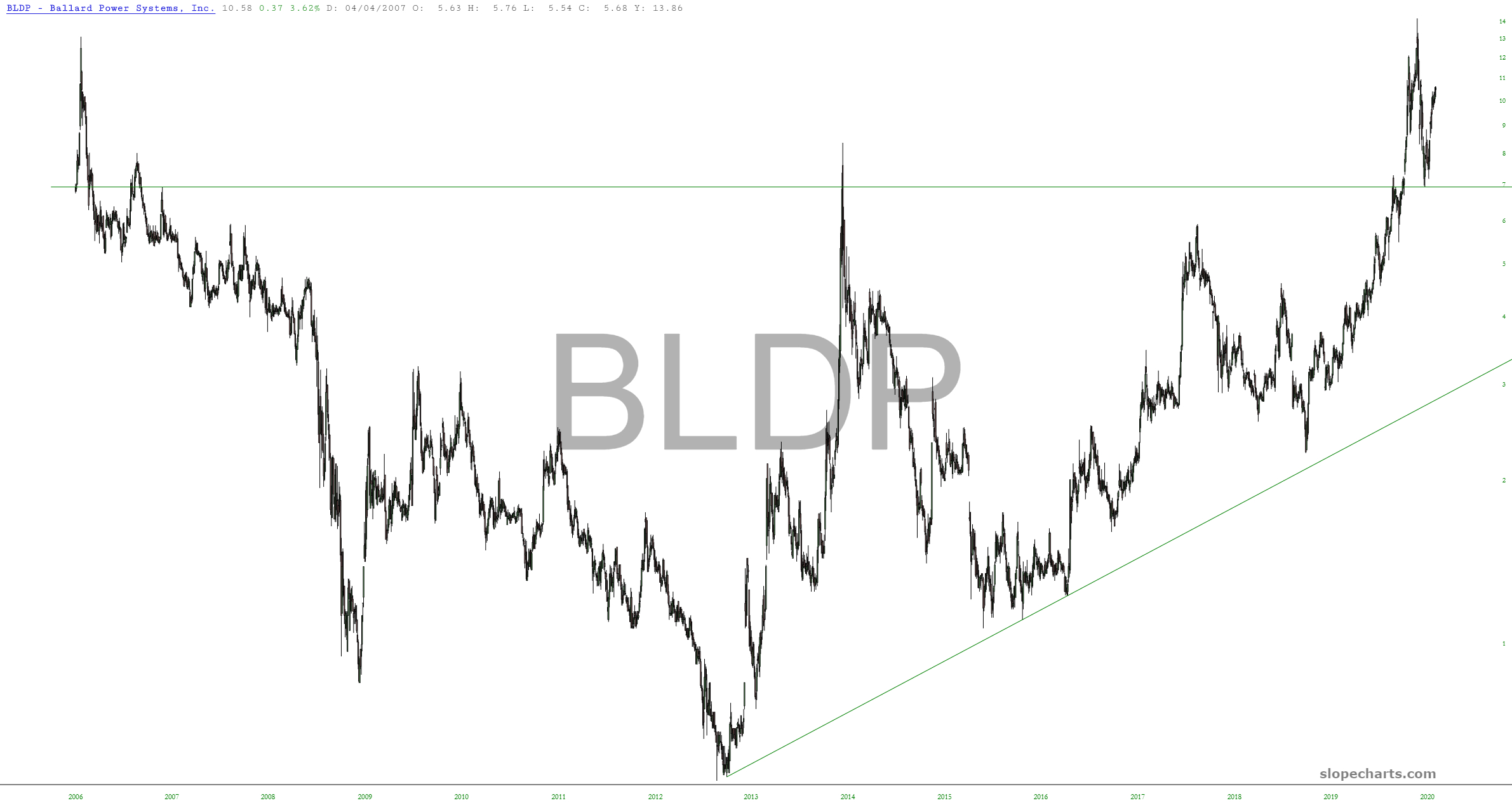
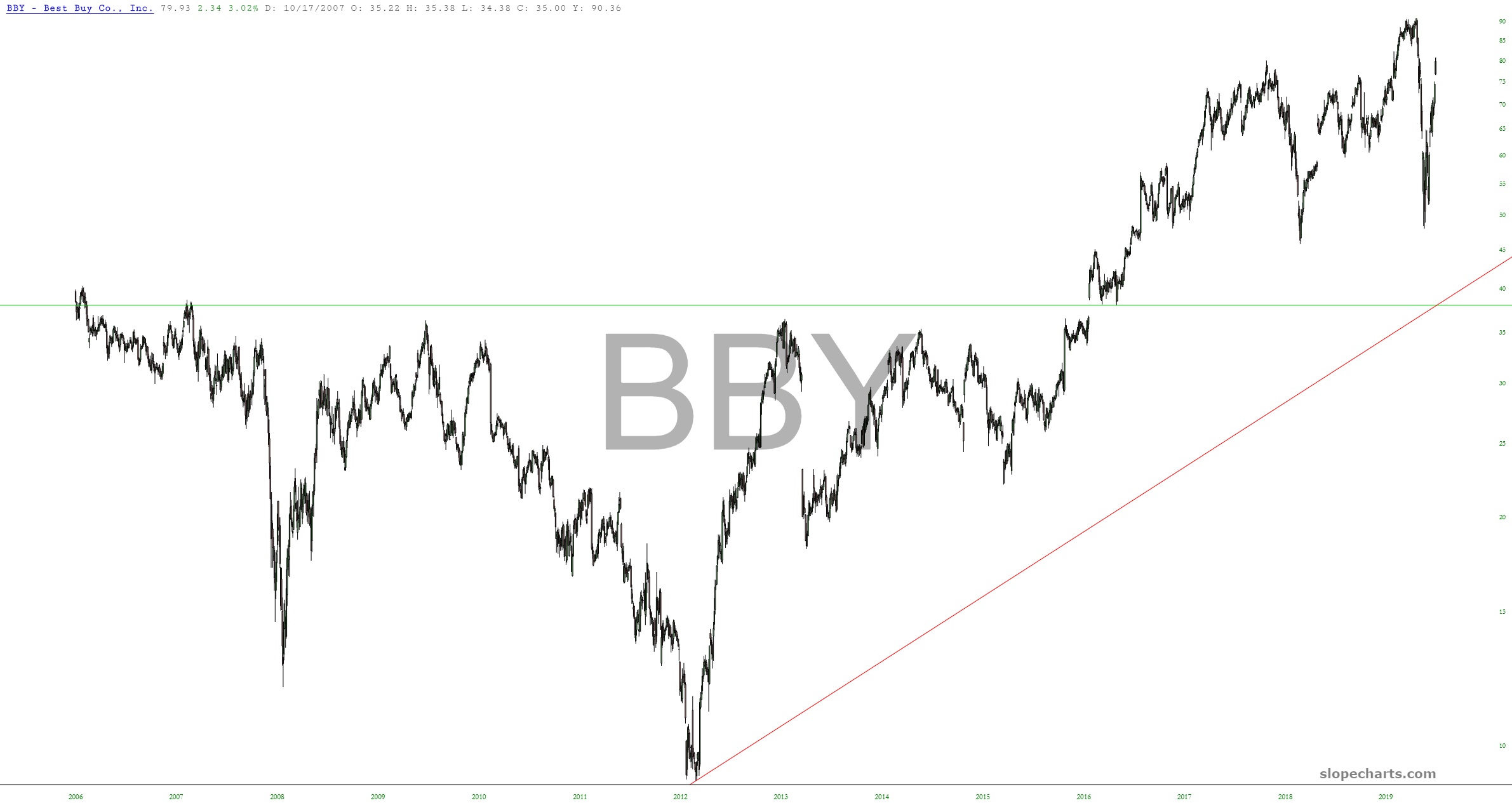
After the market closed on March 24th, I put together a spreadsheet of what I considered the 15 best “buys” in light of the virus sell-off. Here, in retrospect, are the 15 of them, a little more than a month later. I have placed in the caption the percentage change since I put the spreadsheet together. They are shown from worst performance to best. Ironically, the weakest performance was from none other than Gilead. I have put the percentage change in the caption of each chart.
![slopechart GILD](https://slopeofhope.com/wp-content/uploads/2020/04/slopechart_GILD-1-1-640x343.jpg)
![slopechart TAL](https://slopeofhope.com/wp-content/uploads/2020/04/slopechart_TAL-640x343.jpg)
![slopechart CTXS](https://slopeofhope.com/wp-content/uploads/2020/04/slopechart_CTXS-1-640x343.jpg)
![slopechart FCN](https://slopeofhope.com/wp-content/uploads/2020/04/slopechart_FCN-640x343.jpg)
![slopechart ETR](https://slopeofhope.com/wp-content/uploads/2020/04/slopechart_ETR-1-640x343.jpg)
![slopechart XLNX](https://slopeofhope.com/wp-content/uploads/2020/04/slopechart_XLNX-640x343.jpg)
![slopechart AAXN](https://slopeofhope.com/wp-content/uploads/2020/04/slopechart_AAXN-640x343.jpg)
![slopechart ORCL](https://slopeofhope.com/wp-content/uploads/2020/04/slopechart_ORCL-640x343.jpg)
![slopechart NFLX](https://slopeofhope.com/wp-content/uploads/2020/04/slopechart_NFLX-3-640x343.jpg)
![slopechart CIEN](https://slopeofhope.com/wp-content/uploads/2020/04/slopechart_CIEN-1-640x343.jpg)
![slopechart LLY](https://slopeofhope.com/wp-content/uploads/2020/04/slopechart_LLY-640x343.jpg)
![slopechart EXPD](https://slopeofhope.com/wp-content/uploads/2020/04/slopechart_EXPD-640x343.jpg)
![slopechart INTC](https://slopeofhope.com/wp-content/uploads/2020/04/slopechart_INTC-1-640x343.jpg)
![slopechart BLDP](https://slopeofhope.com/wp-content/uploads/2020/04/slopechart_BLDP-1-640x343.jpg)
![slopechart BBY](https://slopeofhope.com/wp-content/uploads/2020/04/slopechart_BBY-640x343.jpg)