
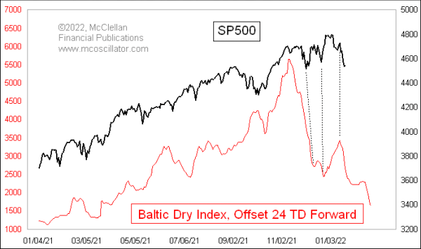
One of my inspirations for creating Layered Charts was a weekly chart I get from McClellan Publications. I would look at something like the chart below and think, “I wish I could do that in SlopeCharts.“
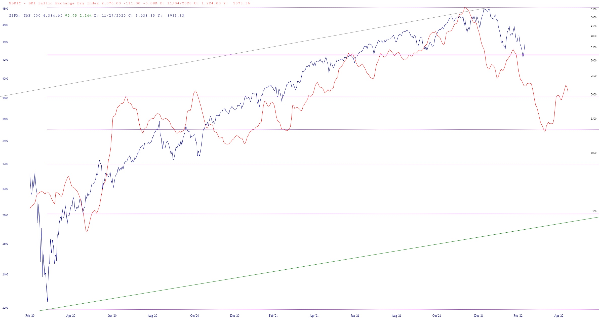
Well, now we can! Thanks to SlopeChart’s vastly-expanded index database, I was able to find out that we did, in fact, have the Baltic Index (symbol $BDIY) and, of course, we’ve got the S&P 500. So I put one of them in Layer One, the other in Layer Two, synchronized the dates, stretched the charts a bit, and voila!
I just wanted to offer this as a real-life example (particularly since it suggests, as McClellan did, that equities are heading lower). I see some Slopers, like Wapani, are making great use of Layered Charts. I hope it continues to gain in popularity.
