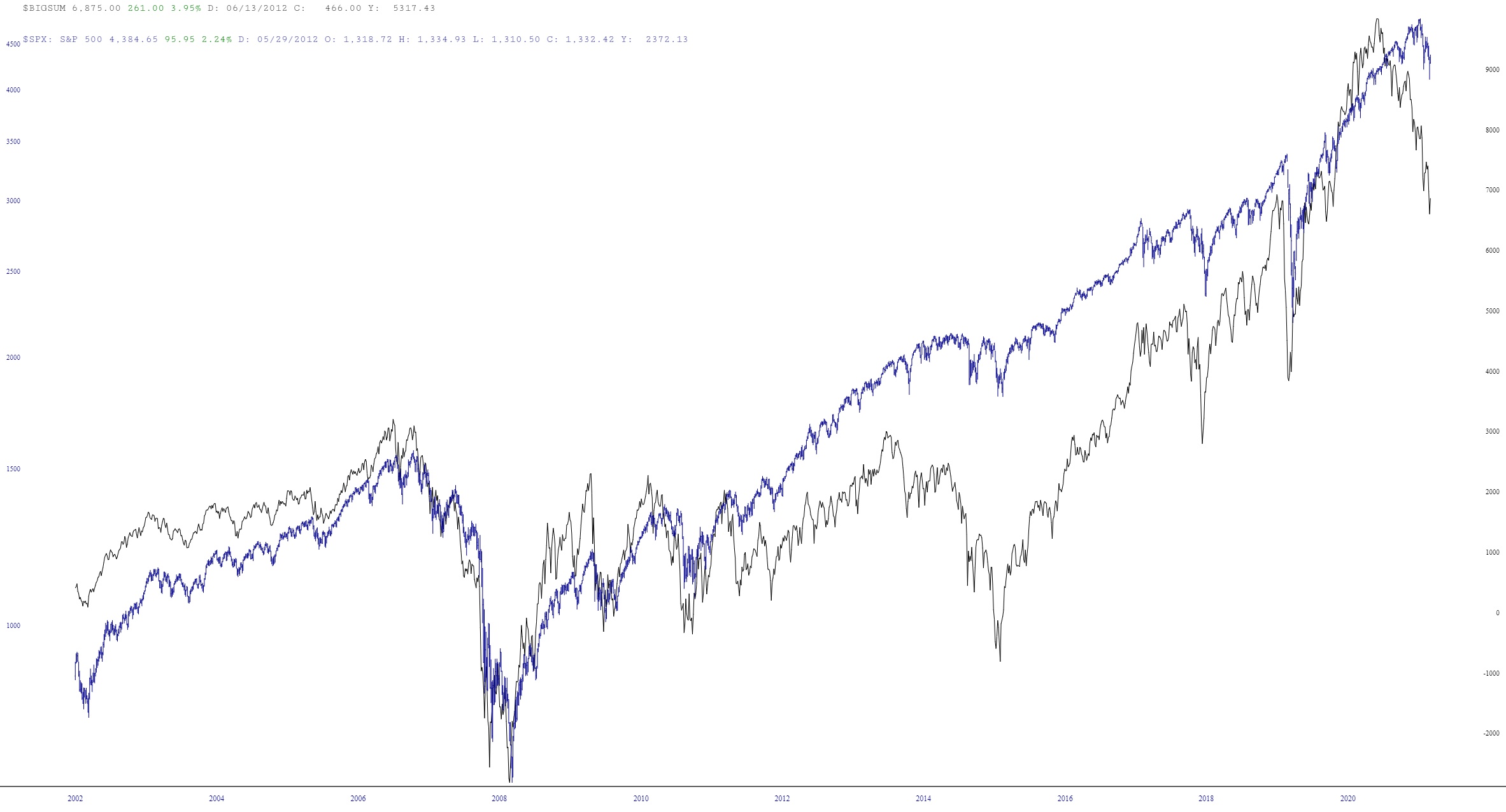
Since I don’t trade the futures markets, I have been monkeying around with the site to while away my time as I wait for the opening bell tomorrow. I created another really powerful example of a Layered Chart that I wanted to share with everyone.
What I did was chart $BIGSUM which is the summation of advance/declines and plotted it against the S&P 500 cash index. I used the “Synch” function to line these up, and a very cool chart ensued.