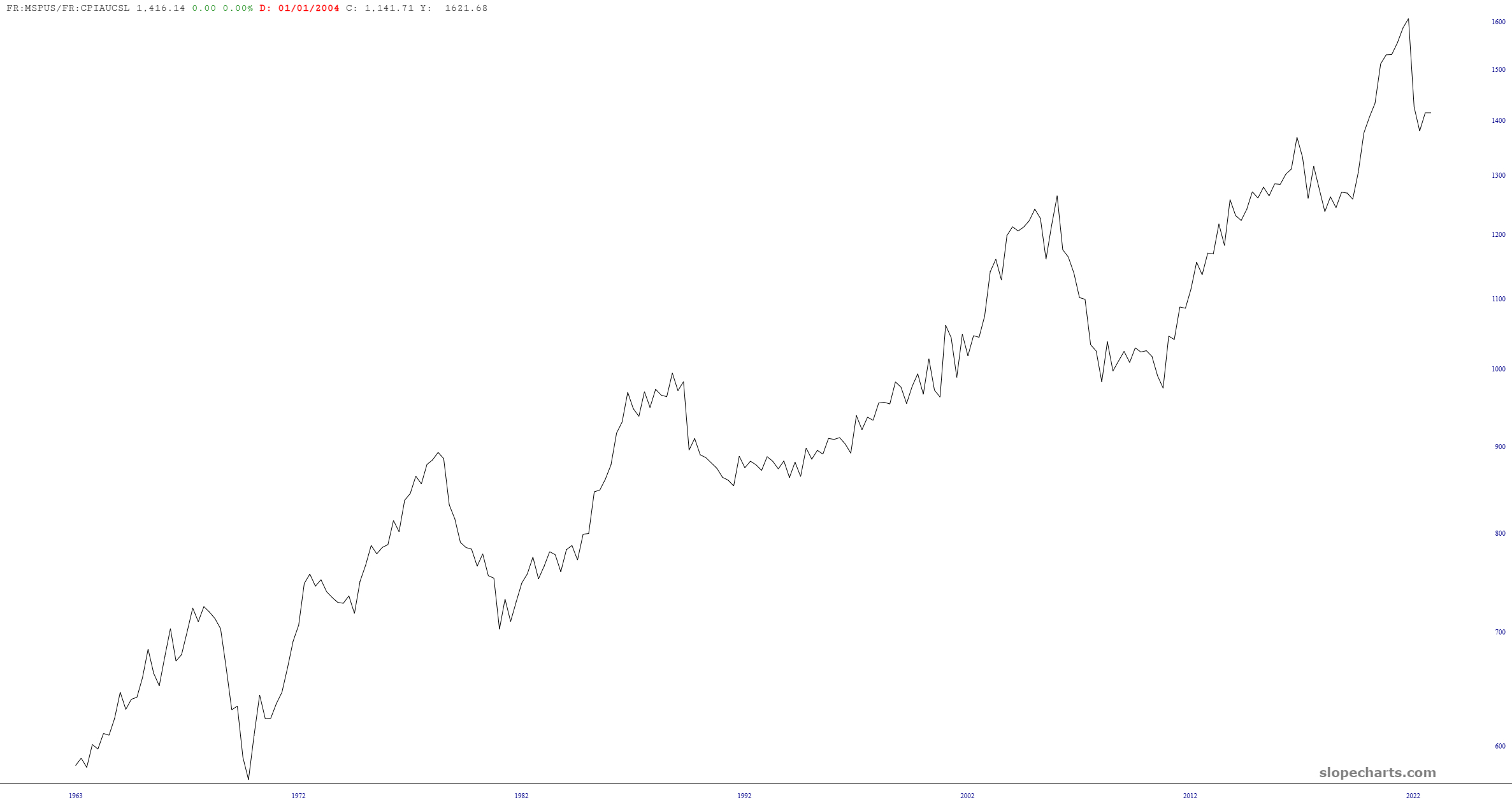
I spent Tuesday evening working on my novel and messing with economic data (yeah, that constitutes a fun evening for me) and I made something worth sharing with Chart Lab. All I did was take a long-term chart of home prices (which, of course, was like a bottle rocket) and divided it by the CPI.
The resulting shows home prices in a somewhat more normalized fashion, as opposed to a ridiculous chart that shows home prices going from fifteen bucks to a million bucks without taking inflation into account. Now, this chart isn’t completely helpful, because the definition of a “house” isn’t quite constant. I’m certain homes in the year 2015 were vastly bigger than those built in, let’s say, 1950. Still, it’s a bit more of a realistic chart and it does a good job showing the boom-and-bust cycles.