Slope of Hope Blog Posts
Slope initially began as a blog, so this is where most of the website’s content resides. Here we have tens of thousands of posts dating back over a decade. These are listed in reverse chronological order. Click on any category icon below to see posts tagged with that particular subject, or click on a word in the category cloud on the right side of the screen for more specific choices.
The Bubble In Which I Reside
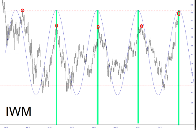
This Should Be PEAK WEEK
Assuming that, out of the blue, every single one of these doesn’t decide to break tradition! The green tints represent the PEAK of each sine wave, and the red circles represent the PEAK of each price pulse.

(more…)
Most Everyone Missed It
Beware of Weakness
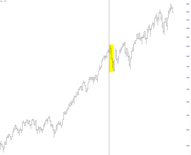
Below is a simple chart of the NASDAQ 100, with a vertical line separating one calendar year from the next. The years were 1999 and 2000. Put yourself in the head of some permabear weirdo like myself, on the heels of an insane, crazy rally. You figure 2000 CAN’T be anything like 1999. It just can’t.
And, sure enough, blammo, the selling starts! Yay! The bear market is here! And yet……..the damned thing went up another 40% in a matter of weeks! AIEEEEEE!!!


