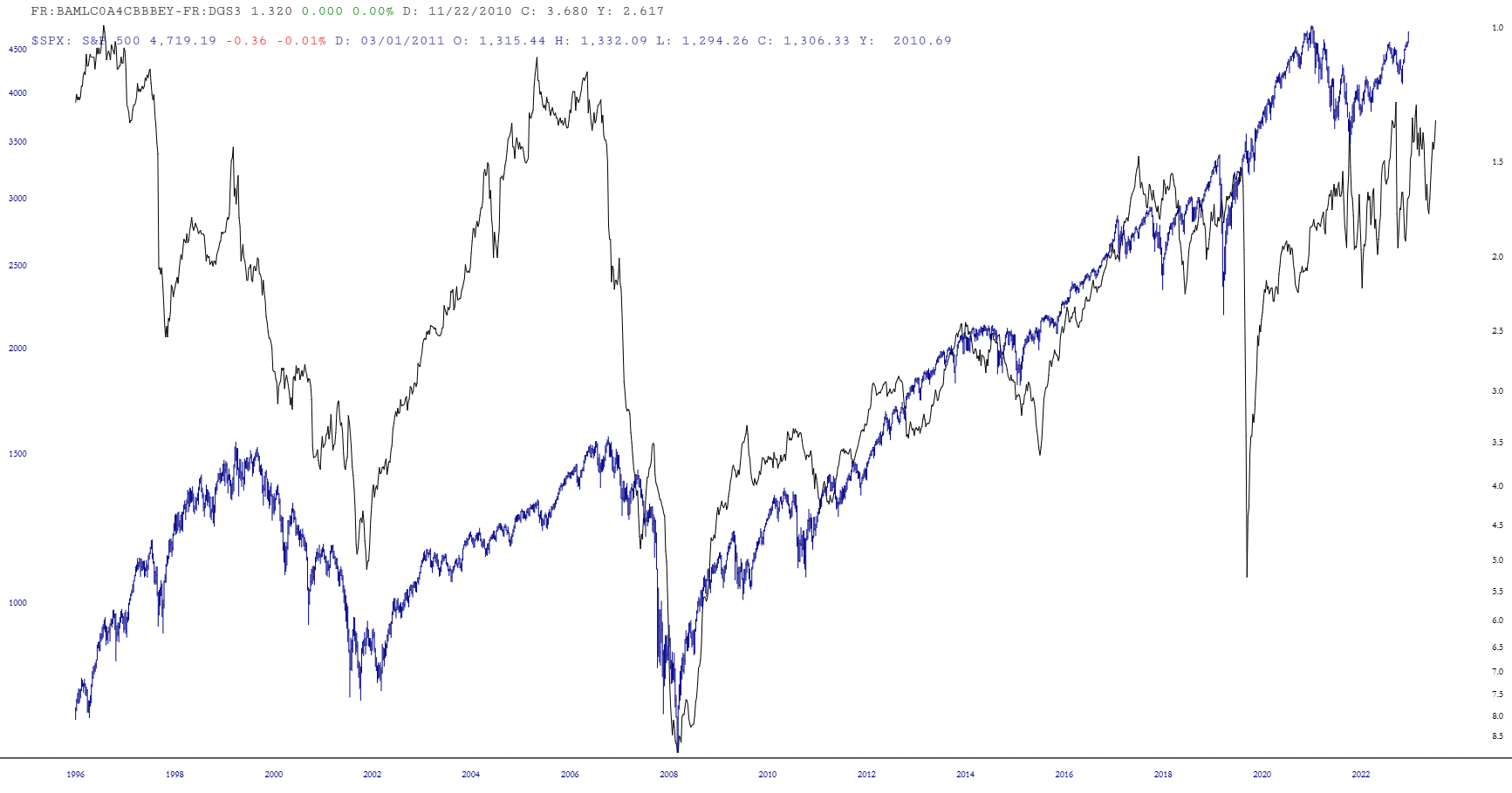
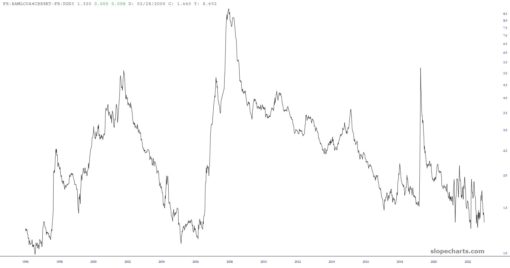
I’ve been having way too much fun with Chart Lab lately. Here is the latest example, with the easy to remember symbol FR:BAMLC0A4CBBBEY-FR:DGS3 What this represents is the spread between the interest for BBB corporate bonds and 3-month t-bill yields. In other words, when it is low, risk is perceived as low, and when it’s high, risk is perceived as high.
I did a few more things
- I inverted it;
- I put the S&P 500 on top of it;
- I time-shifted the index backwards
All of which result in a pretty-cool looking chart which seems to have a rather intriguing correlation!