
Hello everyone — after a bit of a hiatus, I’m back. I’ve been busy behind the scenes building a few new tools that I hope you’ll find useful in your trading.
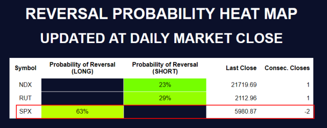
Below is a small table showcasing three markets I’m currently analyzing using a DAILY model. I also track other markets using a WEEKLY model. The choice of timeframe isn’t random — it’s driven by options expiry cycles. Since these models are designed to work hand-in-hand with options trading, I align the model’s frequency with the available expiries. For example, SPX has daily expirations, so it gets a DAILY model. Stock ABC, on the other hand, might only have weekly expiries — so it gets a WEEKLY model. Simple logic.
Now, a quick walkthrough of what’s in the table: the Probability of Reversal is calculated using data up to the most recent DAILY close (before the June 19th holiday, in this case). The Last Close column shows the actual closing price for reference — for SPX, that was 5980.87. This price acts as the “anchor.” Any move up or down from there is measured as a percentage change from that close.
The Consec. Close (short for Consecutive Closes) column shows how many days in a row the market has moved in the same direction. For example, SPX has closed down two days in a row, hence a value of -2.
One last note on the Probability of Reversal: the color helps visually cue the signal strength. When the market is falling, the cell gets greener — indicating a growing probability of a long reversal. When it’s rising, it gets redder — signaling an increased probability of a short reversal. A little heat map for your trading radar.
Now I want to show you the previous tool you may have seen before here on Slope, the “quantcharts“:
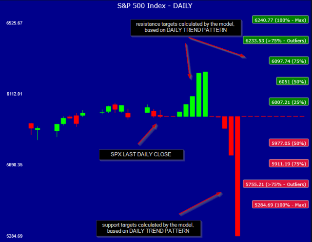
Originally, this tool came bundled with some interactive histograms showing the data the model uses to calculate support and resistance.
I’ve since pulled those models out and reshaped them into a more interactive, user-friendly format. Now you can use a slider to simulate different market scenarios and see how the probability of reversal shifts in real time (see images below).
Even better — you’re not limited to the present moment. You can explore hypothetical setups a few days out, at specific price levels (say, price A or B), and see how they align with upcoming options expiries and strike levels.
I’ll dive deeper into how this works in the coming days, but for now, let’s walk through a real-world example: What’s the current SPX DAILY LONG model telling us?
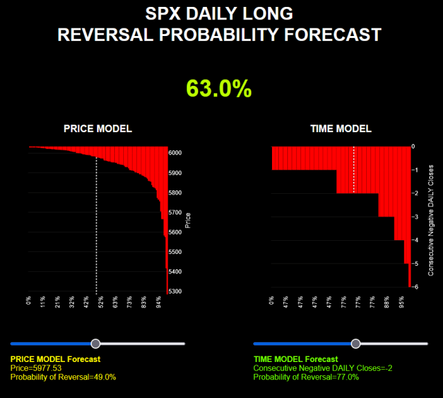
This is the LONG model, and it’s showing up red because the index is — quite literally — in the red. SPX has been down for two consecutive days, with the most recent close at 5980.87.
On the PRICE model (left), I’ve set the input just below that last close. As you can see, we’re not even halfway down the model’s range — meaning there’s still room for the market to drop further. From a price perspective, the probability of reversal isn’t particularly high — currently sitting at 49%. That’s decent, but not a screaming buy. In general, when a market is still trending upward overall, you’ll typically see a lower reversal probability — more of an early buy-the-dip signal with modest odds.
On the TIME model (right), I’ve selected “2 days down” — matching the current streak. Here, the odds improve significantly. Based on similar past trend patterns, the reversal probability after two down days jumps to 77%, which is quite solid.
Putting it all together, the overall combined probability — visible at the top of the chart — comes in at 63%.
So, in short the model is indicating a possibility of an upward drift, I won’t go as far as saying a rally, but somehow higher prices.
Best way to exploit that? Probably a Vertical Spread (e.g. BullPUT), but the Strike must be <= 5980. any close above 5980 will generate a profit (210$ per contract for SPX options 1 day expiry, if you manage to purchase it ATM). Max loss 290$ if the market closes below your strike.
Now let’s simulate another scenario, 3 days down, and a lower price, i.e. let’s say the market today goes down and closes down:
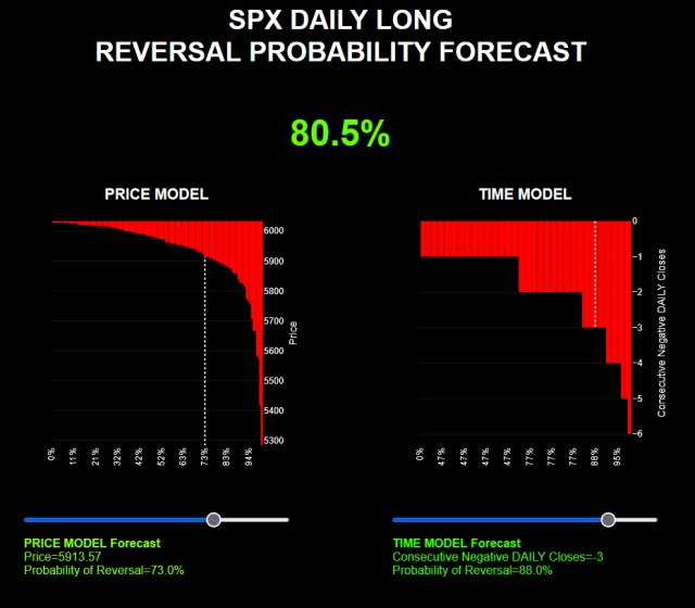
In the Price model (left), I’ve set a target around 5913, which corresponds to roughly a 75% probability of reversal. Why 75%? Because in practice, the market rarely pushes far beyond that threshold — it tends to bounce before reaching deeper extremes.
The Time model (right), set to 3 consecutive down days, shows an even stronger signal: an 88% probability of reversal. If you glance at the histogram, you’ll notice how rare it is for markets to keep trending down daily beyond the 3-day mark. That kind of persistent selling is the exception, not the rule.
So when you combine both models, the overall probability of reversal lands around 80% — which is firmly in oversold territory. In other words, in this scenario, the odds are stacked in favor of a bounce.
Of course, a probability is just that — a probability, not a guarantee. Unforeseen events can always hit the market and send it tumbling further. But extreme moves tend to be rare, and this model is built to account for tail events while still focusing on the more probable, non-tail scenarios — the ones we can actually trade with some consistency.
This has been a long post, but before I leave, I want to conclude with one more analysis, the SPX WEEKLY MODEL.
WEEKLY is a longer period and can offer a better vision of the market when it comes to longer term trends (still short-term but longer than DAILY).
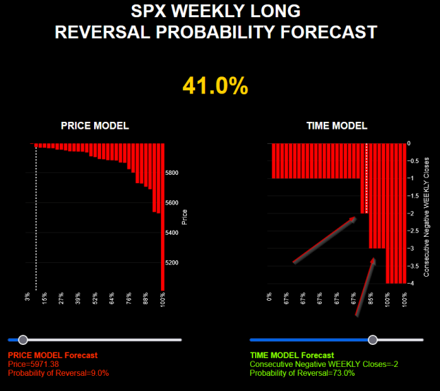
For this setup, I’ve modeled the scenario assuming the index closes the week lower — which would mark the second consecutive down week. I’ve set the price just slightly below last week’s close, based on the idea that we’re already seeing oversold signals on the DAILY model. So while we may get a red close today, the downside might be limited, and a short-term bounce could show up soon — maybe even by Monday.
That said, the overall WEEKLY probability of reversal in this setup is just 41% — not particularly compelling. It’s the kind of signal that might still work if the broader trend is bullish, and the index is gearing up to push higher.
But there’s another scenario to consider — take a look at the two red arrows I’ve marked. The top arrow points to occurrences where the market was down two weeks in a row — these are relatively rare. Now look at the bottom arrow — it shows three-week declines, and as you can see, they’re more frequent.
Translated to plain English: historically, when this WEEKLY pattern appears, it’s more common for the index to drop for a third week than to reverse after just two.
Conclusion: If we get a negative close this week, there’s a statistically meaningful chance we see another leg down next week.
I welcome your comments and questions.
If you want to get direct access to these tools, you can use this link.
