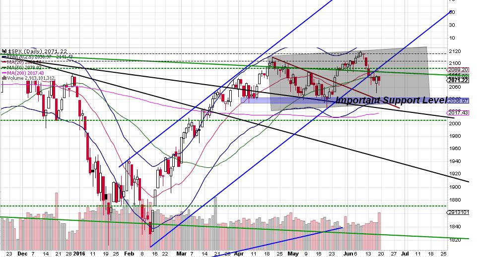
It was a volatile OpEx week for sure. The majority of the downdraft this week was contained to Monday and Tuesday with Wed-Fri being mostly chop. I’ll start with the daily S&P 500 chart (screencap from stockcharts.com)
Slope initially began as a blog, so this is where most of the website’s content resides. Here we have tens of thousands of posts dating back over a decade. These are listed in reverse chronological order. Click on any category icon below to see posts tagged with that particular subject, or click on a word in the category cloud on the right side of the screen for more specific choices.
It was a volatile OpEx week for sure. The majority of the downdraft this week was contained to Monday and Tuesday with Wed-Fri being mostly chop. I’ll start with the daily S&P 500 chart (screencap from stockcharts.com)
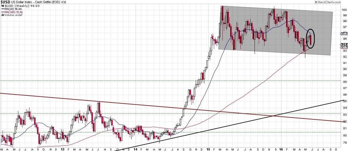
Quite a Friday we had last week, huh? Upon checking my “End of Week” Charts, I noticed some interesting behaviour and thought I’d share my observations. Last weekend sometime, I shared a weekly chart of the US Dollar and that it was approaching its 20 week MA. I use the 20week and 20day moving averages as basic bull/bear filters. I’m only bullish on stocks that are above both and I’m only bearish on stocks that are below both.
I find this makes for an easy and efficient filter. I thought that the US Dollar had reversed short of the test until I saw it after the close Friday and realized it had tested the 20week MA exactly. Take a look. (click any chart for a larger size version)
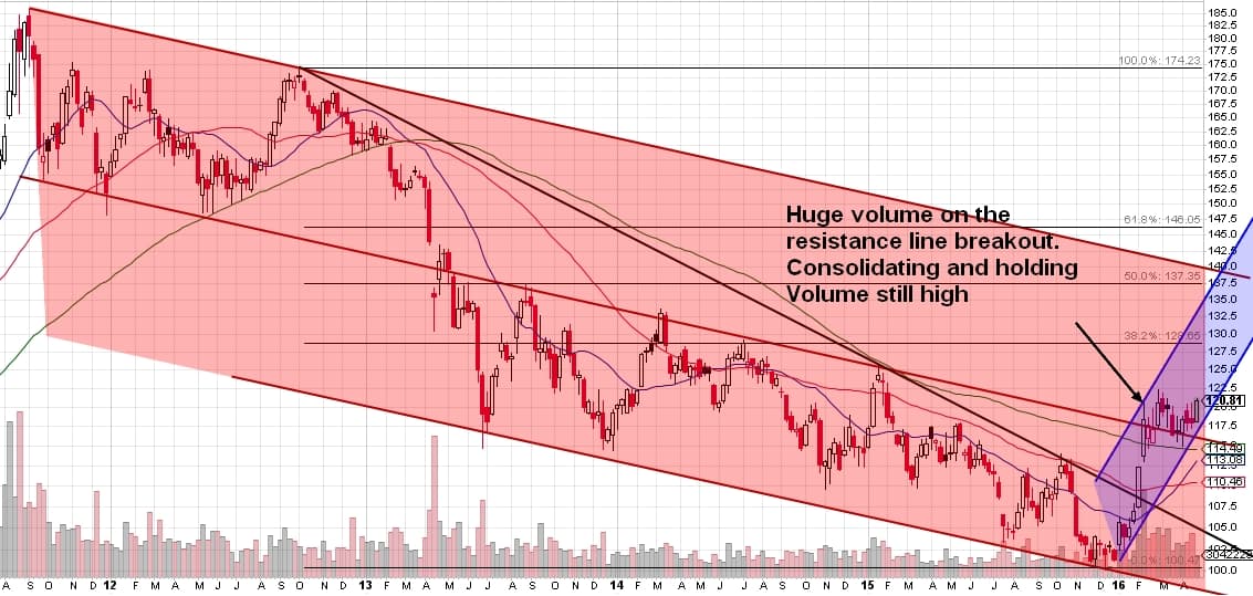
The chart basically speaks for itself. Click to enlarge.
Now. Discuss. : )
The correlations to trading the market were too good to miss on this video. Enjoy!
A few days ago I shared a signal on my blog going back 10 years defined by the SPDR utilities ETF (XLU) being down greater than 3% in a single day while SPX was above its 50MA.
