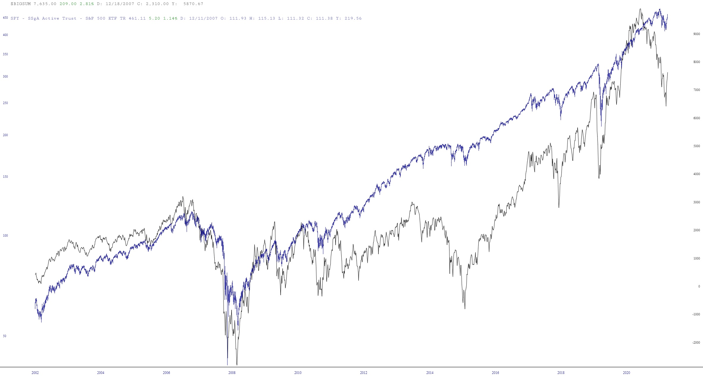
Uh-oh, Tim’s got the layered charts out again.
Anyway, here is the long-term continuous contract of France’s CAC-40 Index.

Slope initially began as a blog, so this is where most of the website’s content resides. Here we have tens of thousands of posts dating back over a decade. These are listed in reverse chronological order. Click on any category icon below to see posts tagged with that particular subject, or click on a word in the category cloud on the right side of the screen for more specific choices.
Uh-oh, Tim’s got the layered charts out again.
Anyway, here is the long-term continuous contract of France’s CAC-40 Index.

This won’t mean much to most of you, but to a few of you, it’ll be cool news – – for a while, our historical data has been surprisingly limited. The NASDAQ ETF (symbol QQQ) is a great example. Until yesterday, it only went back a decade. You will now find that our equities go back WAY farther now (QQQ is shown below, with its entire history since it was invented). Just sayin’!

Incidentally, if you missed my “Make a Wish” post, please be sure to read it.
As we all await the FOMC, I wanted to mention a couple of helpful improvements to the layered mode feature in SlopeCharts. We have enhanced the “browse” feature in layered mode.
When you click the Browse button, you will be presented with this dialog box:
