
I’m not going to do any of the dull ‘bad breath” type jokes that are so common in the financial space: I simply wanted to point out just how weirdly divergent the market is from the cumulative advance/decline. These were created with our super-cool Layered Charts feature. The first shows our entire history of the advance/decline line versus the SPY.
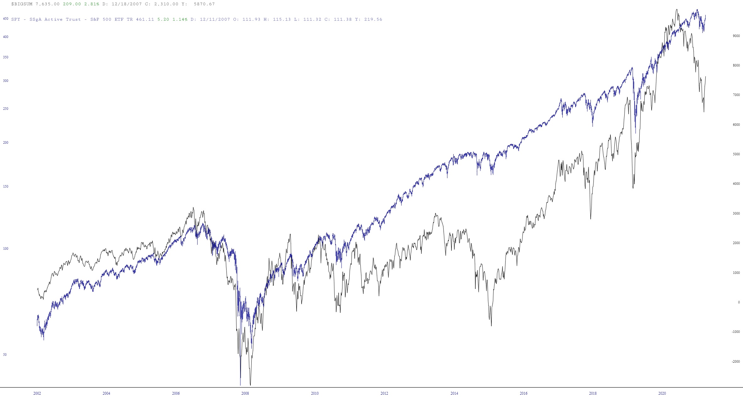
The leftmost portion of the chart – let’s call it the first half, which ranges from 2003 through 2012 – – things are pretty much in synch. That makes sense. More stocks go up than down, the A/D moves up with the market, and vice versa. Makes total sense.
But starting around the spring of 2012, things start to diverge. You can see in the chart above just how far afield stocks go versus the A/D line, which eventually catches up.
I’ve zoomed in on about the past half dozen years here: it’s what’s happened since the Covid crash that I think is especially bonkers.
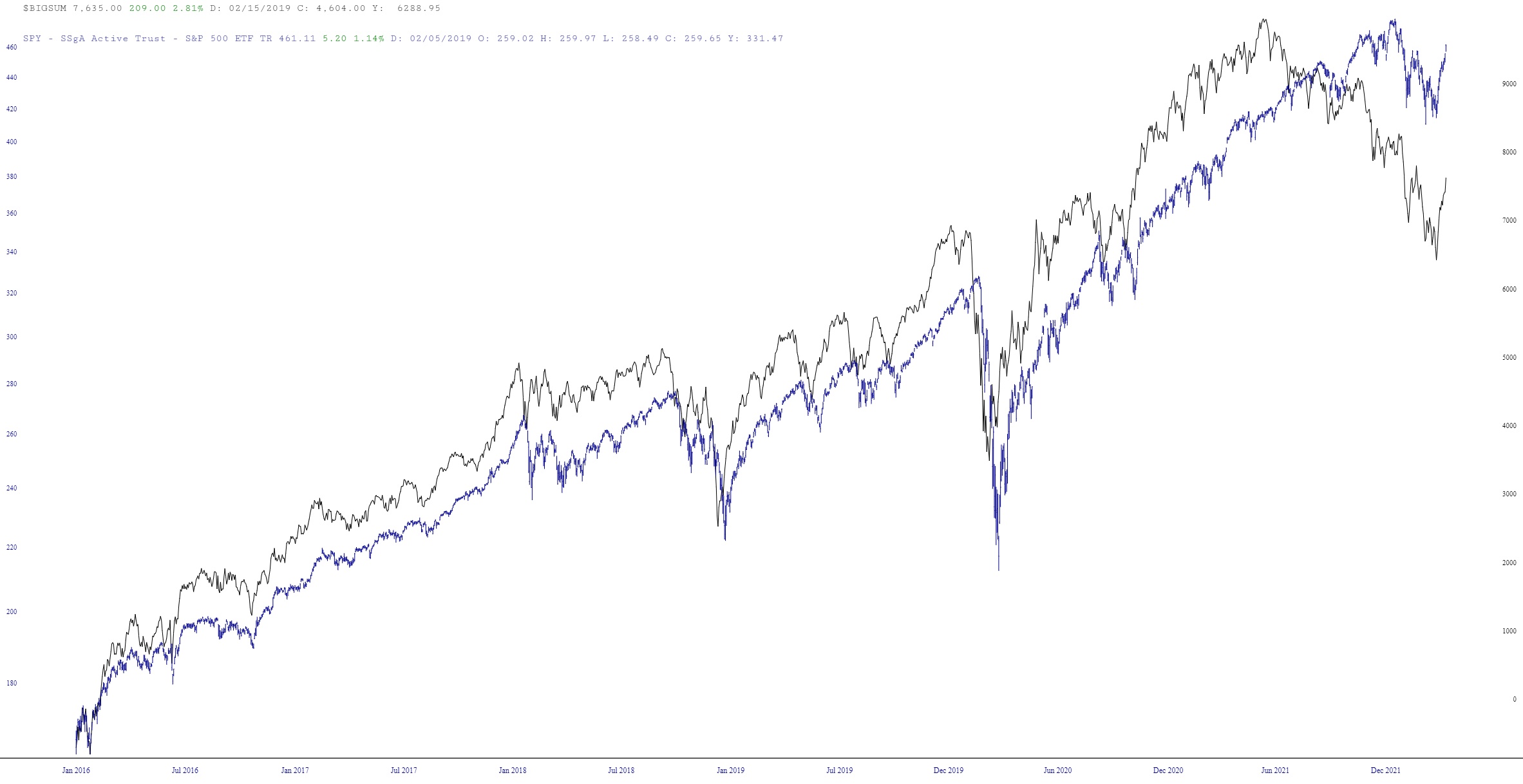
The A/D summation peaked around June 2021, which is when, even if the actual reason (Fed bucks) wasn’t especially “healthy”, the behavior of stocks was the healthiest. That was the peak of Stock Health, even though the nominal peak in price took place a full seven months later! Just look at the lag:
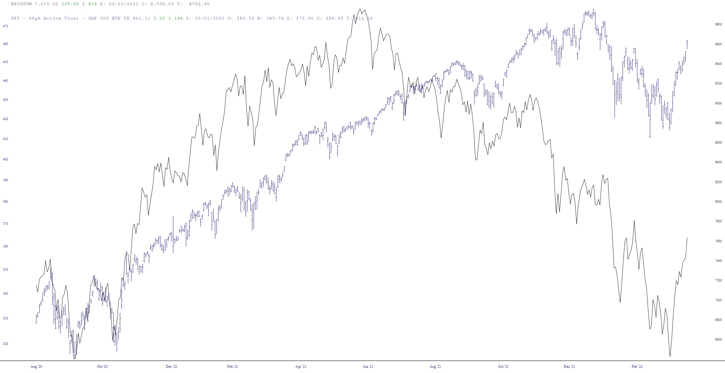
Over the past half year, yes, the charts tend to move up together and down together, but there’s no denying that the breadth has been getting progressively worse since June of last year, and the last two horrible weeks notwithstanding, stocks are NOT healthy under the surface.
