Slope of Hope Blog Posts

Slope initially began as a blog, so this is where most of the website’s content resides. Here we have tens of thousands of posts dating back over a decade. These are listed in reverse chronological order. Click on any category icon below to see posts tagged with that particular subject, or click on a word in the category cloud on the right side of the screen for more specific choices.

So Long!

By -

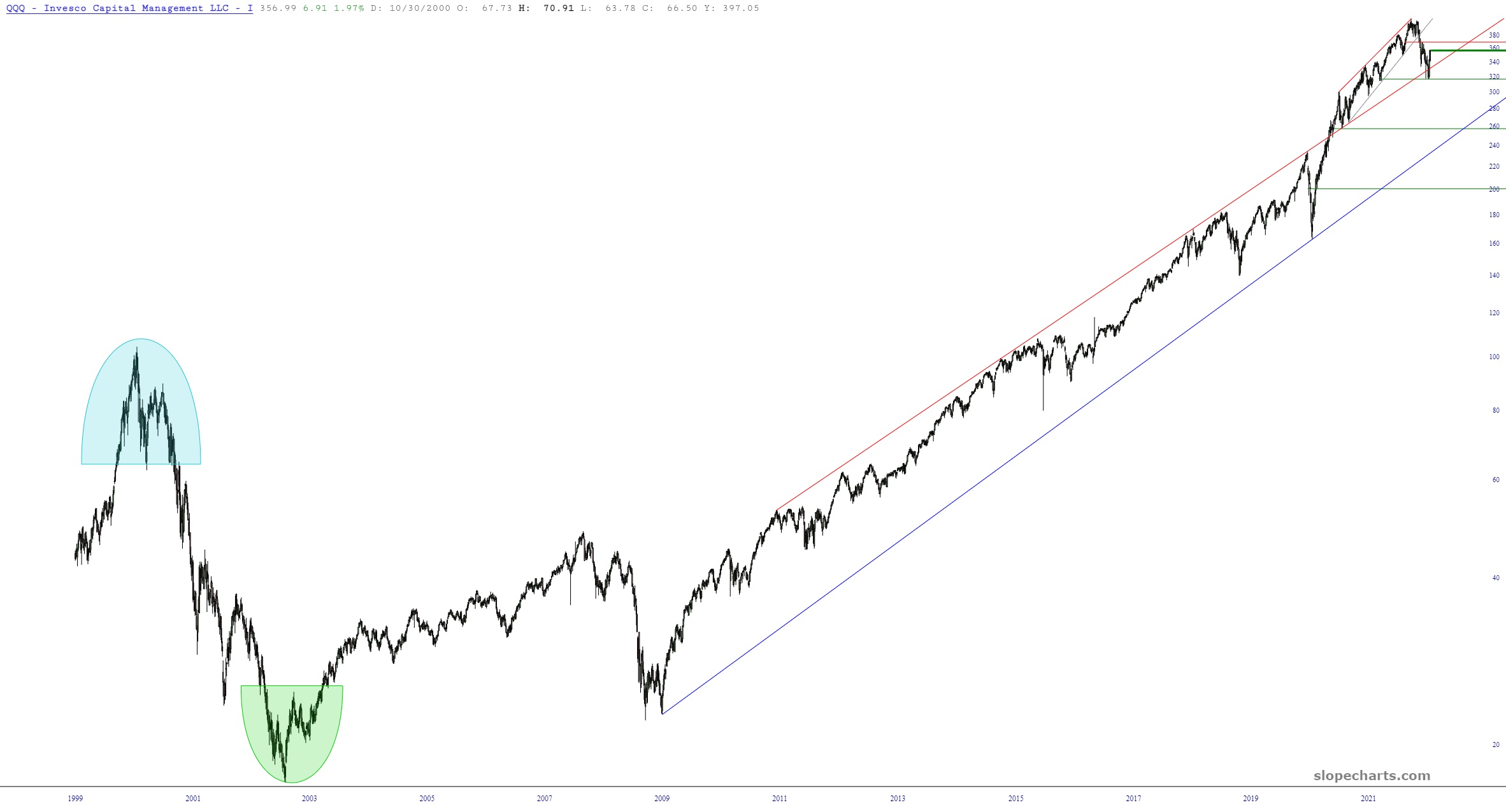
This won’t mean much to most of you, but to a few of you, it’ll be cool news – – for a while, our historical data has been surprisingly limited. The NASDAQ ETF (symbol QQQ) is a great example. Until yesterday, it only went back a decade. You will now find that our equities go back WAY farther now (QQQ is shown below, with its entire history since it was invented). Just sayin’!

Incidentally, if you missed my “Make a Wish” post, please be sure to read it.

Powerful Layered Example

By -

Since I don’t trade the futures markets, I have been monkeying around with the site to while away my time as I wait for the opening bell tomorrow. I created another really powerful example of a Layered Chart that I wanted to share with everyone.

What I did was chart $BIGSUM which is the summation of advance/declines and plotted it against the S&P 500 cash index. I used the “Synch” function to line these up, and a very cool chart ensued.

slopechart layered
(more…)