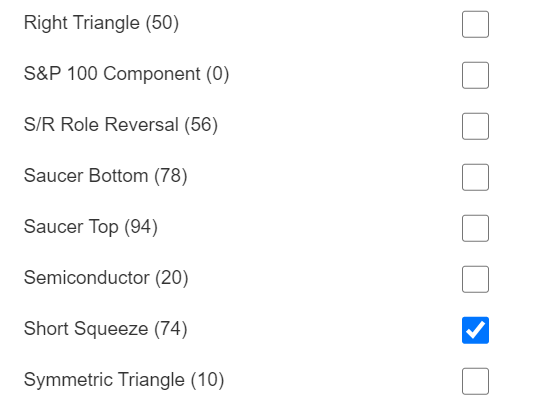
For this post, I used the Filter by Label feature to hone in on the stocks that have recently been subjected to the once-in-a-lifetime short squeeze we witnessed in recent days.
Slope initially began as a blog, so this is where most of the website’s content resides. Here we have tens of thousands of posts dating back over a decade. These are listed in reverse chronological order. Click on any category icon below to see posts tagged with that particular subject, or click on a word in the category cloud on the right side of the screen for more specific choices.
For this post, I used the Filter by Label feature to hone in on the stocks that have recently been subjected to the once-in-a-lifetime short squeeze we witnessed in recent days.
Besides SlopeCharts and the Posts section, my favorite part of the website these days has become SlopeMATRIX. A primitive version of this came out a few years back, but I was so dissatisfied with it I got rid of it. We reintroduced the product in a far better fashion recently, and we’ve just added an important new mode I’d like to tell you about: Risk Mode.
To understand this, you should know MATRIX has four different modes, the newest of which is designed to help manage risk and opportunities:

OK, finally a post that has nothing to do with GameStop. Promise.
It has to do with something we’ve been working on for months, which is the new Slope website. Now for anyone who is suddenly all hot and bothered about those words, let me calm you: there is virtually nothing different cosmetically about the site. The underlying foundation is quite different, but what you see and use has barely changed.
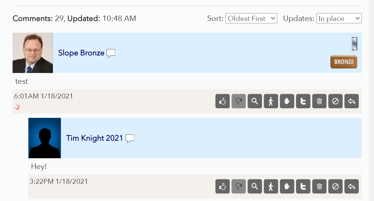
The underlying code which has changed the most is related to comments………
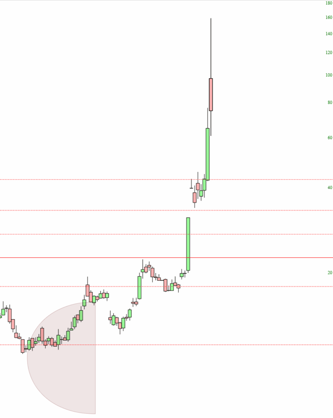
Good Lord Almighty. Sorry to make today all-GME, all the time, but this is wild stuff. Here is the Price Cone (whose IV ends yesterday, so once today is posted, it will be even wackier).
I was pretty much “charted out” for the day, so – – what to do? – – I decided to monkey around with the menus. I’d urge you to take a look, since I think the arrangement is more clear and useful.

I’d also like to point out a new page, Chart Essentials, which is worth a peek.