Slope of Hope Blog Posts
Slope initially began as a blog, so this is where most of the website’s content resides. Here we have tens of thousands of posts dating back over a decade. These are listed in reverse chronological order. Click on any category icon below to see posts tagged with that particular subject, or click on a word in the category cloud on the right side of the screen for more specific choices.
Hedging Update — BAC Again
BAC Again
In a post last week ("Optimal Hedging Costs: A Tell for Stocks"), we mentioned that Bank of America (BAC) had the highest hedging costs in the Dow for most of the last several months, and we speculated about how those high hedging costs might have been a red flag for BAC longs. BAC is up about 28% since then, on news of Warren Buffett's $5 billion preferred stock investment in the Berkshire holding. But as David Weidner noted on Tuesday, Buffett followers who piled into the common stock of Goldman Sachs and General Electric after previous preferred stock investments by Buffett are still under water.
Optimal Hedging Costs: A Tell for Stocks?
Earthquake hits NYC, BAC blamed.
After a rare East Coast earthquake shook New York City Tuesday, this was one of a number of tweets I saw blaming the tremor on Bank of America (another suggested what we felt was BAC's implosion).
If I Didn’t Know Better…….
If you showed skilled chartists the graph below without the symbol and asked their opinion, I imagine the vast majority of them would be hopping-up-and-down bullish. It has a beautiful saucer formation, a clean break, a surge on gigantic volume, and a very clean pullback to an attractive entry price.
Of course, you know as well as I do that the chart in question is the triple-bearish-on-financials FAZ, loved by FAZholes the world over. I'm not saying it's a buy……..but it sure is an interesting chart.
Broken Triangles, Dying Dragon (by Springheel Jack)
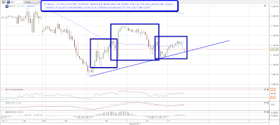
I haven't been posting much in the way of shorter timeframe equity index charts in recent days, and that's simply because the intraday moves have been so wild that there haven't been any shorter term trendlines or patterns worth the mention. That has changed this morning, though since I capped the charts the support trendlines that I was looking at have already broken down. The first pattern is a nicely formed triangle on NQ that has now broken down:

The second is a support trendline on ES that has also now broken down, with an ominous looking H&S look to it:
I'm not expecting a big breakdown today. At worst I'm thinking we may see a retest of 1100 and I'm regarding this as part of a bottoming process before a decent rally. Other instruments are broadly supportive of this view. On oil a counter-trend bounce looks very likely here from the daily chart:

Copper futures hit rising support from the 2008 low overnight and are bouncing there so far. This bounce needs to survive the day though as the candle reversing at support is still ongoing. I'm expecting a bounce here:

I have a rising channel on EURUSD though I don't have much confidence in it. I'm wondering whether it would just be fairer to say that EURUSD is trading sideways around 1.427 at the moment. I am wondering about a diamond bottom on this and will be having a closer look at that later:

I've been having a look at some longer term charts that look interesting and relevant to the bigger picture and the first today is the XLF weekly chart since 2006. This is a very grim looking chart with XLF sliding down declining resistance from the 2007 high for over a year before breaking strong support in the 13 area. Hard to put a likely target on this chart but I'd be thinking in terms of a move to the 9.5 to 10.5 area:

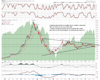
The SSEC chart is even grimmer, and raises a serious question whether the bear market that started in 2007 in Shanghai ever ended. Either way a decent symmetrical triangle formed on SSEC between 2008 and 2011 and that has now broken down. The first obvious target for this pattern is the late 2008 low in the strong 1650 – 1700 support zone:
My WAG for today is that SPX tests the 1100 area and then closes flat or up before a decent rally over the next couple of weeks. My WAG yesterday that we'd see a hard fall into support in the 1120 area went pretty well so we'll see how that goes.
