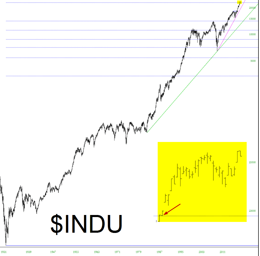
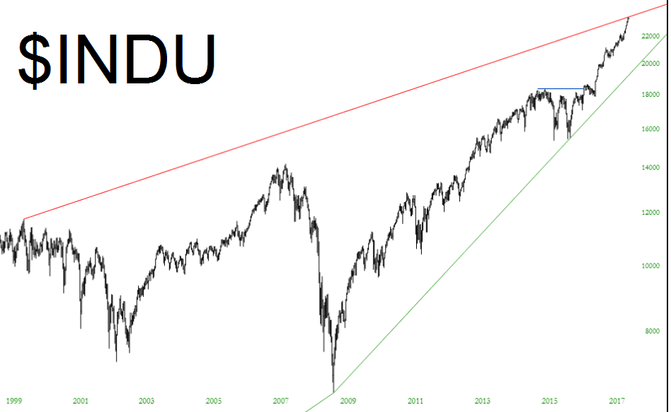
Slope of Hope Blog Posts

Slope initially began as a blog, so this is where most of the website’s content resides. Here we have tens of thousands of posts dating back over a decade. These are listed in reverse chronological order. Click on any category icon below to see posts tagged with that particular subject, or click on a word in the category cloud on the right side of the screen for more specific choices.

US, Global, Commodity & Precious Metals Big Picture Views

By -

Time once again for a review of the big picture, because… perspective. For example, in my mind I feel that training has been done to not expect a real whopper of an inflation trade. That was from the conditioning of the global deflationary force, post 2007. Yet the technicals for industrial metals are bullish for more upside, as you’ll see below.

Anyway, here are big picture monthly charts with limited word interference from me (and hence, not comprehensive analysis). It’s just for your own individual reflection if you’re even into this stuff like I am. (more…)

So Long!

By -

Another day, another SlopeCharts improvement. We have deepened the historical data for indexes and added a couple of new ones. Those of you who are Plus subscribers can, of course, fetch my own list of 36 indexes (and the mark-ups) via the Publish feature to which you have access (just look for my watch list cleverly titled “Indexes“). Here’s one new index, the Dow Jones Composite, which goes back to January 1966.

slopechart_$COMP

(more…)

Ye Olde Stocke Charte

By -

This is dumb, silly, and just for fun………

On Sunday night, I happened to stumble across some really old index data (yes, my friends, this is the kind of thing I do FOR FUN on a weekend). It was from the late 1700s up until 1900, and it was representative of the US stock market. This was before the days of even the Dow Industrials, of course, so I’m not sure what they cobbled together, but it was interesting data nonetheless. I made a simple line chart out of it:

0924-ancient

(more…)