Slope of Hope Blog Posts

Slope initially began as a blog, so this is where most of the website’s content resides. Here we have tens of thousands of posts dating back over a decade. These are listed in reverse chronological order. Click on any category icon below to see posts tagged with that particular subject, or click on a word in the category cloud on the right side of the screen for more specific choices.

The Great Curve

By -

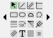
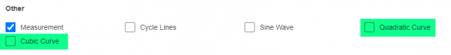
I’m pleased to announce new tools in SlopeCharts: the Quadratic Curve and the Cubic Curve. These are both drawn objects which can be made available via the drawn objects palette.

TwonewTools

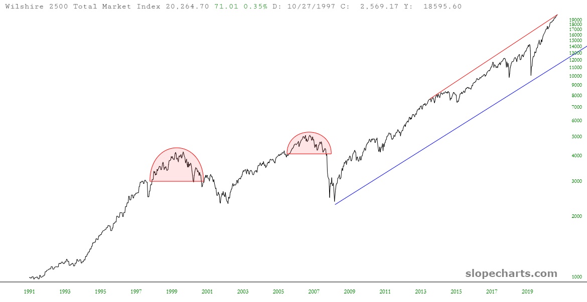
It’s easier to show you these things than to describe them. Here is the quadratic curve, which you can create by clicking two anchor points and then clicking a third anchor point between them to stretch the curve to your liking.

(more…)

Custom Tool Palette!

By -

Those of you who use SlopeCharts are familiar with the tool palette in the lower-left corner, which provides direcetly access to sixteen different drawing objects:

fullpalette

There are two problems with this: one, it doesn’t have enough room to fit all our current tools, and two, it dissuades me from adding more drawing tools since we’re already out of room! We have solved both of these problems, and the solution is found with the icon in the lower-right of the tool palette, which is the new Customize function.

(more…)

Do Some Lines

By -

I am pleased to announce a subtle but very important improvement in SlopeCharts: you can now view line charts on a log scale, instead of being forced to use an arithmetic scale. We had forced this issue earlier, because in instances where values can be negative, we change the graph to a line chart and use the arithmetic scale. Now, SlopeCharts is smarter about it. To illustrate this, below are some Wilshire equity charts, which aren’t quite as jaw-dropping as before, because now the representation is a lot more honest:

slopechart FR WILL IND
(more…)