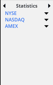
More cool SlopeCharts news! We have added a new data panel called Statistics, and it is jam-packed with information.
Slope initially began as a blog, so this is where most of the website’s content resides. Here we have tens of thousands of posts dating back over a decade. These are listed in reverse chronological order. Click on any category icon below to see posts tagged with that particular subject, or click on a word in the category cloud on the right side of the screen for more specific choices.
More cool SlopeCharts news! We have added a new data panel called Statistics, and it is jam-packed with information.
I’ve got great news, SlopeCharts users: the comparison feature is now vastly improved! After all this time, we now not only have percentage charts, but also price comparison charts.
SlopeCharts not only has comparison charts, but it has two distinct styles of comparison charts, each with their own purpose and value. One style is percentage-based (which can compare as many symbols are you like) and the other is price-based (which lets you compare two symbols, each of which will have its own independent price axis). You can choose what style you would like from the Preferences menu, in the Appearance tab:
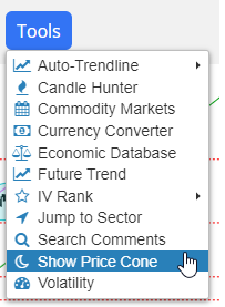
(more…)Hello from a tiny wooden table at the Whole Foods Market in San Mateo. I have yet another improvement for you on Slope: Price Cones. Here is the new menu item in SlopeCharts:
Once again, I awake to a world so uninspiring for content that I struggle to imagine what to write. In this desperate situation, I’ll resort to something I hate doing, which is telling you in advance of some of the things we’re working on in the background of Slope. I normally like to surprise you with such new goodies, but I’ll spoil it somewhat out of a sad need for something – – anything – – to say:
(more…)You will be pleased to know that our IV Rank feature, introduced fewer than 100 hours ago, has already been substantially improved.
Volatility, which SlopeCharts already has here, measures the implied volatility of a given financial instrument based upon its options pricing. The volatility varies from instrument to instrument, but for any one instrument, it’s the relative volatility that is of interest to us.
(more…)