
You will be pleased to know that our IV Rank feature, introduced fewer than 100 hours ago, has already been substantially improved.
Volatility, which SlopeCharts already has here, measures the implied volatility of a given financial instrument based upon its options pricing. The volatility varies from instrument to instrument, but for any one instrument, it’s the relative volatility that is of interest to us.
The range is from 0 to 100. One extreme, 0, means that for this particular instrument, it is at the lowest level of volatility for the year. The other extreme, 100, means that the volatility is at its relative maximum (and thus, for you option sellers, is probably an appealing candidate). The line chart is confined by these two extremes so you can see where volatility is, relatively speaking, for this instrument.
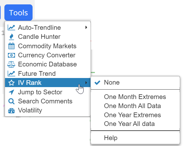
To activate the IV Rank chart, just choose it from the Tools menu. There are four kinds of IV Rank from which to choose, as well as “None”, the default, which will clear away any selection.
Below, for example, is the SPY with its IV Rank. Notice how SlopeCharts tints the zones of the IV Rank so you can get an immediate sense as to how hot or cold the volatility is running right now. As of this image capture, volatility is extremely low.

Below is just the IV Rank graph itself, for the sake of detail. The chart is broken into five equal zones (0-20, 20-40, 40-60, 60-80, and 80-100). It couldn’t be any simpler to interpret.

Implied volatility tends to go higher when a security goes lower, and vice versa. IV Rank, however, doesn’t have this simple reverse correlation. Instead, it tends to go to extremes when the underlying instrument goes to extremes. The example below illustrates this point, showing how the IV Rank (lower chart) spiked to its maximum 100 level at both a peak as well as a nadir of the S&P 500 index.

As mentioned above, there are four styles of IV Rank. Two of them are calculated based on data for the prior 30 days, thus they tend to be much more volatile. The other two are calculated based on the data for the past year. Besides this, the calculations can be based on the extreme high and low prices for the period in question or, alternately, on the entirety of the data set.
Here, for example, is the IV Rank based on One Month of data’s extreme high and low levels. As you can see, this is an extremely kinetic graph.

The yearly IV Rank, however, moves far more smoothly. You can experiment with the four different versions of IV Rank to see which one you find most useful.

Importantly, when you save a chart style, the presence of an IV Rank study is included in the study. This is a great time-saver, because it means once you have established the kinds of presentations you prefer, including IV Rank, they can all be incorporated in a single easy-to-click bundle without having to access the IV Rank menu again and again.

