Slope of Hope Blog Posts

Slope initially began as a blog, so this is where most of the website’s content resides. Here we have tens of thousands of posts dating back over a decade. These are listed in reverse chronological order. Click on any category icon below to see posts tagged with that particular subject, or click on a word in the category cloud on the right side of the screen for more specific choices.

Help!

By -

No, this isn’t a plea for the market to stop going up. It’s more useful than that.

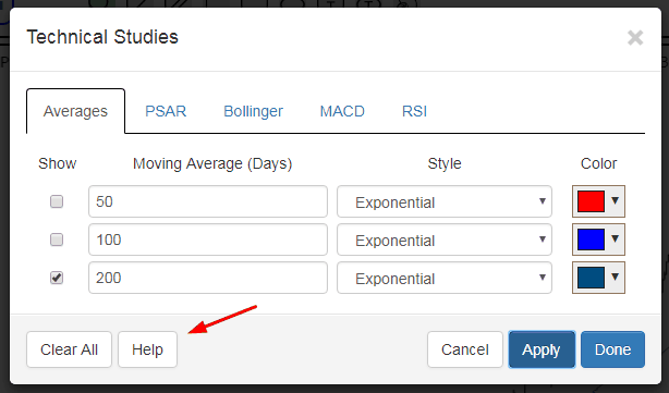
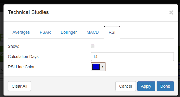
One of you helpfully suggested that, with the growing SlopeCharts list of technical indicators, some instructional information might be helpful. OK, done! Now there is a Help button on every tab related to studies, and clicking it will bring up a new page describing the study and how it is used.

And, hey, if you want to give me something to be thankful for on Thursday, I’d like to see you using SlopeCharts. It’s a dynamite product, it’s free, and hey, there aren’t even ads on the page!

1117-help

Tweet Those SlopeCharts!

By -

In addition to the very cool new “pane” and MACD improvements for SlopeCharts launched last night (read about them here), there’s a minor upgrade to the Tweeting feature. If you want to share a chart with your followers, just right-click the chart and choose this:

1110-tweet

The cool bit is that a URL is sent with your tweet which gives direct access to the chart with the symbol pre-loaded, like this chap did a few moments ago:

1110-st

So try SlopeCharts today. It’s free, it’s hip, and it’s glucose-free.

SlopeCharts’ Great Leap Forward

By -

I am absolutely delighted to let you know about a couple of terrific improvements to my beloved SlopeCharts platform.

(1) Panes – as we set about adding more technical studies to SlopeCharts, we decided to make the panes – – that is, the individual elements of the whole chart – – easy to rearrange. So if you want one study at the top, the price bars at the bottom, and the volume pane wedged in between, that’s your choice. Using the panes is a cinch: just hold down the Ctrl key and drag them around in any arrangement you like.

(2) MACD – the oft-requested Moving Average Convergence Divergence (MACD) study is here! You will see it available in the new Studies tab at the top of the screen. (more…)

Take a Shortcut!

By -

I’m happy to tell you about another time-saving feature in SlopeCharts – – custom keyboard shortcuts.

When I use SlopeCharts (which is daily), I found that I was moving symbols from watch list to watch list constantly. This can be a very time-consuming process, quite tedious, and involving a lot of mouse clicking. So I arranged that we enhance the product so that with a single button, you can perform move and copy operations between watch lists.

To get there, just choose Preferences:

1103-pref

(more…)