I introduced the Slope+ service earlier this year, and it’s been quite successful. I sort of regret that it took me eight years to finally get around to doing a premium services, but that’s water under the bridge, and I’m pleased that it’s been running so smoothly.
I got an email this weekend which really made me smile. It read, in part:
“…followed 1 of your recent recomendations and shorted IYR covering for a approx. $3500 profit therfore paying for my annual subscription fee to slope plus.. nice call on the entire sector”
 It dawned on me that I had never really taken a hard look at how my various ideas have been doing. I had this vague notion that, on the whole, they were pretty good calls, with a few duds sprinkled in, but I hadn’t really subjected it to any true analysis.
So I decided to go through all my Slope+ posts and rate them. I left out about a quarter of these posts, which were the ones that either expressed a general market opinion, contained a lengthy video, or otherwise weren’t easily “rateable” with respect to how they turned out.
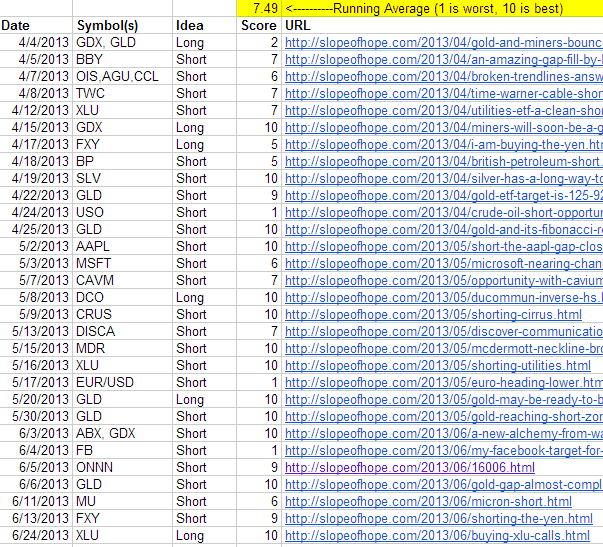
As for the rest, I gave myself a rating between 1 (terrible) to 10 (fantastic), and all of these references are on this link, which is accessible to everyone. I intend to keep this spreadsheet up-to-date at the start of each new month, but I’m going to have it “lag” by a full month, since it would obviously be silly to promptly share the details of Slope+ posts with non-paying readers. Thus, the spreadsheet is presently up-to-date through July’s end. At the end of this month, I’ll update for the August posts.
As you can see, I’ve got a running average of 7.49 right now (which I hope at least illustrates that I’m not being overly-kind to myself!) Not great but not terrible. There are a number of “10s” I’m proud of, and there are a few total clunkers. The good news is that the clunkers get stopped out really fast, whereas the great picks produced big profits. So on the whole I’d probably give myself about a “B” grade so far.
I thought everyone would like to see this effort at transparency. I think it helps provide some insight as to the kinds of suggestions I offer as well as to how they’ve panned out. Of course, the performance could change over time. My JOY short, for instance, could plunge like crazy this fall, making it a great suggestion. At this point, it remains just “meh”, since it hasn’t really done anything yet.
Anyway, it took me a number of hours to pull the data together, but I think it’s a nice improvement to the information about what’s on Slope and how I’m doing with the premium site. Thank you.


