Slope of Hope Blog Posts

Slope initially began as a blog, so this is where most of the website’s content resides. Here we have tens of thousands of posts dating back over a decade. These are listed in reverse chronological order. Click on any category icon below to see posts tagged with that particular subject, or click on a word in the category cloud on the right side of the screen for more specific choices.

I’m Inclined to Agree

By -

We recently added the ability for SlopeCharts to tweet out charts. One user made good use of the feature, and I told him it was a nice-looking chart. I was very pleased at his response:

0606-copmliment

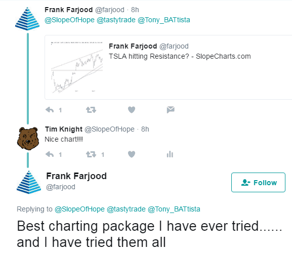
The reason it’s the best isn’t because of the time I’ve had to work on it (I’ve only started) or the money behind it (which is basically nothing). It has the most nauseating, but truthful ingredient of all: love. Because I care deeply about this stuff and, frankly, the vast majority of other charting vendors seriously don’t give a flying crap, whereas I do.

Just remember: Tim gives a flying crap.

Joking aside, I manage a seven-figure portfolio using ONE and ONLY one tool: my beloved SlopeCharts. So if I trust it this much, maybe you should consider paying up the $0.00 I demand for it and try it too. There aren’t even ads on the freakin’ page, baby.

Gold Miners in 2017 Whipsaw

By -

Ever since 2012’s failure of the ‘QE 3 rally’ in the precious metals it has not been fruitful to micro manage the gold sector, because that failure jump started a savage bear market that would need time to work out the excesses both in the sector’s investor base and in its mining businesses, which had become bloated and inefficient. That’s what bear markets do; they clean out the landscape to make it inhabitable for new investors one day. Here is a weekly chart showing the bear’s kickoff. HUI’s 55 week EMA then became the ball and chain that kept its fate sealed (red arrows) until January of 2016.

hui

(more…)

Moving Averages

By -

I wanted to mention a subtle improvement to SlopeCharts – – now, when you lay down moving averages, you can see detailed information on all of them (color-coded) on the data line. SMA stands for simple moving average, EMA for exponential moving average, and the parenthetical number indicates the number of days used in the calculation. As you move the cursor, it will reflect the information for that particular day. There are many new indicators on the way.

0603-colorful