In last year’s market outlook for 2018, I anticipated a rise of around 10% for the SPX. At its all-time high set on September 21, the SPX had risen by 9.62%, before it began to lose its gains for the year, and more.
At the time of today’s analysis and post (December 17), you will see from the first percentages gained/lost graph that 7 of the 9 Major U.S. Indices are in negative territory year-to-date.
The second percentages gained/lost graph shows that 8 of the 9 Major Indices are in correction territory from September 21. In fact, the Russell 2000 and the Dow Transports are fast approaching a 20% bear market territory.
The following graph shows the percentages of stocks in the U.S. Major Sectors and Major Indices above their respective moving averages.
The only ones with 50% or more of their stocks above their 200-day moving averages are the S&P 500 Real Estate, S&P 500 Utilities, and Dow Utilities.
The one to note is the S&P 500 Real Estate Sector, which has precisely 50%. If we see further weakness in this sector sending it below that level, I’ve no doubt that we’ll see broad weakness continue across all markets.
Each candle on the following three charts of the SPX represents a period of one month, one quarter, and one year, respectively.
All three charts show clearly the weakness that this index has experienced since September, the uncertainty that has gripped it all year, and the strength of this year’s bearishness versus tepid bullishness.
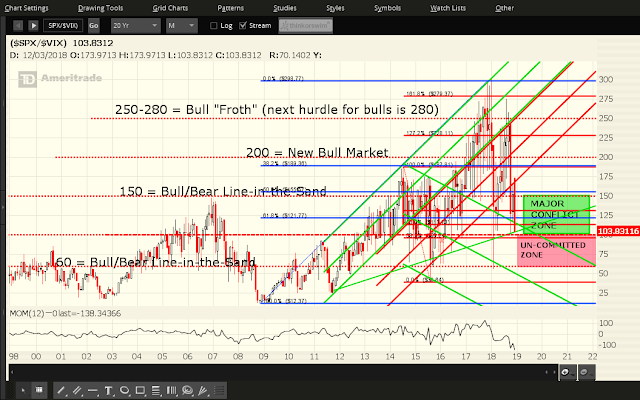
Each candle on the following three ratio charts of the SPX:VIX ratio represents a period of one month, one quarter, and one year, respectively.
Price is currently sitting just above the 100 Uncommitted Zone…a zone, which, if broken and held to the downside, would see a swift selloff occur in the SPX and other U.S. Major Indices.
The extreme volatility and lack of bullish commitment, thus far this year, in the SPX is best illustrated by the yearly ratio chart. Its entire candle range for 2018 has encompassed both candles of 2017 and 2016, as well as good portions of all prior candles to 2010, and has set a new record high for annual ratio range.
CONCLUSIONS AND OUTLOOK FOR 2019
I think that 2019 is likely to bring the same level of volatility and uncertainty, not just in U.S. equity markets, but in other world markets and world politics, as well. I’m getting the impression that major world markets are doubting the ability of their respective political leaders and central banks to continue to stimulate markets to the same degree that they’ve enjoyed since 2009. In fact, even with all the tax cuts and removals of many regulations that we’ve seen this year in the U.S., markets are still down extensively. With central bankers tightening their monetary policies, and no further fiscal stimulus packages on the horizon in the U.S., I don’t see a convincing bullish bias returning any time soon.
Depending on where both the SPX and SPX:VIX Ratio close at the end of December, I anticipate, either a slower level of equity accumulation, if there is much, to, potentially, propel the SPX to retest its prior all-time high of 2940.91, or to resume further declines, putting the SPX at 2400, or lower, as I’ve repeatedly mentioned since August and as I last described here. In fact, 2250 would be the next major support below that level, followed by 2000, as is evident on the above three charts of the SPX.
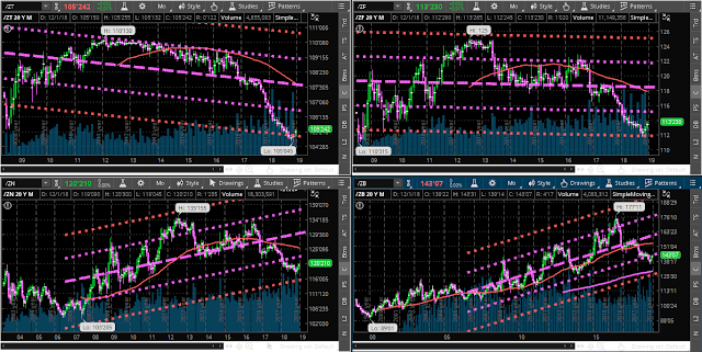
Under the latter scenario, I’d expect money to rotate into bonds (which has already been the case over the past several months, as shown on the following monthly charts of 2/5/10/30-year bonds) and/or cash (U.S. $).
Good luck next year!


