Slope of Hope Blog Posts
Slope initially began as a blog, so this is where most of the website’s content resides. Here we have tens of thousands of posts dating back over a decade. These are listed in reverse chronological order. Click on any category icon below to see posts tagged with that particular subject, or click on a word in the category cloud on the right side of the screen for more specific choices.
Gold/Silver Ratio, SPX, Yield Curve and a Story to Tell
I most often use linear scale charts for stocks, markets and indicators for their more absolute views. But in the case below we conjure up a long-term log scale chart showing the Gold/Silver Ratio (GSR) and the S&P 500 (SPX), as it works better in providing a percentage-based relationship between an indicator of market liquidity and inflation when declining and lack of liquidity, deflation or… it has to be said, Goldilocks, when rising.
Now, when viewing the most recent Goldilocks phase, where SPX has gone in positive correlation with the GSR we will have to suspend disbelief that this is anything normal or natural. It was created by will of man as first the Bernanke Fed conjured a balls out inflation out of 2008’s deflationary destruction and then as a crowning achievement, concocted Operation Twist in order to manipulate the bond market into flashing this signal… ‘Nope, no inflation here!’
(more…)Farewell to a Perfect Week

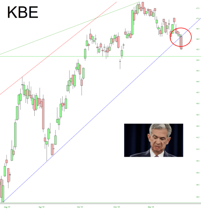
The Breaks
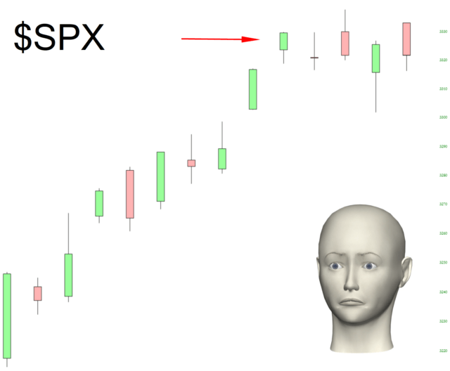
You know my 2020 mantra: bullish bonds, bullish gold, bearish equities. We’ve made terrific progress this week, and most particularly, today. If you are a regular visitor to Slope, and you appreciate my 365-days-a-year work on it, kindly sign up for a premium membership.


