Here are the five big firms reporting Wednesday morning before the opening bell. These all seem to be financial “perma-risers” to me, but click on any of these for a large version. They all seem to be eerily steady.

Slope initially began as a blog, so this is where most of the website’s content resides. Here we have tens of thousands of posts dating back over a decade. These are listed in reverse chronological order. Click on any category icon below to see posts tagged with that particular subject, or click on a word in the category cloud on the right side of the screen for more specific choices.
Here are the five big firms reporting Wednesday morning before the opening bell. These all seem to be financial “perma-risers” to me, but click on any of these for a large version. They all seem to be eerily steady.

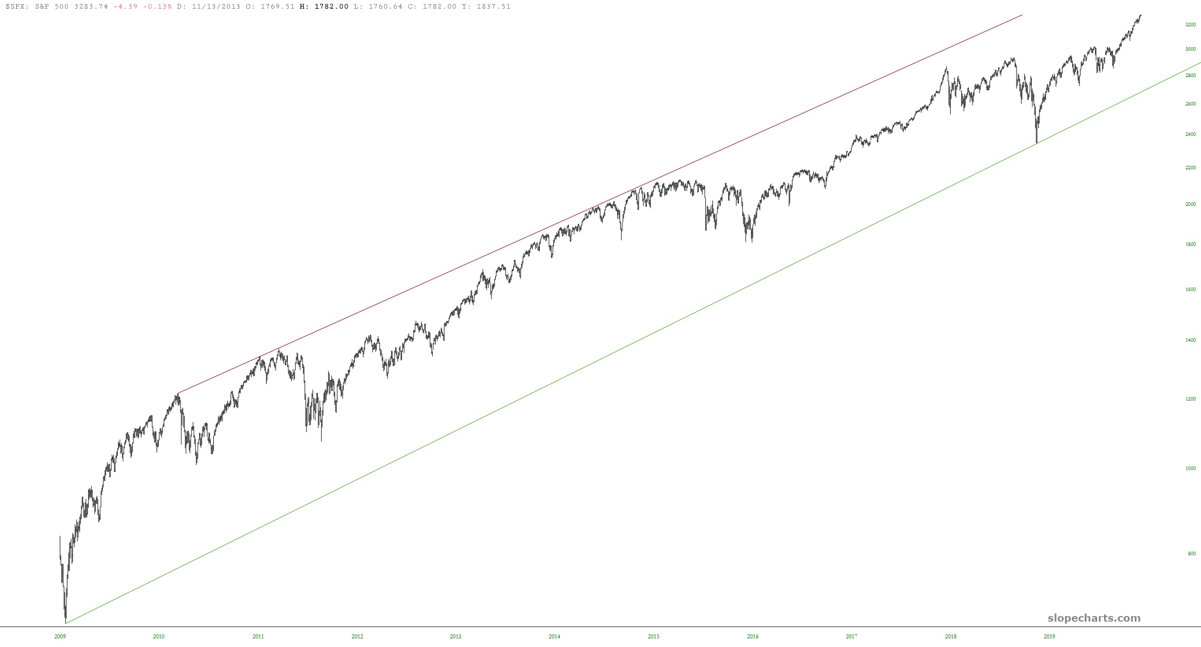
As we lurch to lifetime highs every day, I stumbled upon something quite curious and interesting that I wanted to share. First we have the S&P 500, which has been cruising up an ascending channel for eleven Fed-induced years.
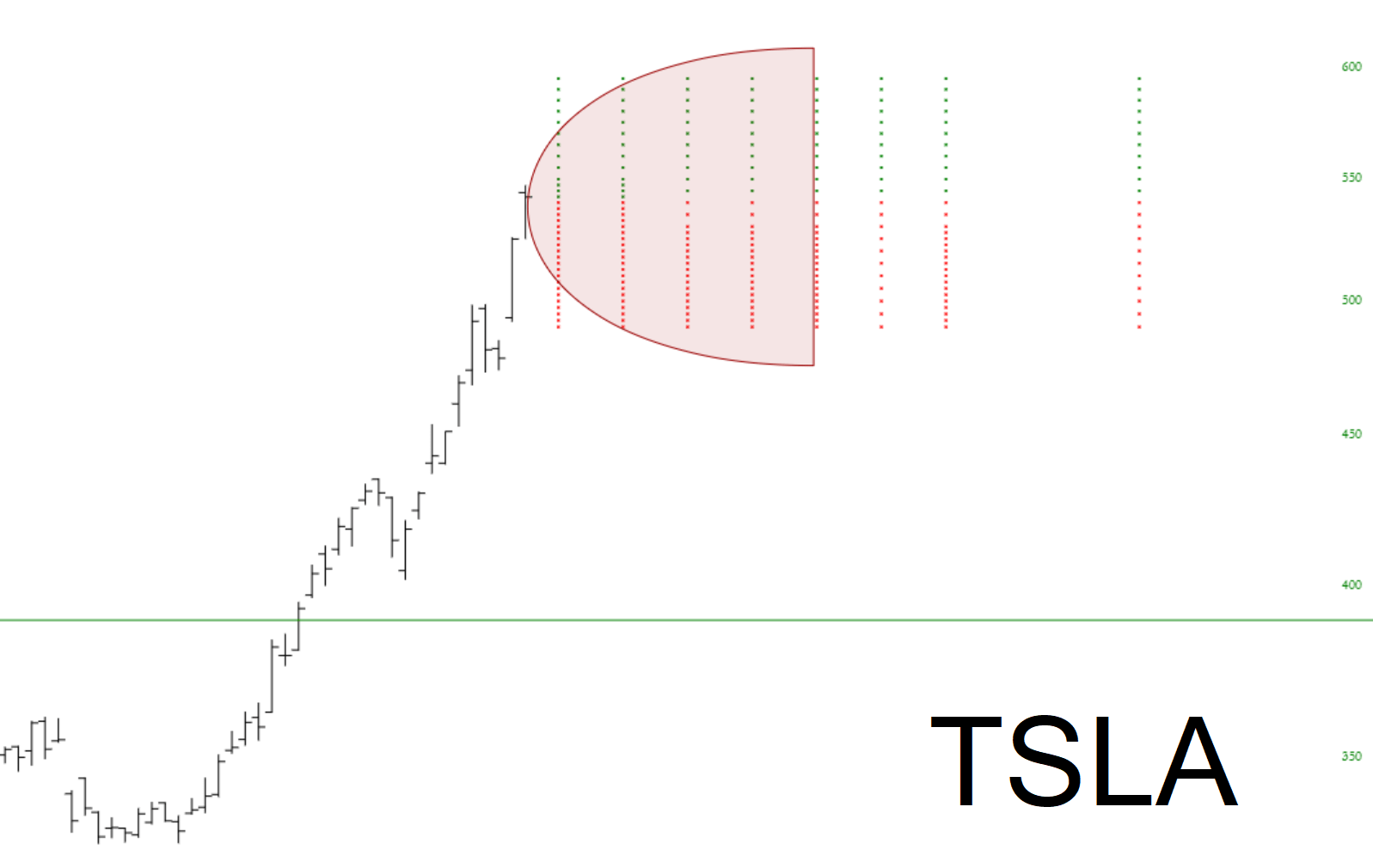
I wanted to show how a couple of SlopeCharts features can be used together to helpful effect: first, the Price Cone, and second, Option Dots. I’ve used them in the chart below with high-flying stock Tesla. The price cone illustrates the options market’s assessment as to likely price movement in the next 30 days (an enormous range, for obvious reasons) whereas the option dots show the various put and call options available at different price points.
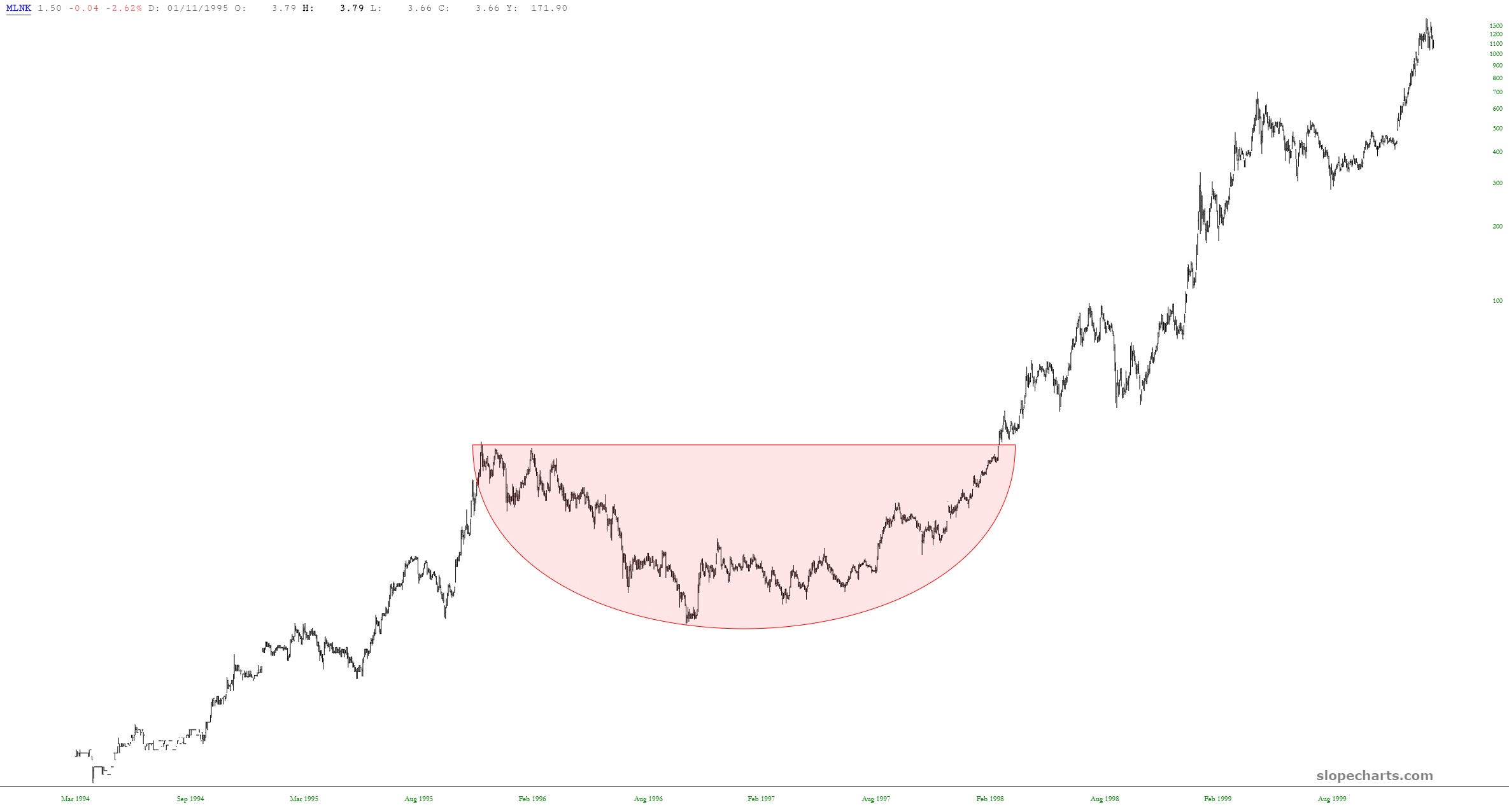
I would like to introduce you to a company which (a) got really lucky with one investment (b) parlayed their gains into a bunch of other risky Internet investments (c) soared in value as it captured the imagination of the investing public. What is this firm, you ask? SoftBank? Well, sort of. But let’s hop back in the time machine and go back to the 1990s: