
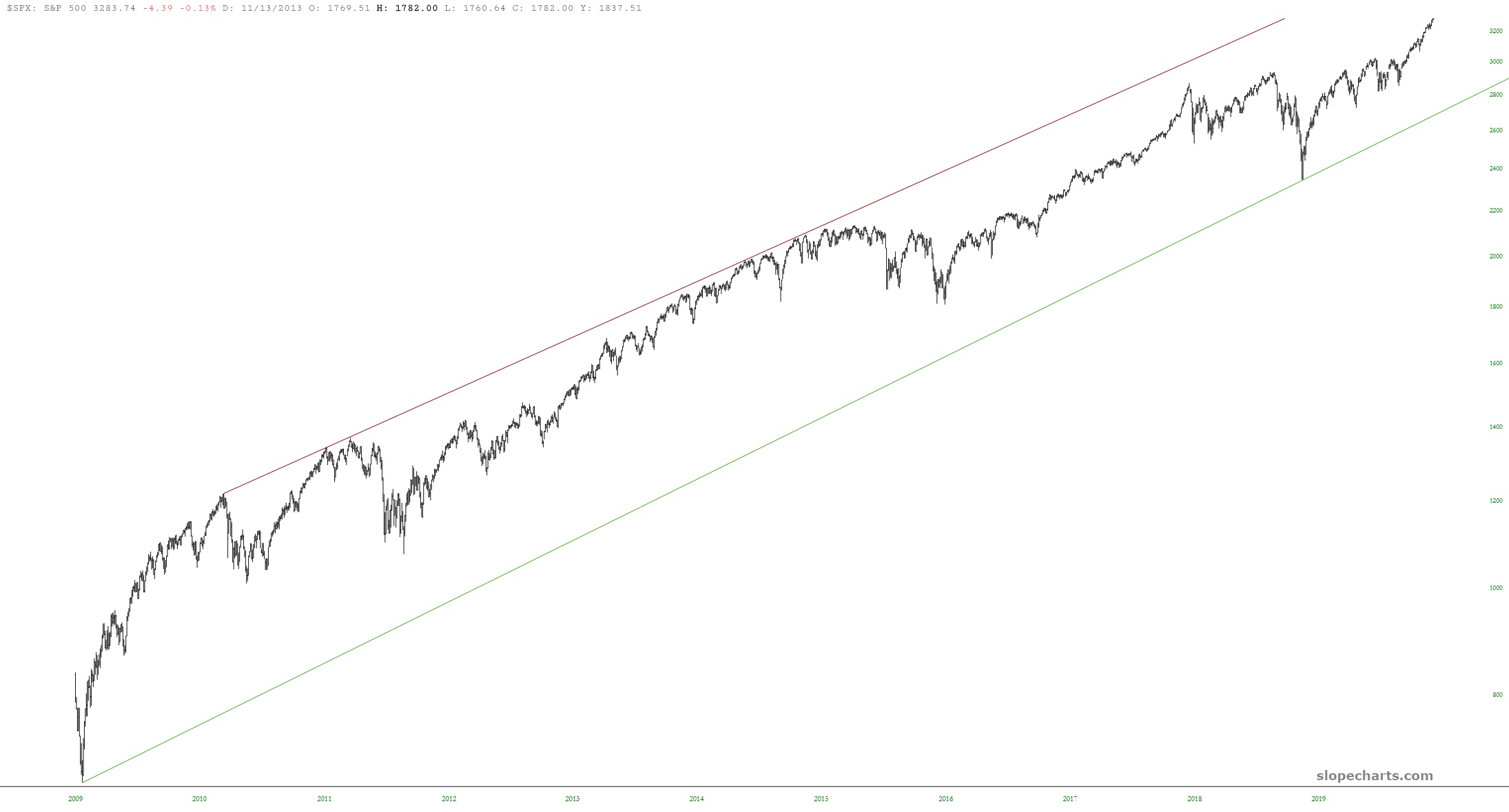
As we lurch to lifetime highs every day, I stumbled upon something quite curious and interesting that I wanted to share. First we have the S&P 500, which has been cruising up an ascending channel for eleven Fed-induced years.
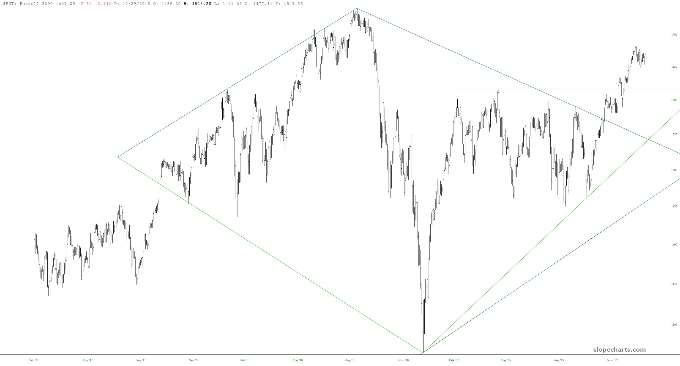
In contrast to this, we have the Russell 2000, we peaked a year and a half ago and is struggling to break out and join the land of daily-new-highs that other indexes are enjoying.
Completely by chance, I used SlopeCharts to see what the ratio chart of IWM to SPY looked like, and I was knocked off my feet by what I saw. Just look at this pattern. GAW-GEOUS!
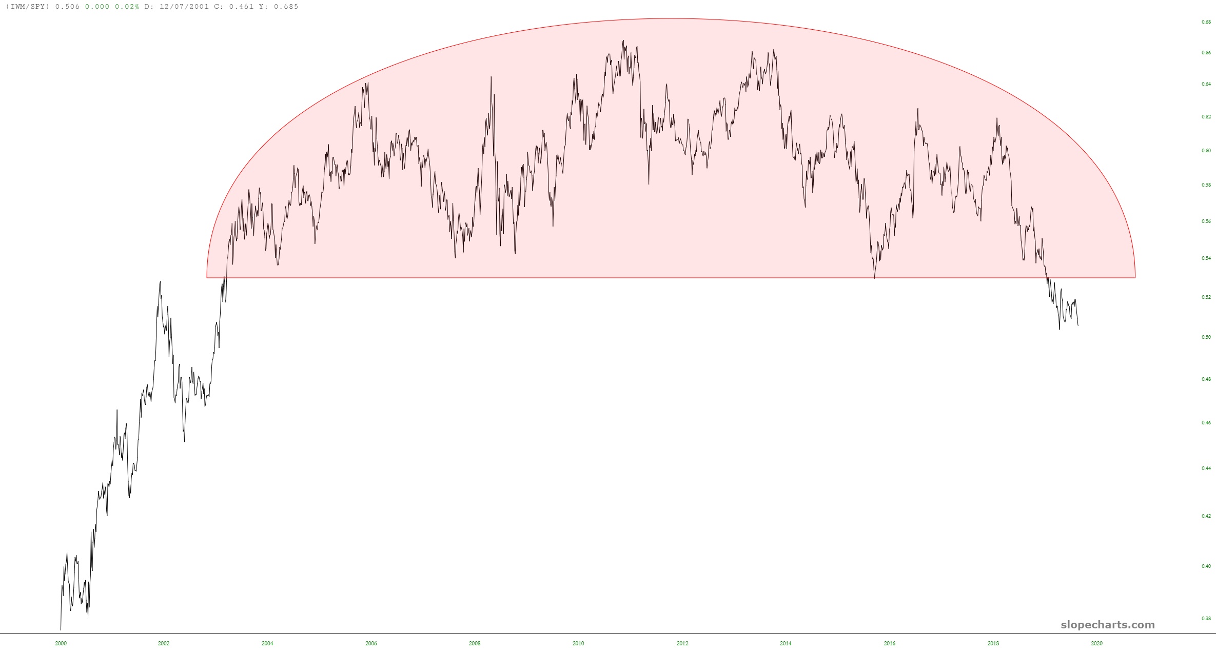
What would my conclusion from all this be? I’d say that small caps are in some long-term trouble!
