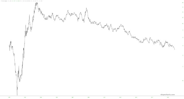
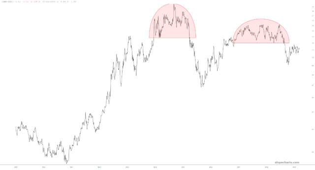
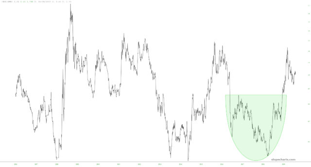
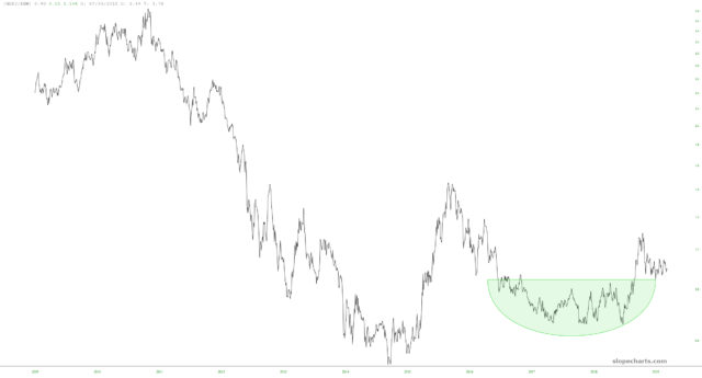
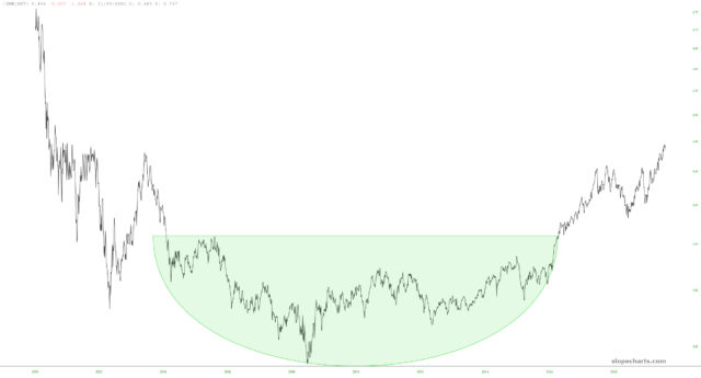
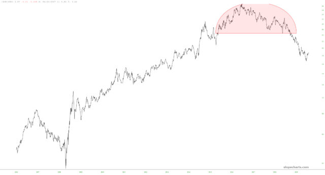
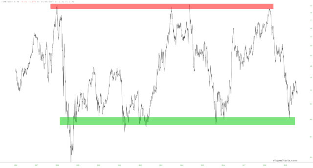
I did an unusual experiment today that I wanted to share with you. It’s the kind of goofy side project a data weirdo like me does when an idea pops into his head while taking out the trash.
I punched in a couple of dozen big ETFs and created a matrix of them in Excel using the CONCATENATE function.
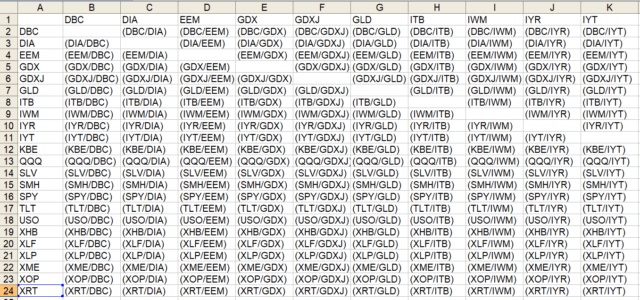
I then went into SlopeCharts and loaded every single combination (there were over 500). I then – – and this was the time-consuming part, but I do love my Slopers – – I looked at every single chart to find any that I found to be interesting. There were maybe ten. And here they are (as a side note, my extra-beloved Gold and Diamond members can see my customized symbols by subscribing to the “Pairs” watch list via their own SlopeCharts subscription).
Click on any image for a much larger version. I’ve highlighted what I consider to be the key reversal patterns and, in the last chart, the long-term range. Fascinating stuff, I think.
