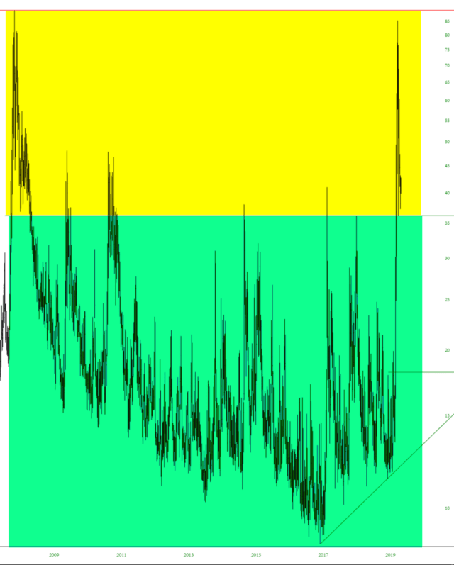
Allow me to share a couple of charts that have almost nothing to do with one another, but strike me as similar in a strange way. The first one is the volatility index, the VIX. I have split this into two zones. One is in green, below roughly the 35 level, which is where virtually all the activity has been for many, many years.

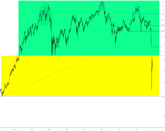
The other “split” chart is the oil sector index, $XOI, in which the area above price level 750 is in green, and likewise indicates where the vast majority of activity has been for many, many years.

My opinion is that the yellow zones represent a “new normal” that is going to persist for longer than anyone dares imagine. To most, the present prices seem like outliers that will soon be resolved. Personally, I don’t think so.
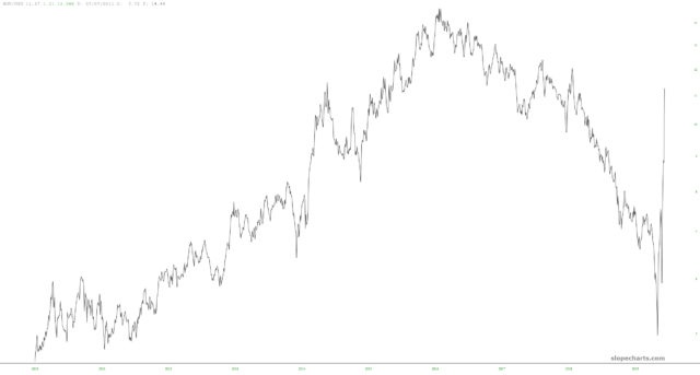
As an oblique aside, below is a chart I made of the XOP/USO ratio. Energy companies have been extraordinarily stock in the face of exceptionally weak oil. Does this mean that oil companies will “catch down” to the commodity they process, or that oil will “catch up” to the strong values of companies like Exxon? Food for thought………


