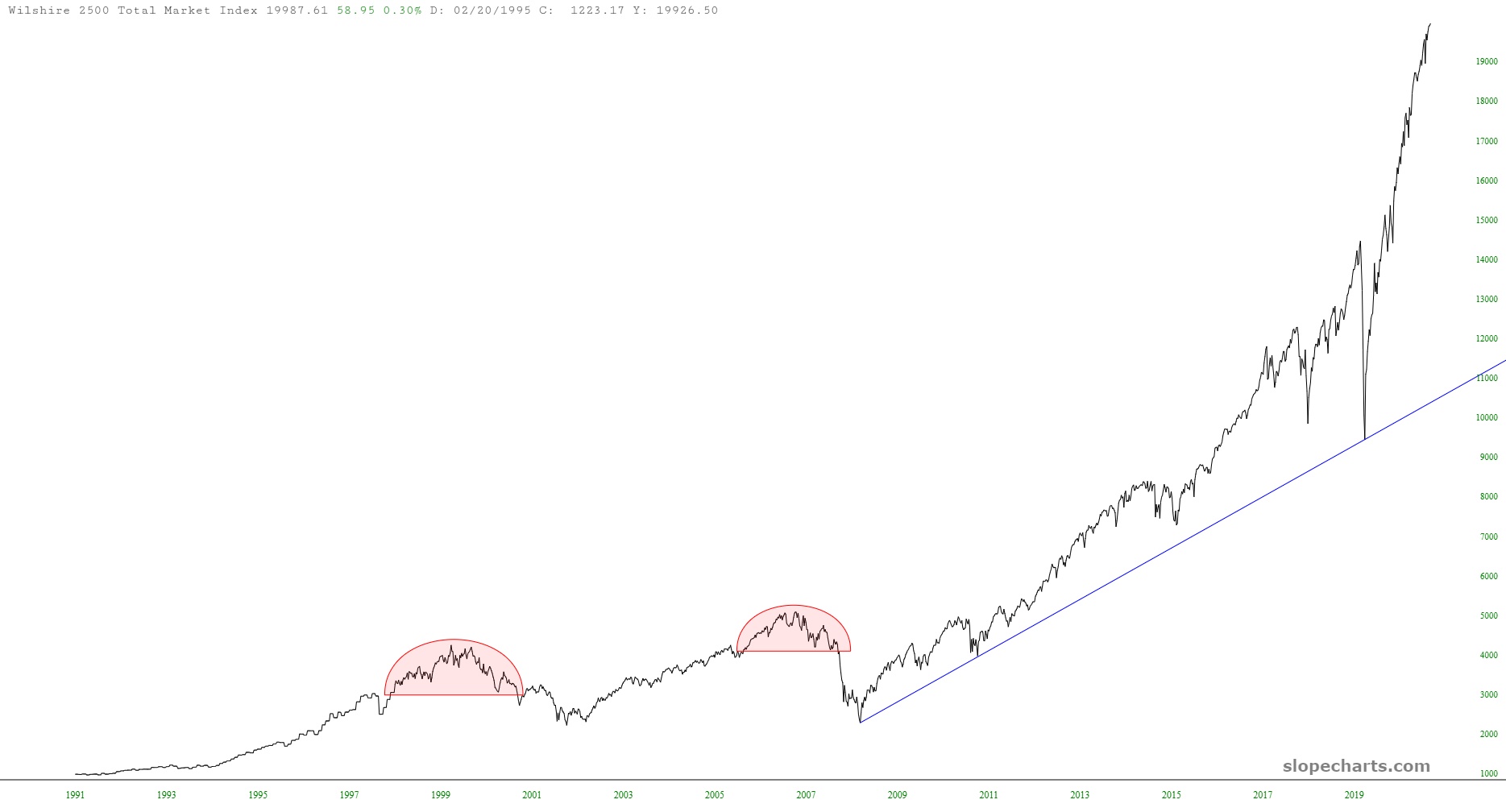
As we approach Friday morning’s gift-to-billionaires from Jerome Powell, I’d just like to again offer these two charts of broadly-defined U.S. equity indexes in case anyone has forgotten how batshit-insane things have become.
Slope initially began as a blog, so this is where most of the website’s content resides. Here we have tens of thousands of posts dating back over a decade. These are listed in reverse chronological order. Click on any category icon below to see posts tagged with that particular subject, or click on a word in the category cloud on the right side of the screen for more specific choices.
As we approach Friday morning’s gift-to-billionaires from Jerome Powell, I’d just like to again offer these two charts of broadly-defined U.S. equity indexes in case anyone has forgotten how batshit-insane things have become.
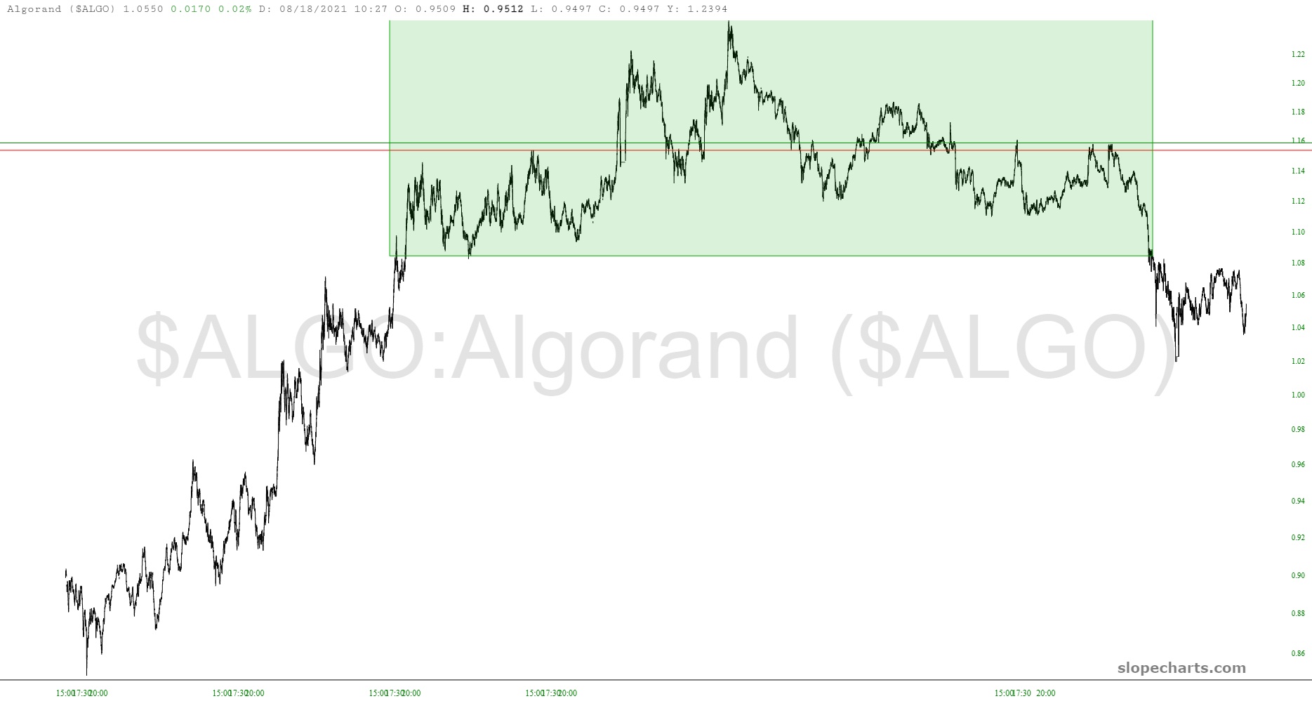
I’ve mentioned ceaselessly, both here and on the air, how “chart-friendly” crypto is. Well, that cuts both ways. The charts can tell me when they’re going up, and they can also suggest to me when they’re about to fall.
Slope is rather special in that we save a lot of intraday data, both for stocks and for crypto. Armed with this, I saw a series of intraday minute bar charts that were chilling to me. So I took my profits yesterday evening (with the exception of three positions, which I wound up closing Tuesday), thank you very much. I’ll get back in when the coast seems clear.