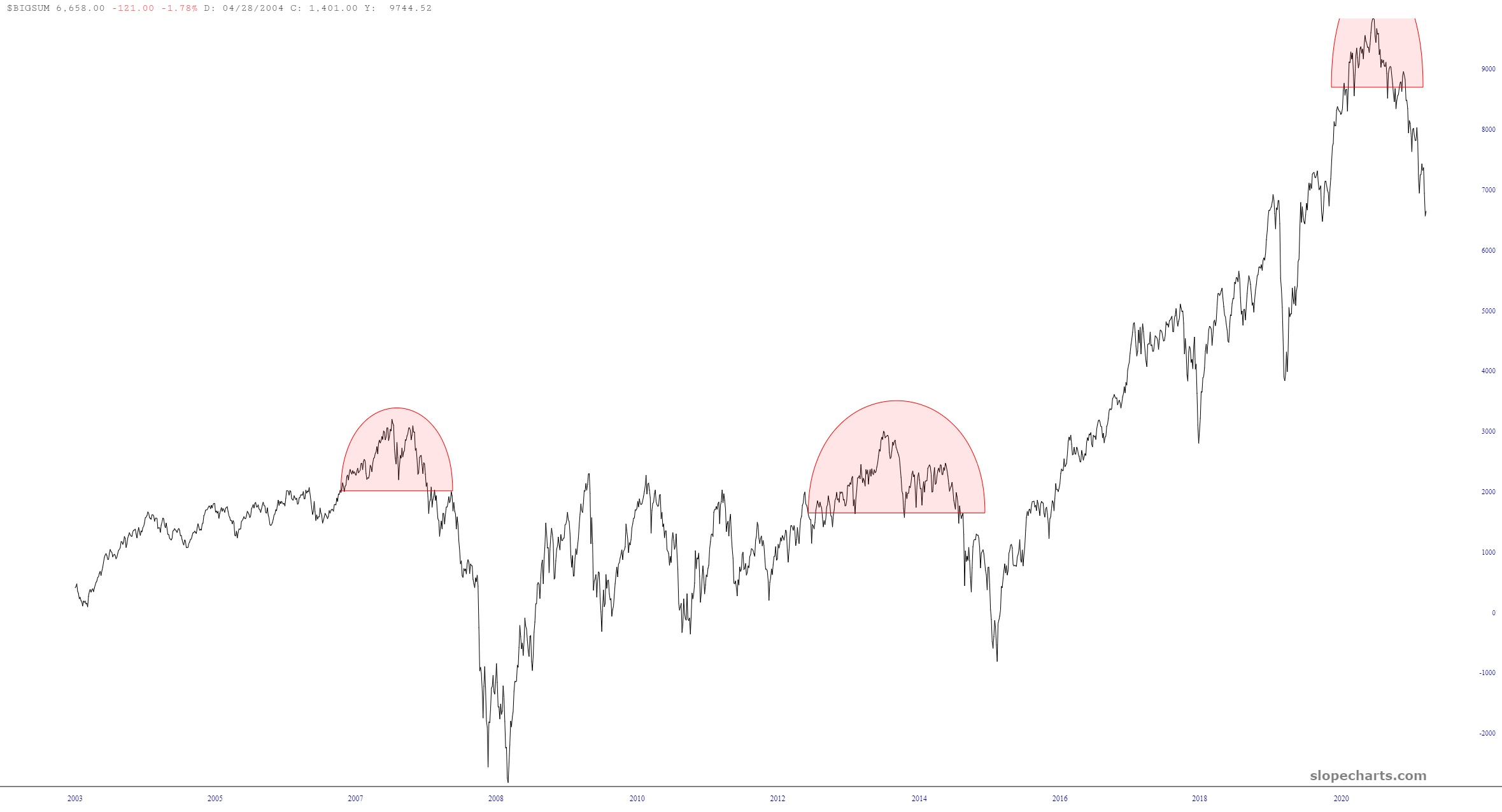
OK, I can’t end the day without just one more post. It’s a simple one, and one which applies to the market as a whole. I’ll leave them to your own interpretation (except for my always handy tip to click the danged thing for a bigger version). Here is $BIGSUM, which is the cumulative advance/decline line for U.S. stocks:
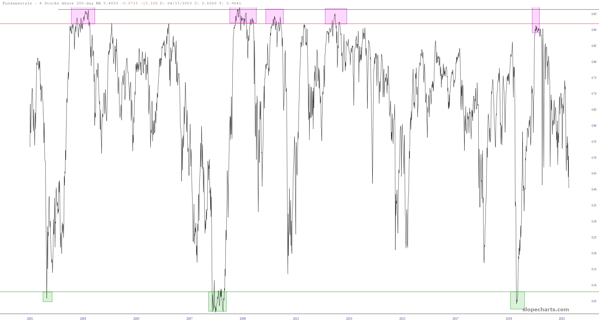
And here is the chart of the percentage of stocks above their 200-day moving average which, understandably, has been eroding for many months but, it seems clear, has far from bottomed out.