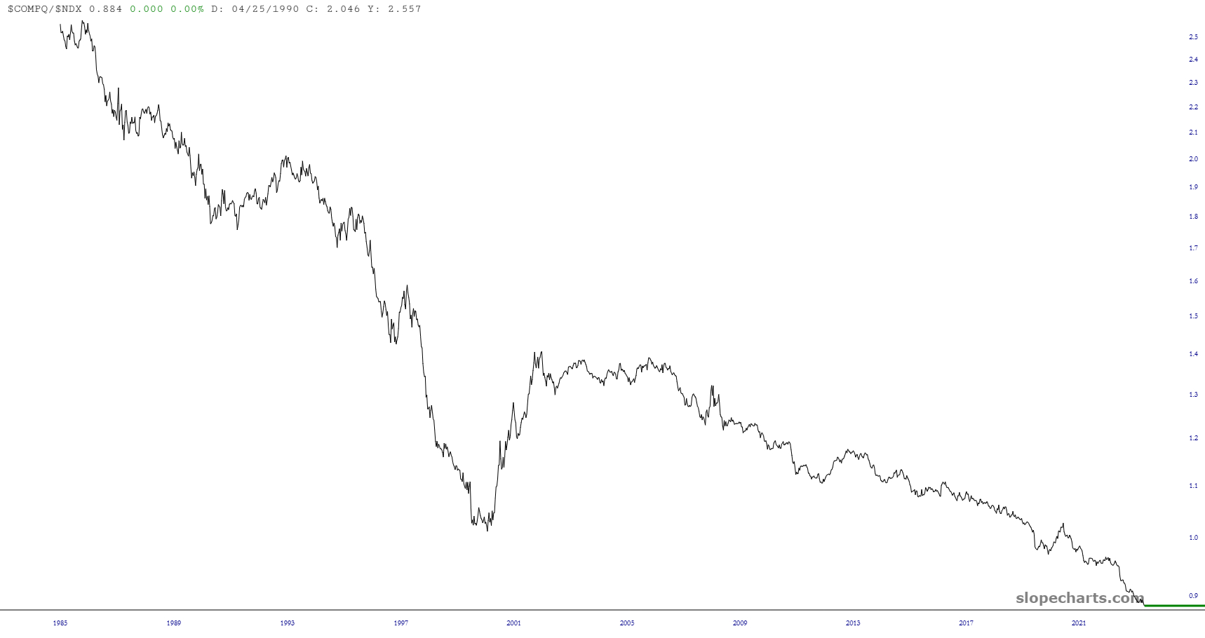
Just a quick, simple ratio chart showing how the NASDAQ Composite (which is no slouch!) is getting absolutely beaten to death by the mega-cap heavy NASDAQ 100. It just shows you how potent a minority of stocks are versus the NASDAQ as a whole.
Slope initially began as a blog, so this is where most of the website’s content resides. Here we have tens of thousands of posts dating back over a decade. These are listed in reverse chronological order. Click on any category icon below to see posts tagged with that particular subject, or click on a word in the category cloud on the right side of the screen for more specific choices.
Just a quick, simple ratio chart showing how the NASDAQ Composite (which is no slouch!) is getting absolutely beaten to death by the mega-cap heavy NASDAQ 100. It just shows you how potent a minority of stocks are versus the NASDAQ as a whole.
