Carriers with the Freshest Air
Slope initially began as a blog, so this is where most of the website’s content resides. Here we have tens of thousands of posts dating back over a decade. These are listed in reverse chronological order. Click on any category icon below to see posts tagged with that particular subject, or click on a word in the category cloud on the right side of the screen for more specific choices.
Here’s some interesting information about which CEOs are the most and least popular among their employees. I guess it’s no shock that Jensen Huang, the CEO of NVDA, is loved by virtually all his employees, since he’s made them all rich with a stock that goes up every single day. As for Evan Spiegel the CEO of Snap……….yeah, not so much.

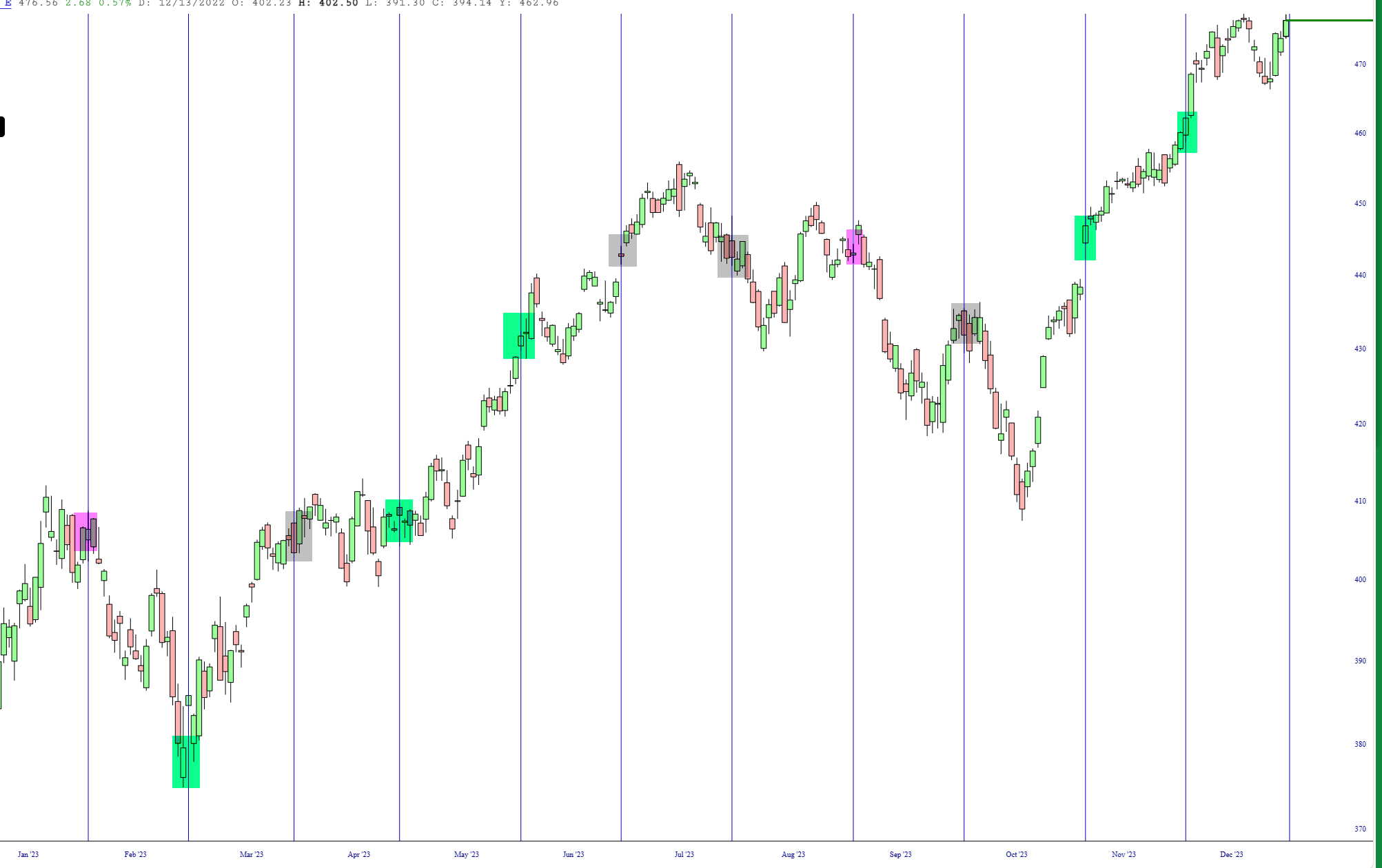
Here is a chart I put together of the SPY with a vertical line denoting each monthly CPI report. This is all thanks to our spiffy Event Markers feature! The green tint indicates reports that led to a generally bullish month, the magenta for bearish, and grey for neither. As you can see, the last two reports simply egged on the bulls. Let’s see what Thursday morning holds, with the market presently at lifetime highs.
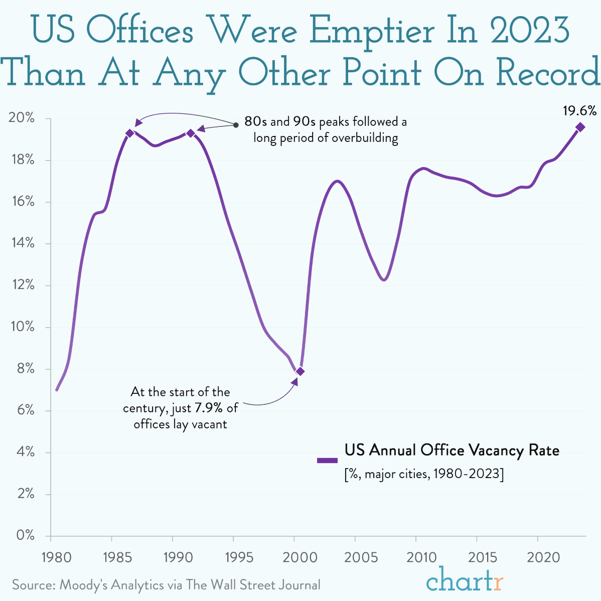
If you want to get a sense as to how vacant commercial real estate is, take a look at this: there’s never been more see-through buildings!
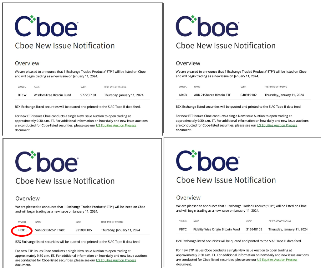
All right, crypto crowd: after years of waiting, your ETFs are here! A dozen of ’em! Including the saucy ticker symbol HODL. Heh. Oh, you.