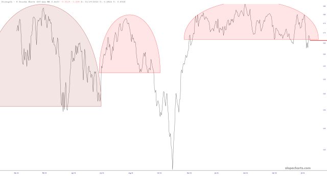
In spite of the recent mega-surge in equities, I’d like to point out that the 80,000 foot view of market strength isn’t looking quite so peachy. Below is the chart of the percentage of stocks above their 200-day moving averages.
Slope initially began as a blog, so this is where most of the website’s content resides. Here we have tens of thousands of posts dating back over a decade. These are listed in reverse chronological order. Click on any category icon below to see posts tagged with that particular subject, or click on a word in the category cloud on the right side of the screen for more specific choices.
In spite of the recent mega-surge in equities, I’d like to point out that the 80,000 foot view of market strength isn’t looking quite so peachy. Below is the chart of the percentage of stocks above their 200-day moving averages.
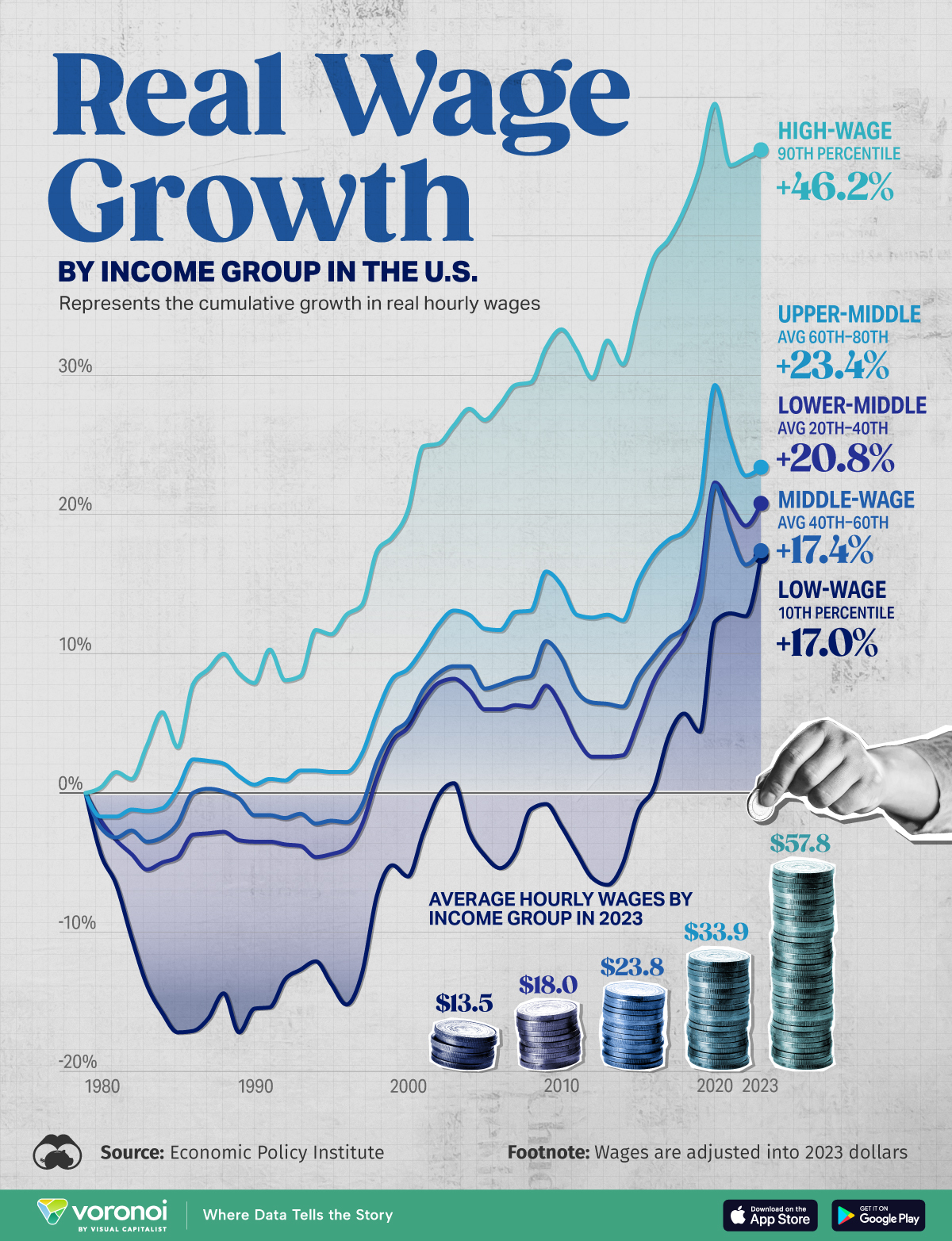
If you’re a high earner, you’re doing GREAT!
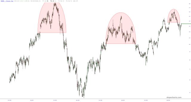
Even though folks joke about Crox shoes, they have endured for decades. This chart, however, looks awfully vulnerable to a tumble.
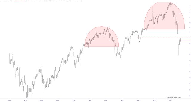
All is well, right? Problems averted? Keep an eye on Japan. The narrative could change fast. Here’s the USD/JPY:
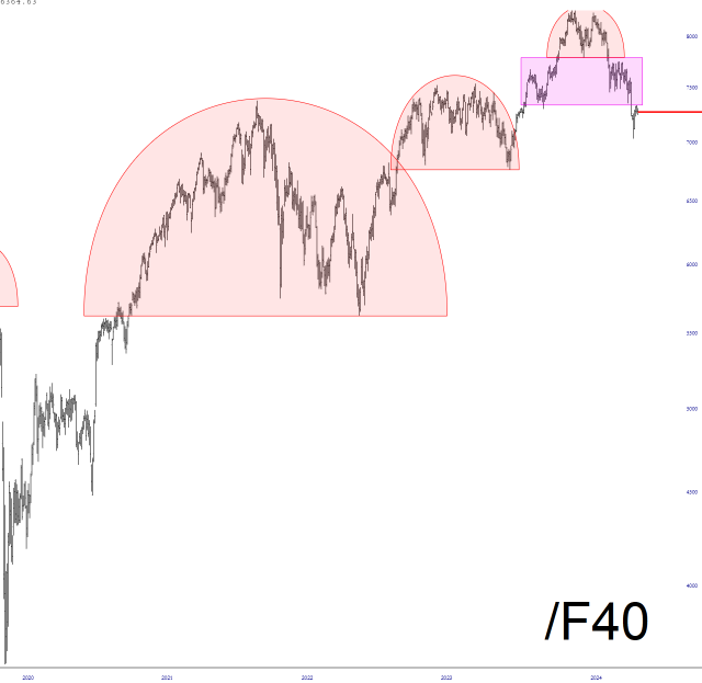
Here is a dazzling tour of some long-term European equity futures. Draw your own conclusions!