Slope of Hope Blog Posts

Slope initially began as a blog, so this is where most of the website’s content resides. Here we have tens of thousands of posts dating back over a decade. These are listed in reverse chronological order. Click on any category icon below to see posts tagged with that particular subject, or click on a word in the category cloud on the right side of the screen for more specific choices.

Introducing Personal Symbols

By -

SlopeCharts has another cool new feature which will be especially useful for paying subscribers: the ability to create a shorthand way to reference even very complex symbols. Not only is this useful as a time-saver (and memory saver, since no one can remember some of these crazy formulae) but it makes working with Layered Charts possible in ways that couldn’t be done before.

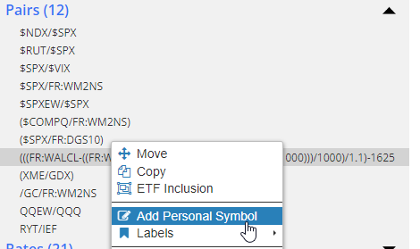
Here’s how the feature works: if you have a customized symbol created, right-click on it within its watch list and choose the menu item Add Personal Symbol.

(more…)

Fed Spread 2.0

By -

About six weeks ago, I did a post called The Near-Perfect Predictor which illustrated how, with some formulaic sleight-of-hand with SlopeCharts, its layered charts feature, and its access to Federal Reserve Economic Data, it could offer up a remarkably prescient view into what the S&P 500 was going to do next.

Ever since then, every Thursday, I have published for premium members up-to-date charts illustrating what the chart portends. (Interestingly, when I did the post, the S&P was just about at its juiciest with respect to potential to fall). Here were my crazy scribblings at the time:

(more…)

Linear or Log (by LZ)

By -

You wrote a book on the subject of financial panics, so here’s a question: should bears use linear charts for help with predicting eventual bear market lows? Not necessarily for a price target, but more to understand the scale of what’s coming.

I thought of this when looking at Home Depot after your post, because it looks like a perma-riser chart about to break support (huge event by itself) , but when I changed the view to linear, it looks like an obvious bubble since maybe 2009 with a possible stretch target of $22. The $50 area looked like the biggest support area after Covid lows until I saw the linear chart. 

(more…)