
About six weeks ago, I did a post called The Near-Perfect Predictor which illustrated how, with some formulaic sleight-of-hand with SlopeCharts, its layered charts feature, and its access to Federal Reserve Economic Data, it could offer up a remarkably prescient view into what the S&P 500 was going to do next.
Ever since then, every Thursday, I have published for premium members up-to-date charts illustrating what the chart portends. (Interestingly, when I did the post, the S&P was just about at its juiciest with respect to potential to fall). Here were my crazy scribblings at the time:
Thanks to Slopers LZ and Chomper, who pinged me to the fact that the originator of this formula had done some refinements, I decided to put on my diving outfit again and see what I could come up with. I am pretty excited about the results.
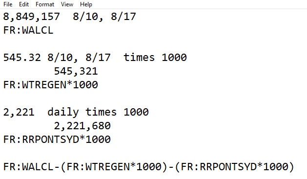
I engaged in more scribbling, messing around, and trial-and-error, and I came up with this godawful formula, which I think you Platinum folks can use.
(((FR:WALCL-((FR:WTREGEN*1000)+(FR:RRPONTSYD*1000)))/1000)/1.1)-1625
Here is the result, overlaid with the S&P 500. I have NOT time-shifted this, but as Max, the originator of the formula, points out, and time-lag between the “prediction” and the reality is approaching 0. In other words, it’s the spread that counts (and, sadly, the spread right now is kind of teeny-weeny, although the predictive data has weekly granularity, so we won’t know the latest prediction for three more days).
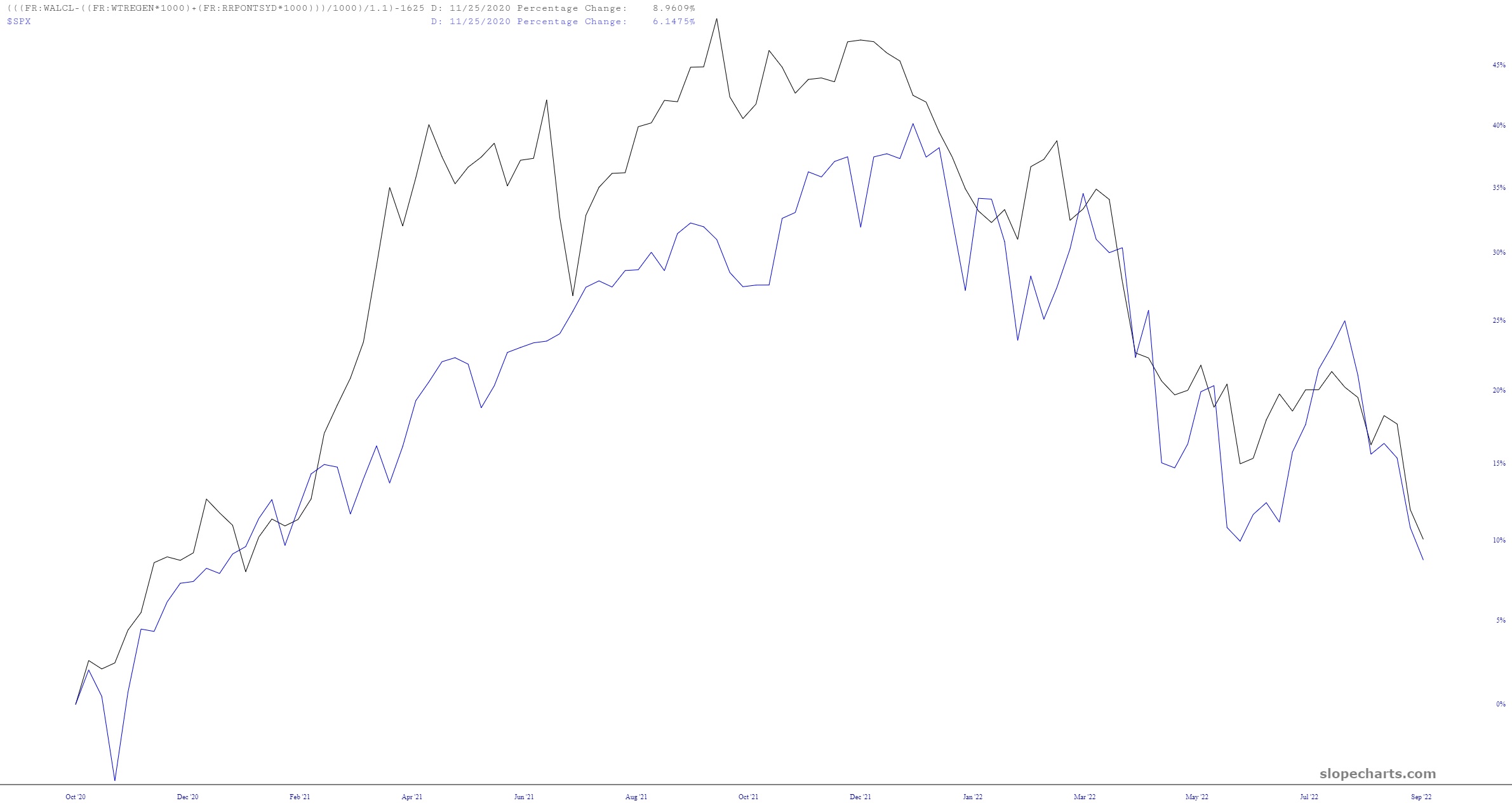
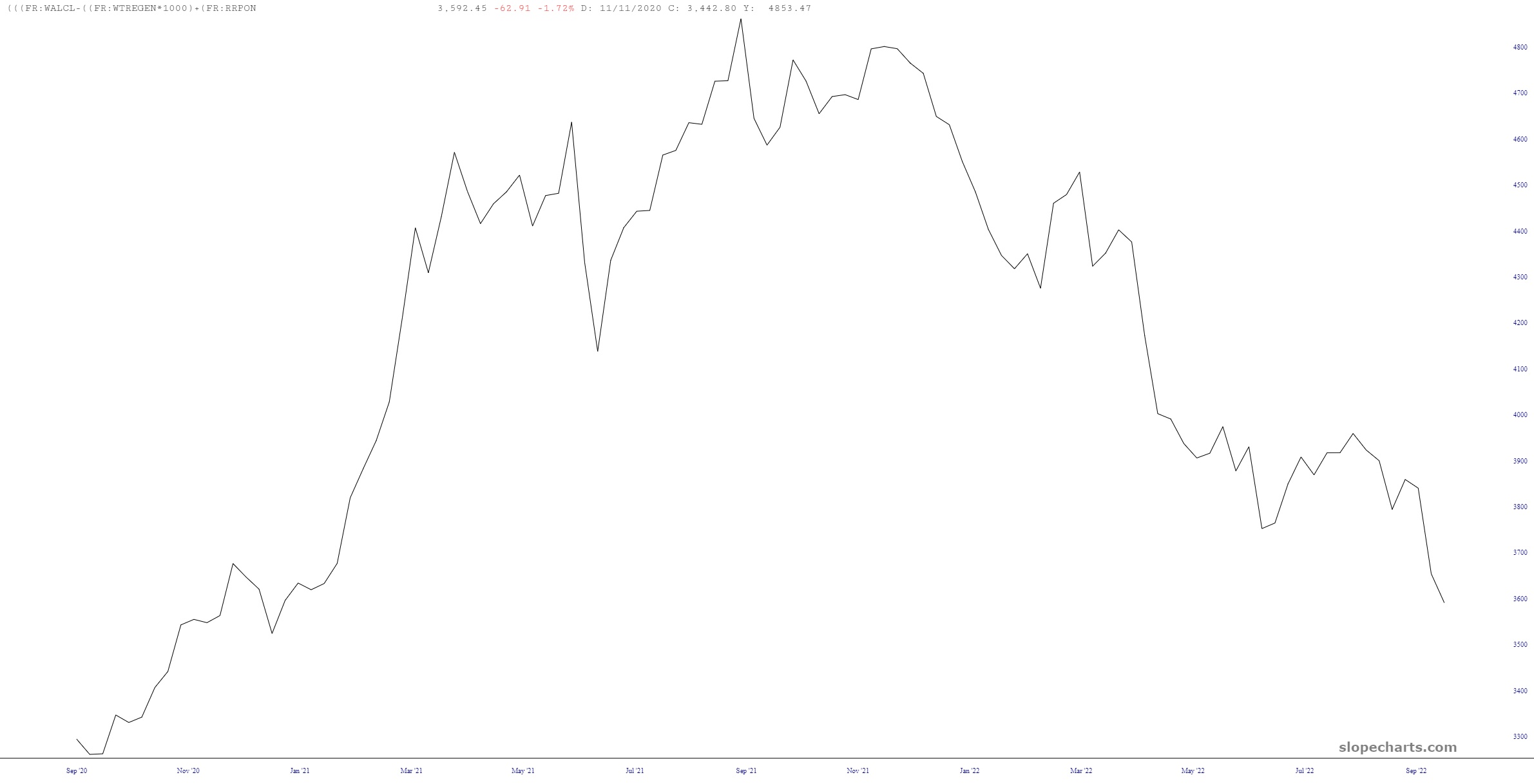
I plotted the hideous formula shown above all by itself, and it suggests the “fair value” for the S&P is only about 2.5% less than where we closed on Monday. In other words, no more fat juicy spread (the point being that, paradoxically, the most fantastic time to go hog wild shorting was precisely in mid-August, when bears were universally suicidal).
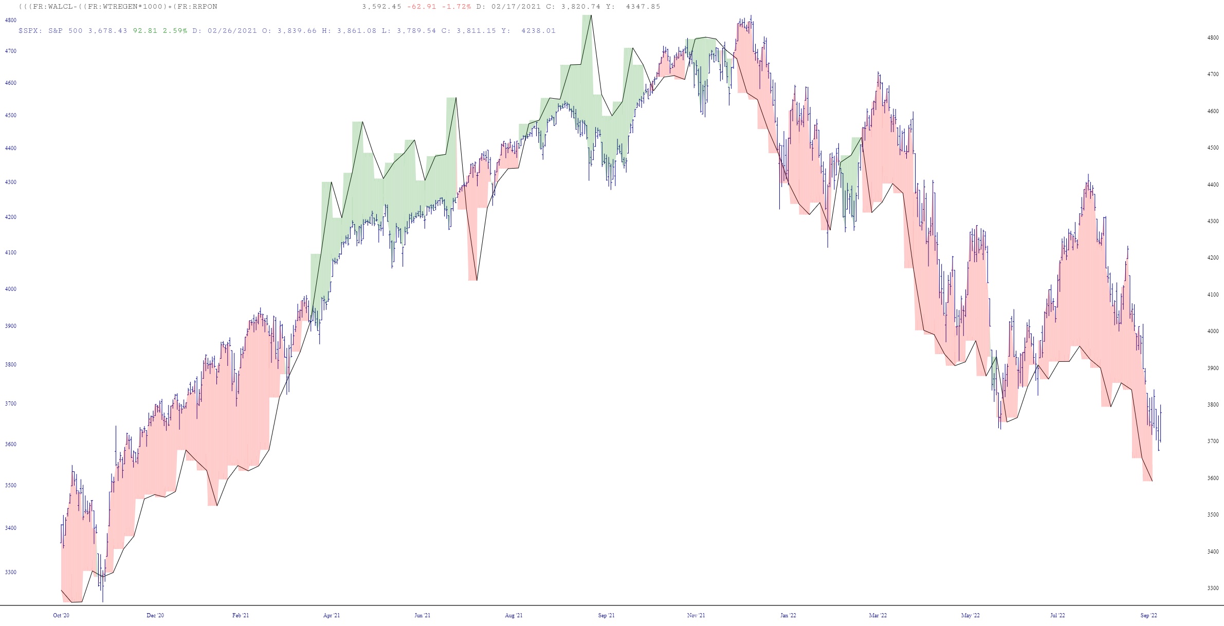
Thanks to the “spread” feature in SlopeCharts, I’m able to vividly display the delta between where we are and where we “should” be. Hey, at least it still shows things as overvalued, albeit not by much.
I’m going to sign off for the night, sharing the /ES minute bar chart, which is resolutely blasting higher:
All I can say in response to this is that there is, in my opinion, an iron wall at about 3800, where the Fibonacci retracement is located. It might take a little time for our bullish friends to get this out of their system.
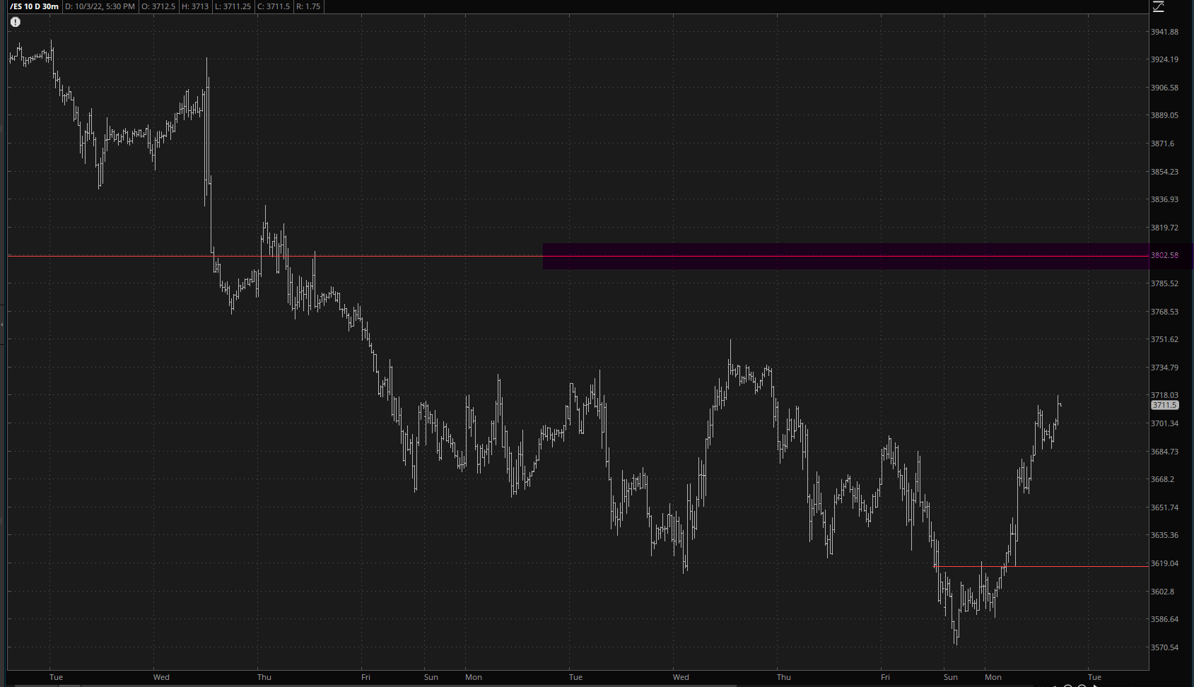
Take heart, fellow bears. There are only four trading days left until Bear Force One.
