Slope of Hope Blog Posts

Slope initially began as a blog, so this is where most of the website’s content resides. Here we have tens of thousands of posts dating back over a decade. These are listed in reverse chronological order. Click on any category icon below to see posts tagged with that particular subject, or click on a word in the category cloud on the right side of the screen for more specific choices.

Two-Handed Tuxedo

By -

We awake this morning to an interesting bifurcation in the market.

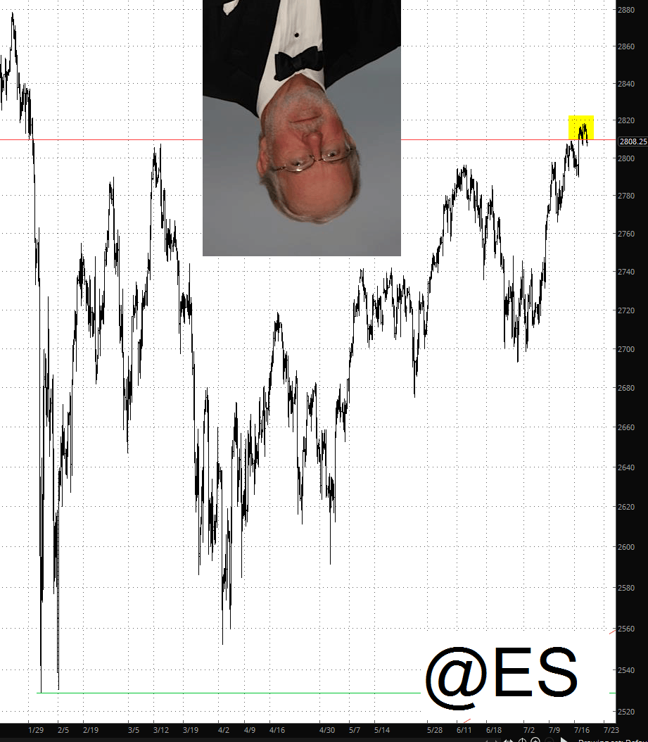
On the one hand, we have a market poised to explode to new lifetime highs on a virtually daily basis. It has many things going for it. (1) ALL news, no matter it is, from nuclear war to new toenail-clipping technology, is interpreted as good news for the market (2) Many important indexes have experienced lifetime highs or, if not that, breakouts above resistance trendlines (3) the S&P 500, represented by the /ES chart below, has finally conquered its February 1 price gap, and there is a powerful bullish pattern beneath this horizontal which has the market poised for what seems to be a powerful vault higher.

hand

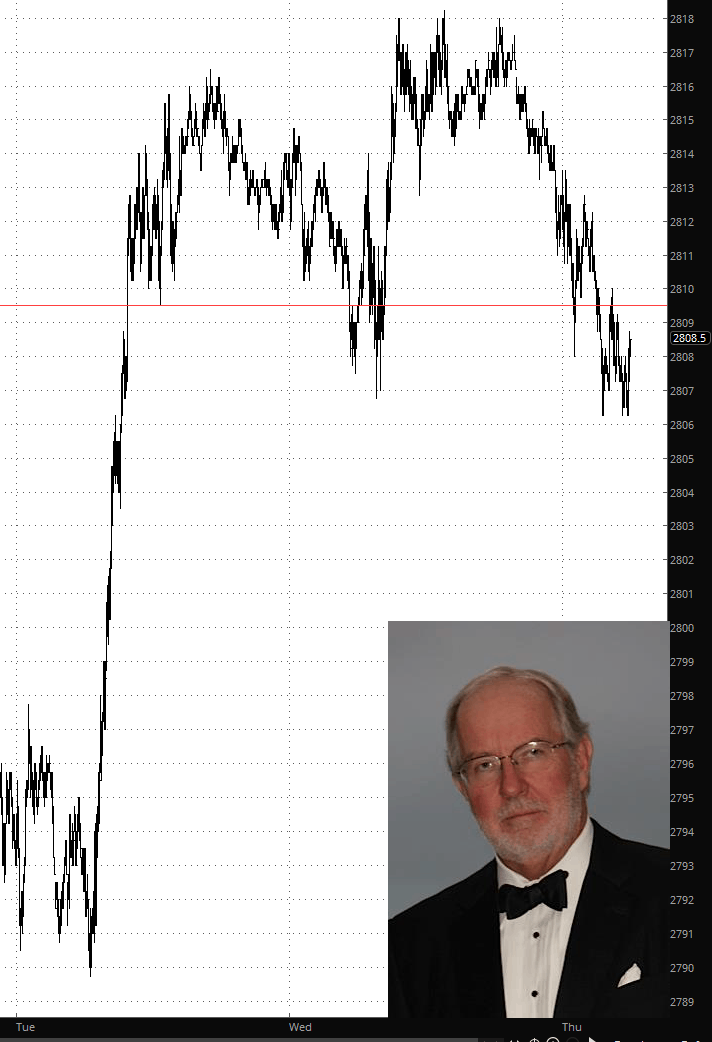
On the other hand, there’s Dennis.

hand

Economic Combustion Powering SPX to Test All-Time High?

By -

A big-picture perspective of the S&P 500 (SPX) shows that the most recent up-leg off of the June 28 low at 2691.99 has climbed to a new high at 2816.25, or +4.6%.  In so doing, the SPX has hurdled its prior two significant rally peaks at June 13 (2791.47) and at March 13 (2801.90), positioning the index for upside continuation to my next optimal target zone of 2845-2860. 
 
Should such a scenario unfold, the SPX, in effect, will be climbing towards a test of its all-time high at 2872.87 from January 26 of this year. Only a break below 2789 will trigger initial signals that the June-July up-leg needs a breather.

(more…)

Gold/Silver Ratio: Rising for a Month Now

By -

Well, look who is sporting a bullish looking pattern on its daily chart. It’s probably NFTRH‘s most watched indicator outside of the T Bond Continuum.

As you can see, a rising Gold/Silver ratio (GSR) attended the market stock market disturbances in February and March and a declining GSR has attended the relief, i.e. the expected ‘top-test’ by the S&P 500 that has ground on since roughly the same time that GSR topped in late March.

The GSR has spent a lot of the post-financial crisis era in dysfunction mode, but so far in 2018 it is working as we’d normally expect; it rises with market liquidity contraction and declines with risk ‘on’ and an absence of liquidity events.

So, is that indeed a bull pattern? Can we assign such TA to a ratio as opposed to a stock or an index? Valid questions, but all things being equal stock and/or commodity bulls would probably rather not see a pattern like that. What can’t be argued is that gold’s ratio to silver has been increasing for a month now. (more…)